You are viewing a single comment's thread from:
RE: ♳ [UI] Payable with STEEM, SBD -– Buttons & Badges - revised
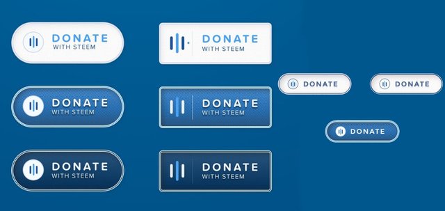
Some buttons looks "fat" for me. but all other looks great. thank you for your efforts.
Some buttons looks "fat" for me. but all other looks great. thank you for your efforts.
are u behind a retina display? can u explain ? I'm trying to export every graphic as @1x / @2x so this should ne happen usually .. could u pls expand on this? Anway, thanks for your feedback
No I'm on 14" WQHD+ (2560 x 1440).
Probably it's my own perception.
Thin buttons looks more elegant for me.
Thank you for your effort!
it's 'Phat'