♳ [UI] Payable with STEEM, SBD -– Buttons & Badges - revised
v1.0.1
To follow up on one of my recent post and on request of many community members, i was trying to get first batch of "pay/donate" buttons ready the past days. Still much space for improving, but at least - it's a good start as i find.
They will get used at steempay.io button generator for now and hopefully they will find broader adoption soon! More features are planned as well - to be able to add username on "buttons & badges" maybe better to call them "widgets" then. Thanks to @steve-walschot!
TO BE INLCUDED AT steempay.io/generate SOON
First batch includes
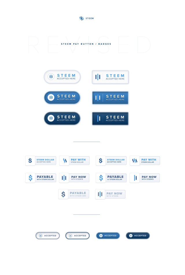
Pay buttons & badges
Download as - .zip file
@1x / @2x (retina support) / .SVG
| Buttons | Download |
|---|---|
| Accepted buttons | ➟ download here |
| Accepted badges | ➟ download here |
| all | ➟ download here |
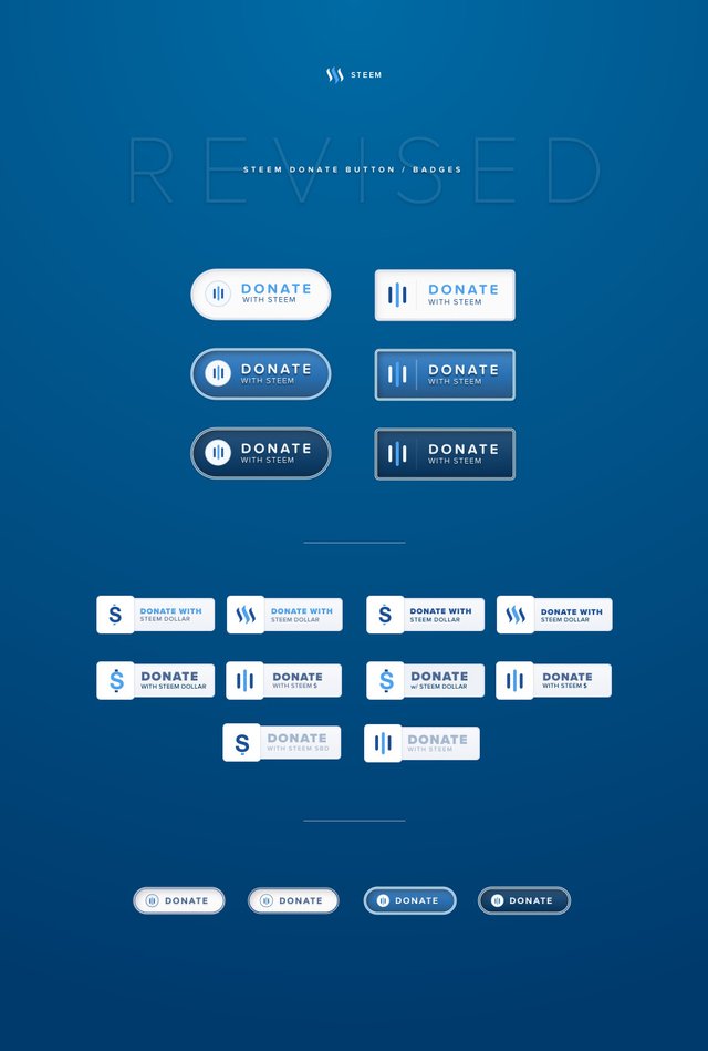
Donate buttons & badges
Download as - .zip file
I've added to downlod queue - @1x / @2x (retina support) / .SVG
| Buttons | Download |
|---|---|
| Donate buttons | ➟ download here |
| Donate badges | ➟ download here |
| all | ➟ download here |
Feedback appreciated
More to follow soon!
c
Work in progress
You can watch the progress on these graphics here
– these links will get updated automatically
https://share.sketch.cloud/2mGQ
Don't miss to check out also:
- STEEMPAY.IO v1.0.1 LIVE! Accept Steem/SBD anywhere! Button generator included!
- ♨ [Brand-Design] STEEMCLEANERs - Logo concept
- Announcing SteemCleaners, the Steemit Abuse Fighting Team

You did a great work, thank you I liked! :)

These are looking nice and clean well played @cass
i like this
Nice work Cass. I wish I could elaborate here but there was not much I could elaborate on in this post. Maybe next time.
This is probably the visaion for a way forward for a better steemit community. Thaks for the great concept. This is why i upvoted you
good
Very slick and professional looking, keep it up.
Some buttons looks "fat" for me. but all other looks great. thank you for your efforts.
are u behind a retina display? can u explain ? I'm trying to export every graphic as @1x / @2x so this should ne happen usually .. could u pls expand on this? Anway, thanks for your feedback
No I'm on 14" WQHD+ (2560 x 1440).
Probably it's my own perception.
Thin buttons looks more elegant for me.
Thank you for your effort!
it's 'Phat'
That's nice, thank you @cass!
Though maybe flat style would be better ;)
indeed this would be great
Amazing designs, @cass. What tools do you use to create them? (photoshop?)
sketch3