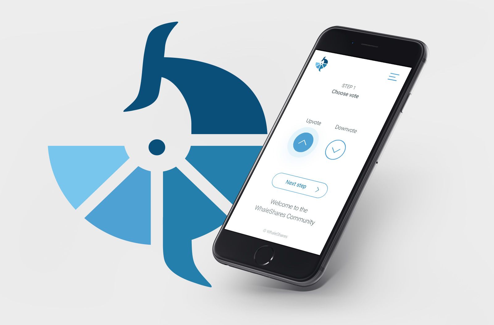
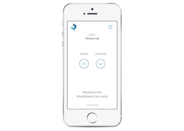
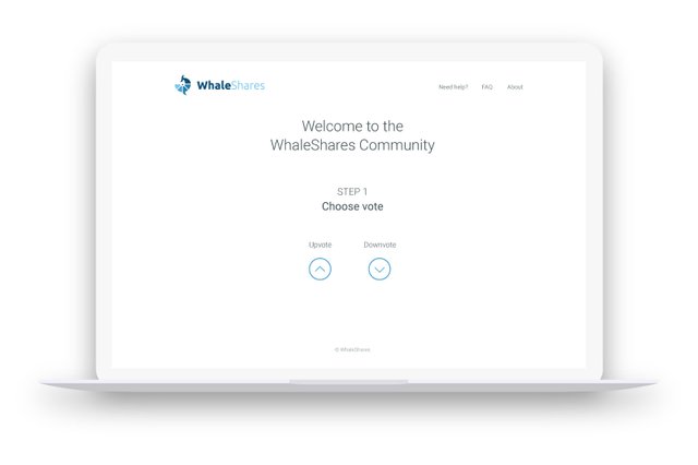
💻 WhaleShares website redesign - first preview (unofficial)
Hello you,
I was so excited about my yesterdays logo I decided to redesign whole WhaleShares.net website. @vitkolesnik insipired me with this his design.

I wanted to make this design as minimalistic as it gets. Questioning every single element and its purpose.
First drafts


💰 1 SBD for best feedback that will help me make this design better
What dont you like? Why? How should I change it?
Download source files from my Drive

Andrej Cibík @andrejcibik
Web design | Web development | Logo design
Hey, that looks pretty great! Mobile ease of use will be very useful.
I want to make sure you have considered to check for time and date of post (no more than 6.5 days), as well as verifying that post hasn't already gotten a vote from whaleshares or beyondbits.
What I like about your prototype: It's clean, easy and intuitive. It insures that all of the steps are taken, with adequate instructions.
What I like about the current version: You can see everything in one place, with minimal clicks. The power bar is a great visual representation.
What's missing from both: I would love to see the $ value of the vote before placing it. A slider or selector with % vote weight would be amazing!
Something else to consider: The plan is to release more whales and their tokens. Make sure to incorporate a plan for seamless scalability.
I think you will win my $ for the 4th point :)
Im gonna be thinking about the 3rd point. Both approaches (all at once or steps) have their advantages and disadvantages.
Let someone else earn the reward ;-)
I'll even add 10 whaleshares for them to win :)
Whaleshares, Powered by Akrid
;)
HAHA that's funny coming from the legend himself.
Can you guys believe this guy? xD
I believe you for sure bro.
Bromances make my wife jealous...but dang how do i not have at least a few? :D
Wives just don't understand a mans need sometimes haha
Awesome @akrid !
Dear @andrejcibik
You will NOT pay 1 SBD to get the people to help you improve ur work....
ILL GIVE U 150 beyondbits to give out for that! Maybe reach out to @Vitkolesnik too! He is a good guy and might have interest in even working with u? Who knows..but if possible, i always prefer to try to make synergistic connections between others. Its what beyondbitcoin is about :)
Silly brilliant people...always eating themselves alive by giving when they are just starting out. Please become a mini-whale over time as it will make me smile to know u kept the sbd and powered up.
Buying voting power/votes is the only thing that brings value to sp other than the locking up of the vast majority (and of course the community who cares enough about steem to lock up that sp and create beautiful things. :)
Your gift is not money...it is your skills that were finely crafted and honed over years and with nothing less than passionate and determined focus on creating beauty and intrinsic value from your miraculous brain!
Give me that bts addy please.
Thank you very much for your time @officialfuzzy.
I already announced the prize for best feedback, so I have to keep my word. :)
Do you have any thoughts to design itself?
My BTS address is andrej-cibik.
Maybe you can do something about the Welcome to the WhaleShares Community....
Something like this:
WhaleShares Community
then... the step 1 change it to blue color...
that's it from my first quick look :)
I dont want the "STEP #" to be blue because its not clickable element. It has quite low importance.
faint blue maybe?
The first thing that feels strange to me is that upvote is on the left side. Maybe it's just my personal feeling, but I imagine that upvote is the default button that you want to press and thus should be on the right side - just like OK, Apply, Next, etc. in software or phone apps.
I agree it should be more prominent, because most people will use only upvote. I will think about it.
I really like the minimalistic loook, it is so clean and intuitive... and that logo is just fantastic.
What I dont like is too many different font styles. You use way too many weights, sizes and colors. Basicaly every text has different size.
I agree with akrids point about steps and current design. Your design looks minimalistic and simple, but it might take too much time for regular users.
Lastly, I think this work deserves much more attention.
Wow, you are right about the texts. Really valuable critique. I think we have the winner if noone else comes.
oh really? thanks so much :)
I wont lie...the logo IS fantastic.
That looks amazing! I started with frontend design and I really like the simplistic layout. Very well done!
Thank you :) My design philosophy is "Question every part, if its not necessary, remove it."
@andrejcibik got you a $1.56 @minnowbooster upgoat, nice! (Image: pixabay.com)
Want a boost? Click here to read more!
Wow @andrejcibik - the logo you designed looks great. First time I saw a site where you can make those prototypes. Looks great! Makes me want to use that website too. Your designs are amazing. Not joining the best feedback, but I want it in blue (steemit middle logo blue) and material design. Would look cool! :D
Thank you anyways. The colors were decided in previous post :)
You mean the website should be in light blue?
Sorry, yes the website - or maybe some parts of it. Or maybe a simple background - white at the top fading to blue at the bottom - with some kind of design on it (like fractals or random triangle shapes - it may be too mainstream though).
Or maybe just a blue header with white background.
Works too. I think that's how material design looks. Headers will be colored then the whole page is white. Cool.
best site for support perspective you did it well dear, the great site whaleshare deserve this beautiful face up , now it will attract more steemians and do its best for the betterment of the people , hats off to you and congrats for this great mile stone that you do
Nice post. Upvoted and following you. Please visit my blog @bikash-tutor and upvote me. Thank you.