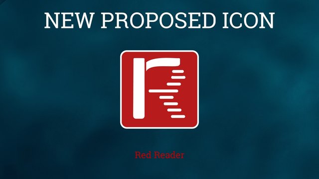
New Proposed Icon for Red Reader
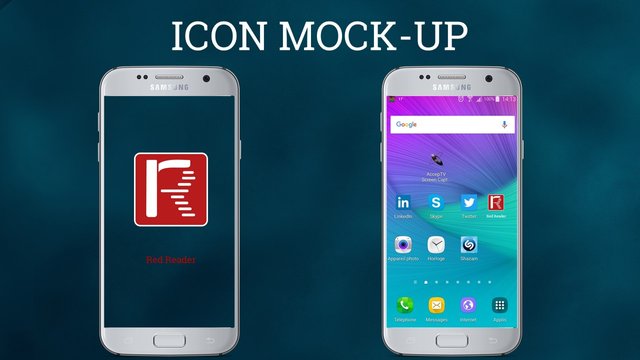
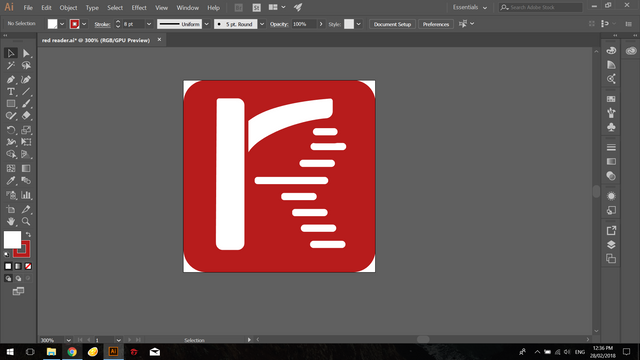
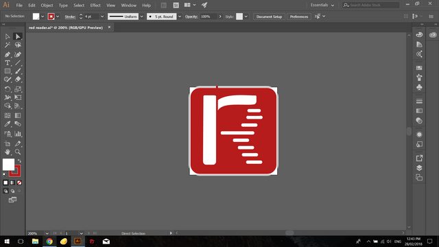
This is my new proposed icon design for the android application "Red Reader", designed using Adobe Illustrator. The features of this app is right down below:
The app lets users view and interact with reddit content. More
Design Concept:
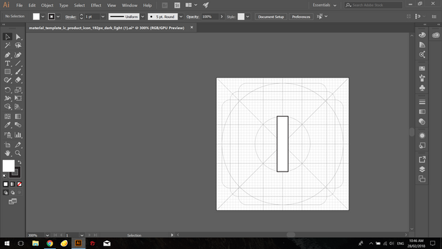
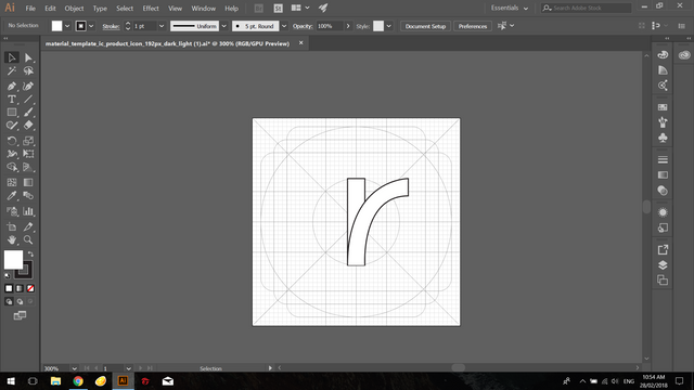
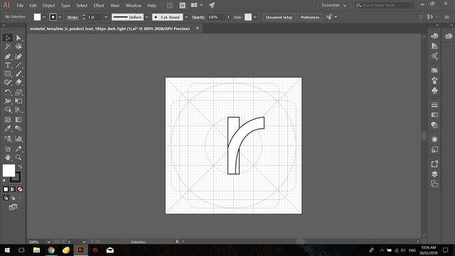
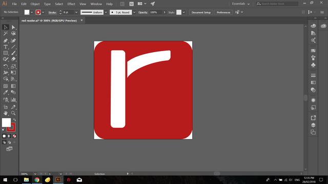
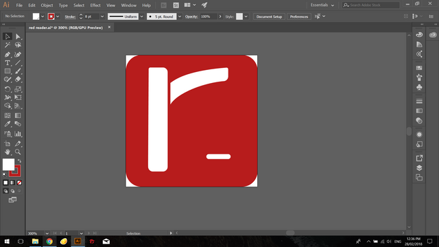
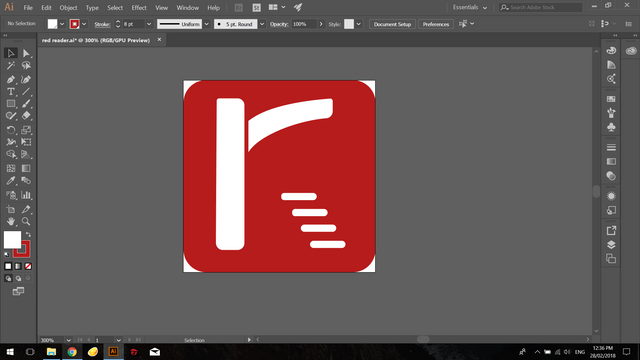
I still used the 'R' character but innovated it by impleneting lines that represents threads of reddit as the threads are how the content is in format.
icon sizes:
96px

72px

48px

32px

Benefits:
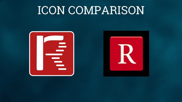
The current icon uses the 'R' character without much design into it. My take is a bold 'R' that is simple enough and stylish to suit the app.
Proof of Work:
Original files
You can download all the original files here:
Image Sources:smart phone , android home screen
Font source : Roboto Slab
Posted on Utopian.io - Rewarding Open Source Contributors
Your contribution cannot be approved because it does not follow the Utopian Rules.
Hard rules broken:
Suggestion:
You can contact us on Discord.
[utopian-moderator]