New Proposed Icon for Media Converter Pro
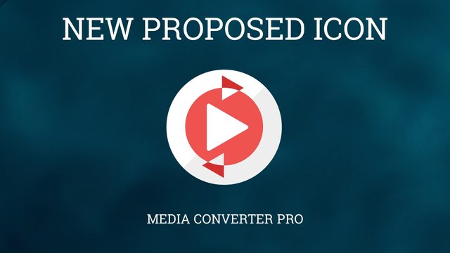
This is my new proposed icon design for the android application "Media Converter Pro", designed using Adobe Illustrator. The features of this app is right down below:
The app lets users convert media files into other formats. More
Design Concept:
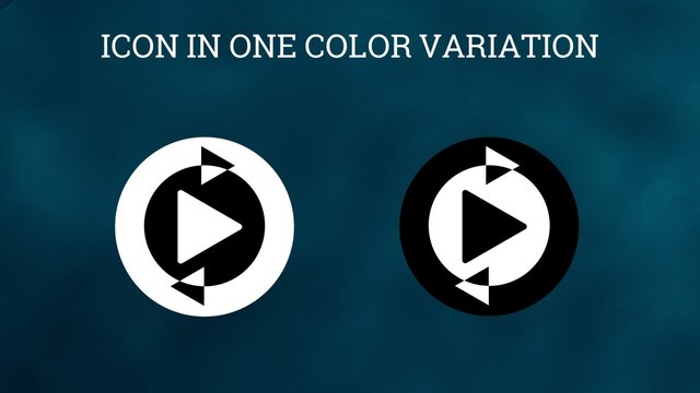
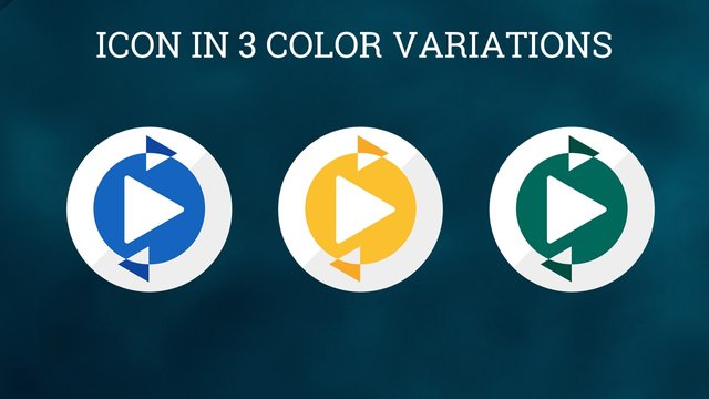
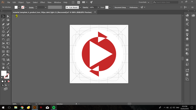
The universal symbol for media the triangular play button was used. Surrounding it is a circle where two arrow heads circling it symbolizes the conversion process of the app.
Icon Sizes
96px

72px

48px

32px

Mockup On Mobile Device:
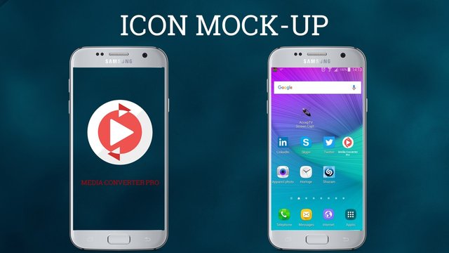
Font Used: Roboto Slab
Benefits / Improvements
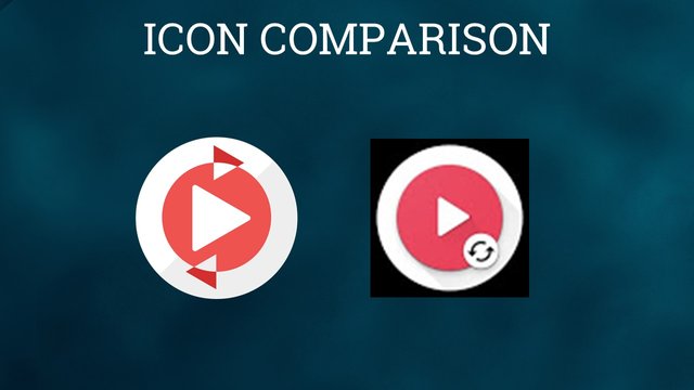
The current icon is too basic. My design will be a much sleeker look while offering style and functionality.
Tools
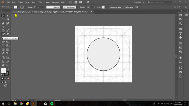
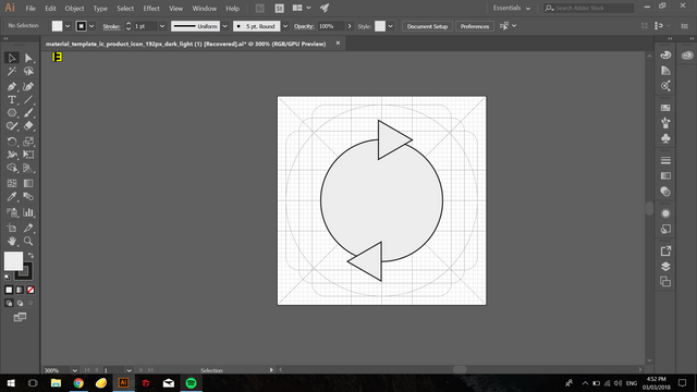
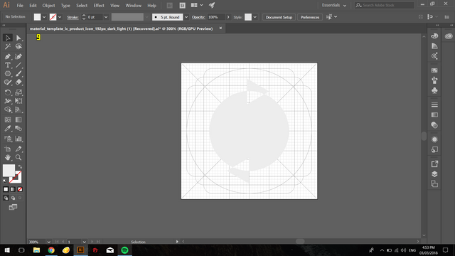
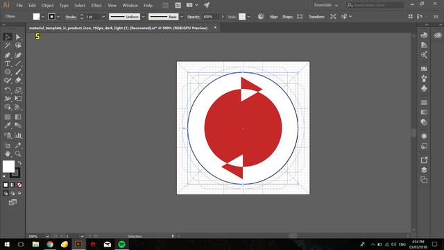
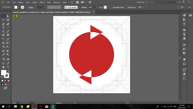
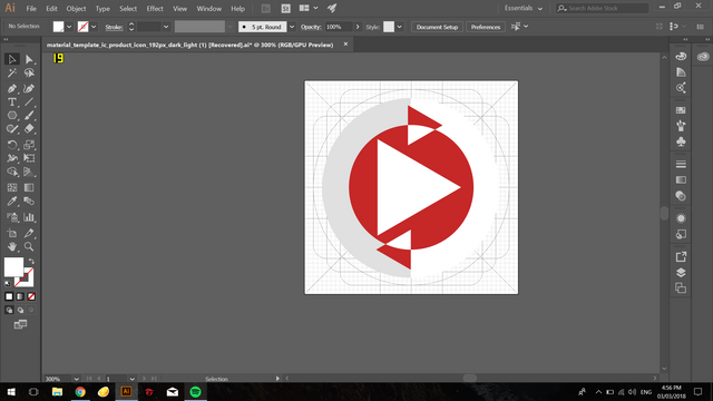
I used Adobe Illustrator CC 2017 version for both design and presentation. Here are some screenshots for proof of works.
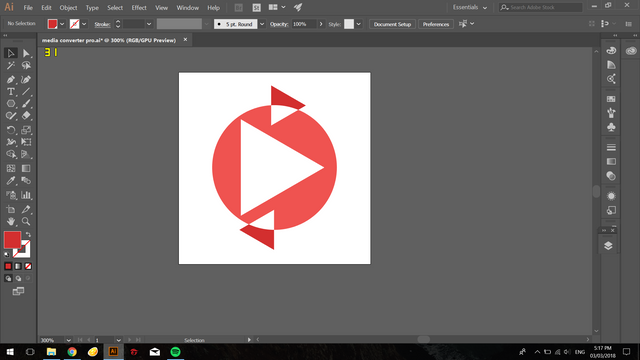
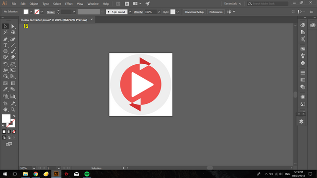
Original files
You can download all the original files here:
Image Sources:smart phone , android home screen
Font source : Roboto Slab
Posted on Utopian.io - Rewarding Open Source Contributors
Your contribution cannot be approved because it does not follow the Utopian Rules.
Your icon also is too basic and complicated at the same time, current logo used a regular convert icon you just made it harder to understand.
You can contact us on Discord.
[utopian-moderator]
Your contribution cannot be approved because it does not follow the Utopian Rules.
Hardrules broken:
Suggestion
You can contact us on Discord.
[utopian-moderator]