Logo design for Mouse Dictionary
Repository
Details
Mouse Dictionary is a super fast dictionary for Chrome and Firefox.
Features:
Blazing fast
Detect phrases in text intelligently
You can import your own text data
Divide special expression into individual words and look them up at once(e.g. camelCase, snake_case)
Customizable
Benefits / Improvements
First, I made an open book icon because it means dictionary. Then I draw a circle and divide it for give meaning to translate words to other languages. Also, I added M and D, the first letters of Mouse Dictionary. I choice light blue and orange colors cause light blue means education, orange is taking attention and the project owner used similar tone on the chrome web store overview.
Presentation
Proof of authorship
Tools
Adobe Illustrator CC 2018
Original files
Proof of Work Done

This work is licensed under a Creative Commons Attribution 4.0 International License.

Hi @tebriz, thank you for your contribution.
First i would like to talk about the presentation of the contribution. you know a lot of people in graphic category treat their contribution as their portofolio. it is one of many ways project owners can see your work, so it is a common thing that project owners will contact utopian contributors personally and ask them to do a work after seeing their post. and if you really want to be a graphic designer as you said in your github issues, i suggest you to level up your presentation. To do so, you can take a look at utopian weekly top contributions, see how they build their presentation to look more appealing. and in case you didn't know it, better presentation means better score, and better score bring better reward.
for the logo, there are few things i want to point out, first the elements in your logo, if you said one of the elements is a book/dictionary, you should make it recognizeable as a book/dictionary.
for example take a look at the image bellow

People won't be able to recognize it as "translator that translate words to other languages", the circle with diagonal divider looks like a pill/drug, that's the first thing come in my mind when i see the logo. I know the letter M and D are the intial of the project. but as a graphic designer it is our job to solve this kind of probem.
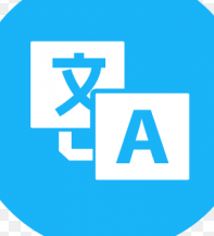
now compare it to image bellow.

you can tell that this logo related to translator/dictionary.
Your contribution has been evaluated according to Utopian policies and guidelines, as well as a predefined set of questions pertaining to the category.
To view those questions and the relevant answers related to your post, click here.
Need help? Write a ticket on https://support.utopian.io/.
Chat with us on Discord.
[utopian-moderator]
Thank you for your review, @nilfanif! Keep up the good work!
Hi @tebriz!
Your post was upvoted by @steem-ua, new Steem dApp, using UserAuthority for algorithmic post curation!
Your post is eligible for our upvote, thanks to our collaboration with @utopian-io!
Feel free to join our @steem-ua Discord server
Hey, @tebriz!
Thanks for contributing on Utopian.
We’re already looking forward to your next contribution!
Get higher incentives and support Utopian.io!
Simply set @utopian.pay as a 5% (or higher) payout beneficiary on your contribution post (via SteemPlus or Steeditor).
Want to chat? Join us on Discord https://discord.gg/h52nFrV.
Vote for Utopian Witness!