My new designed logo for Quick SMS
https://github.com/mahbubiftekhar/quickSMS
Details
This is my contribution to an Android application which allow user to send same messages to the same recipient. User can easily tap on their photo and pick the message they wish to send. They can add, modify or delete these pre-set messages at any time. I have visited their GitHub page and created an issue regarding the icon-logo proposal. Here are links to our communication:
Presentation
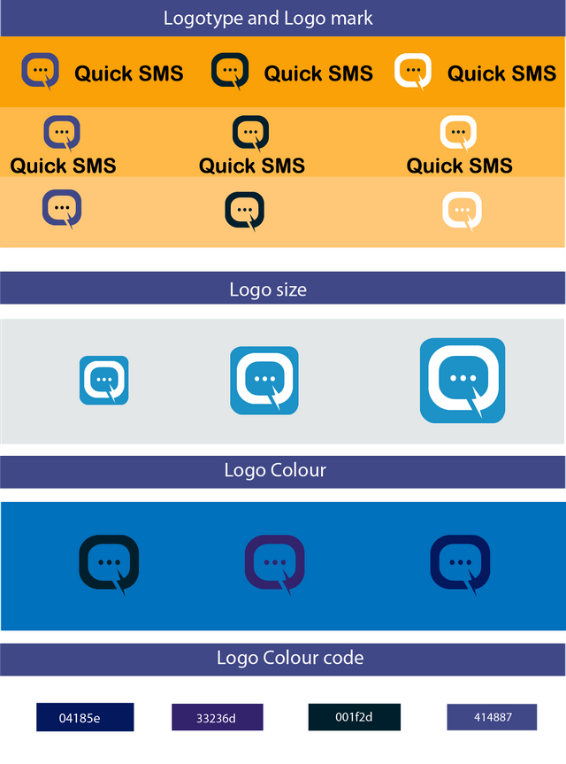
Benefit
Current logo of the application is quite old. Then I offered to create a logo for this project and the project owner agrees. Then I showed Two sample, the project owner selected one and asked me to make a bit change then I changed that. The updated file liked by the project owner.
Proof of the work
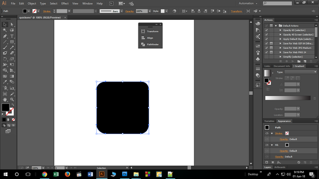.png)
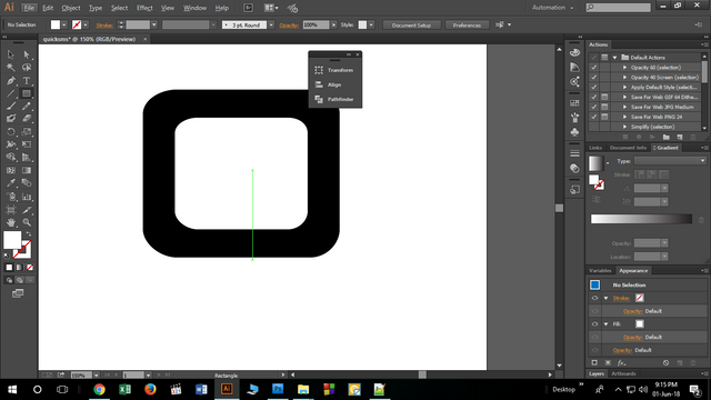.png)
Tools
All the works has been done by adobe illustrator cc 2017
Original Files
Proof of work done
https://github.com/saifulfrank

This work is licensed under a Creative Commons Attribution 4.0 International License
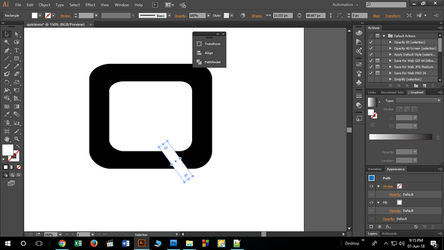.png)
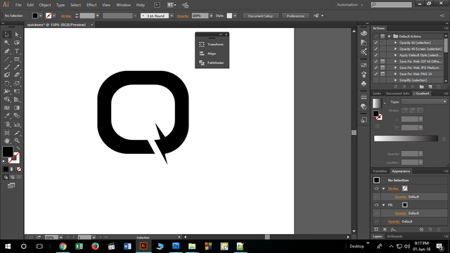.png)
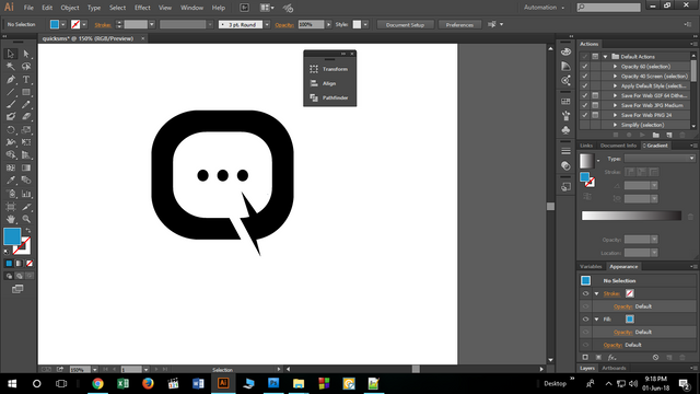.png)
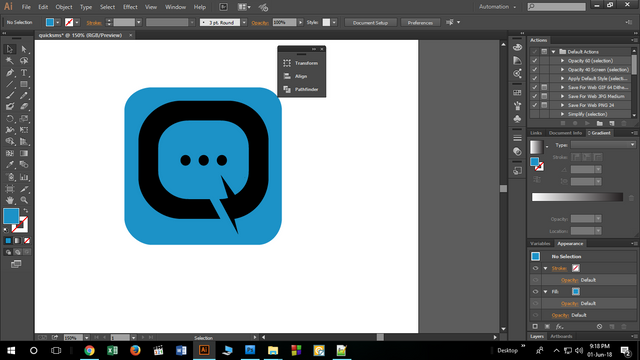.png)
Hey @saifulfrank ,
Thank you for the contribution but your logo design so generic and it has some flaws need to be corrected.
In my opinion icon and application background corners should has same smoothness. Actually, your icon not need a background.
Because of the shape of your icon, your final logo design (with application background) is looking unbalanced. It looks more close to top.
Color variations of your logo design are so similar with each other. On your presentation there are not clearly visible because of the dark background. (Using dark color on dark color reduces visibility and readability)
You should show your initial idea. For example, what is the meaning of zigzag line? Is it represents "quick" or something like that? Please explain your thoughts clearly on your next contributions.
You should tell differences between old logo design and your proposed logo design on Benefits&Improvements part. Also it should include your process, improvements according to feedbacks and features of your final logo design.
Your contribution has been evaluated according to Utopian policies and guidelines, as well as a predefined set of questions pertaining to the category.
To view those questions and the relevant answers related to your post, click here.
Need help? Write a ticket on https://support.utopian.io/.
Chat with us on Discord.
[utopian-moderator]
Thank you so much. i have got many important info from your opinion. I will follow all the instruction in my next contribution.
Hey @saifulfrank
Thanks for contributing on Utopian.
We’re already looking forward to your next contribution!
Contributing on Utopian
Learn how to contribute on our website or by watching this tutorial on Youtube.
Want to chat? Join us on Discord https://discord.gg/h52nFrV.
Vote for Utopian Witness!