Logo proposal for Lector
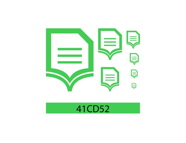
ICON
Github Repository
Details
Qt based ebook reader
Currently supports:
- epub
- fb2
- mobi
- azw / azw3 / azw4
- cbr / cbz
Issue link
Merged link
Font-newsgoth-lt-bt
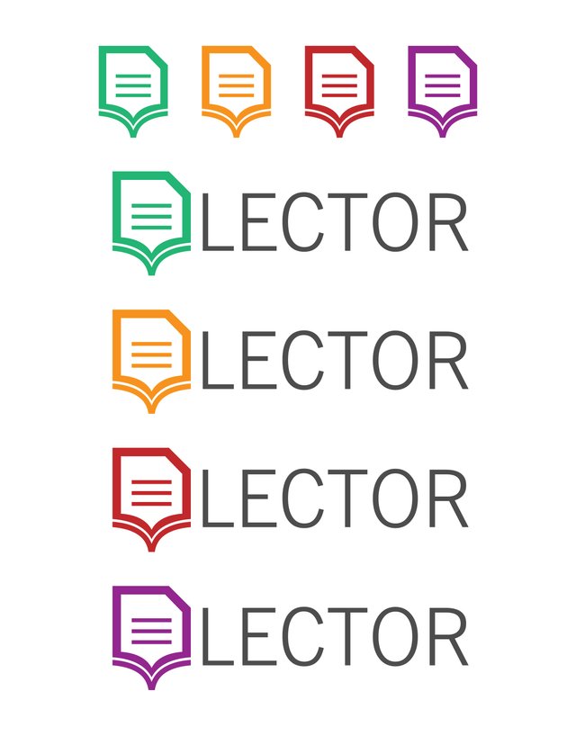
LOGOTYPE
SIZE and COLOR CODE
DIFFERENT COLOR
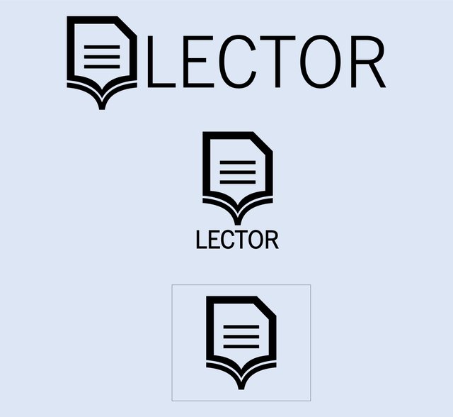
ONECOLOR / ICON AND LOGOTYPE
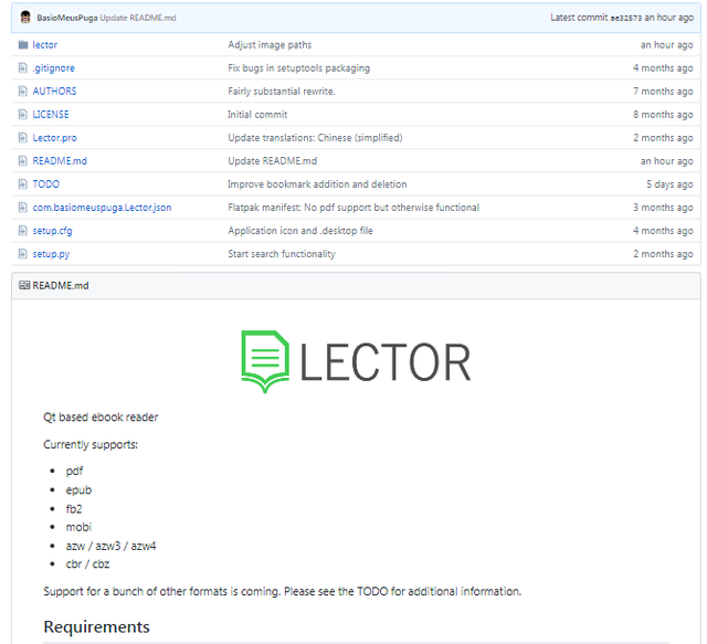
README FILE
Benefits, improvements
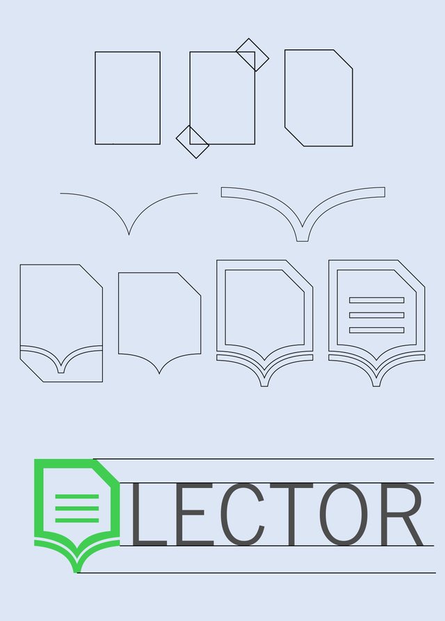
Logo idea: this project works with qt.
- So, I designed a page and cut the corners. (qt form)

- I used an icon in v form to express the book.
- Letter L = the first letter of application.
- I applied qt color for this logo.(green)
So;
compatible with its own system(qt), simple, a logo was created.
Process steps
Proof of Work Done
Original Files
Tools
Adobe Illustrator CS6.


Hey @psikoz
Thanks for contributing on Utopian.
We’re already looking forward to your next contribution!
Want to chat? Join us on Discord https://discord.gg/h52nFrV.
Vote for Utopian Witness!
Thank you for your contribution.
You have to maintain consistency between each elements, some part need the same thickness to make the logo looks more appealing. and always pay attention to the gap, if you make it too narrow it will look bad when the logo scaled down (small size)
Your contribution has been evaluated according to Utopian policies and guidelines, as well as a predefined set of questions pertaining to the category.
To view those questions and the relevant answers related to your post, click here.
Need help? Write a ticket on https://support.utopian.io/.
Chat with us on Discord.
[utopian-moderator]