UI: Travel-It (App for Steemit)
Details
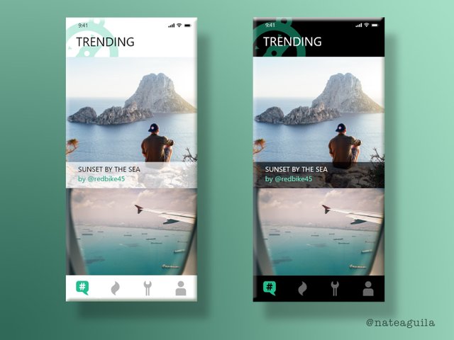
This is a submission of UI elements for a Utopian project called Travel-It, a Steemit mobile application that is focused on travel photos. Details for the project may be found HERE.
Benefits / Improvements
The navigation icons were designed to be simple yet informative, reflective of their functionality. The request included icons for Trending, Hot, Tools, and Profile. I don't think including text beneath the icons is necessary, but if the developer does so--I recommend short one-word descriptions.
Tools
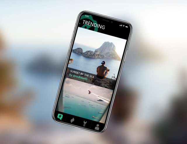
Adobe Illustrator was used to create the vector icons. Adobe XD was used to create the UI screens (which I am throwing in as bonus material). Adobe Photoshop was used to make the presentation mock-up.
Original files
Posted on Utopian.io - Rewarding Open Source Contributors


Wow, that looks really gorgeous. Great work on the design.
Gr8 work, more grace
How appropriate and ironic. I’ve just spent ten minutes telling someone how to improve their mobile picture and then see this post immediately afterwards! Thanks for posting this and the work involved, I’ll direct them over
the ever-expanding steemverse, i hope it doesnt bubble so bad that it becomes hard to see through the multitude as everyone on the planet pushes their own app on the chain once more .... nice work btw ...

resteemed ... follow for followback
about me (extensive version):https://steemit.com/rudyardcatling/@rudyardcatling/signature-post-201804
(i'll hold the vote until im back at 100 in two hours and delete this last sentence when i do)
LIKE IT!+
Beautiful UI activity layout. Nice work altogether.
Your contribution cannot be approved because of these following reasons
Design chosen by Project Owner:
Designs rewarded based on moderators judgment: