A New Logo / Icon For " Maps.me – çevrimdışı haritaları "
Free, detailed and completely offline maps with navigation system showing step-by-step directions to the destination - more than 90 million travelers worldwide rely on it. Record mobile data; No internet is required for the application.
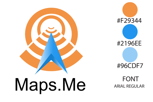
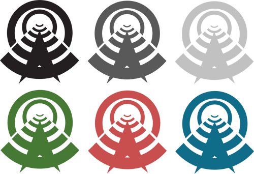
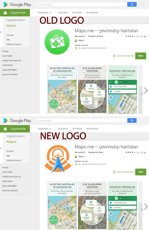
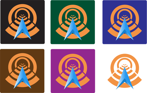
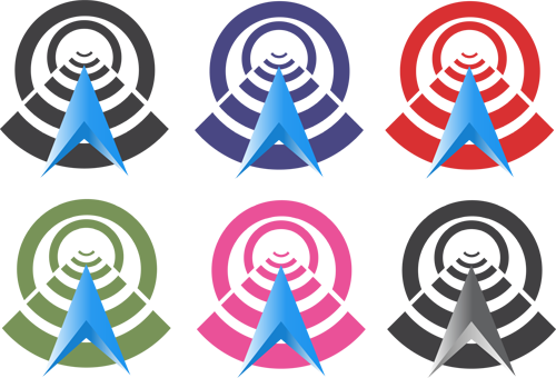
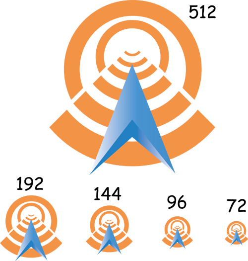
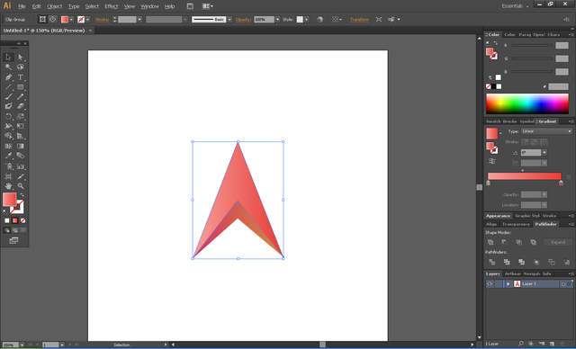
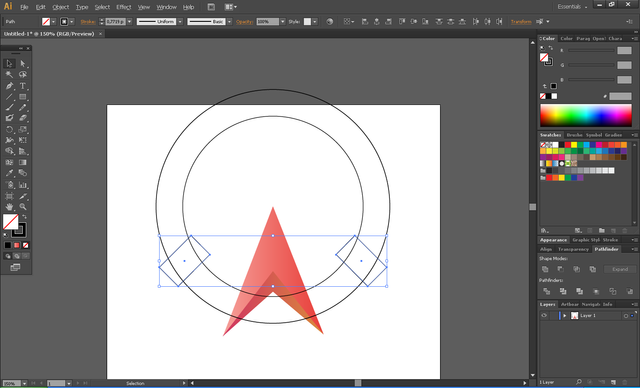
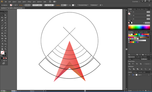
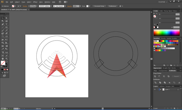
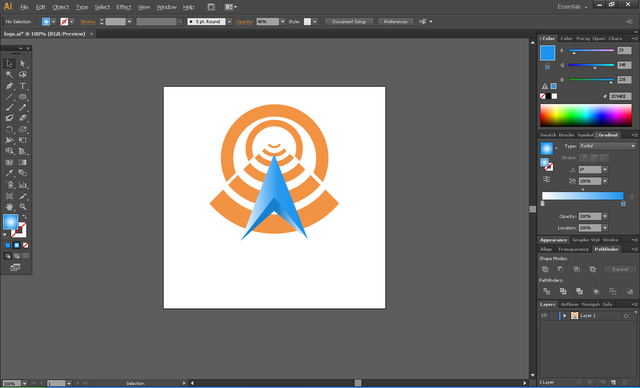
I made many meanings to Logo. You do not need internet for the program. So I reversed the wifi sign. The reverse Wifi sign means roads and streets. As a result, I designed a beautiful and meaningful logo.
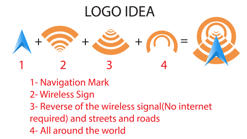
I used Adobe Illustrator CS6 to design for the new logo. And Proof of my works.
Google Play Link: Here
All vector and editable files is Here.
Posted on Utopian.io - Rewarding Open Source Contributors
Congratulations @klavydelikanlisi! You have completed some achievement on Steemit and have been rewarded with new badge(s) :
Click on any badge to view your own Board of Honor on SteemitBoard.
For more information about SteemitBoard, click here
If you no longer want to receive notifications, reply to this comment with the word
STOPPlease add version of logo in one color and version with logotype. Dont forget to convert text into shapes.
Thanks for suggesting. I fixed it. Can you check ?
Your contribution cannot be approved because it does not follow the Utopian Rules.
You can contact us on Discord.
[utopian-moderator]
You knew right from the start. Why did you even tell me to fix the sharing?
You are not fair. And I looked at the contributions you shared. You should fix yourself first. I will hate Utopian. Because of you. I am angry. If there is an option, I do not want you to check it out. @andrejcibik
Hi @klavydelikanlisi Hi. There is nothing wrong with moderation on u entry. It's just that it's not enough to be approved. Maybe if you mai, we can talk about it. There are many things that need to be learned by you about graphic design.
I admit that there are many things I need to know. but the point I do not understand is.
If you dont want second chance, I will give you only 1 next time. Good luck.
I always want second chance. I do not want you to control me. I say again, justice.
you should be grateful you got a chance... some may say your logo is too complicated and not as good improvement..
and you know, you could do it right (that one color version) ... and just make a transparent border around that navigation symbol so it would be clear, not just change the color.. that is what @andrejcibik tought.
I can not be grateful that the design I'm dealing with one day is garbage. You are very clear and I understand. I do not want to extend too much. I'm just angry with her.