My Proposed Design for GitJourney by OlgaKuklina
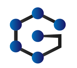
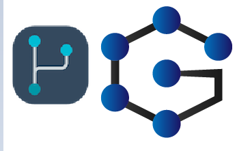
This is my designed icon for GitJourney
Click here for more info.
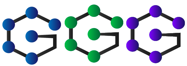
DIFFERENT COLOR VARIATION
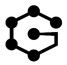
ICON IN ONE COLOR
COMPARISON FROM EXISTING ICON
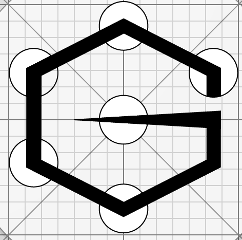
CONCEPT
I used the letter "G" stands for GitJourney then the hub element. I combined the two to make a good design of it and to make it more attractive compare to existing design. I didn't used font from my letter instead, I used polygon to make it perfect and easy to edit.
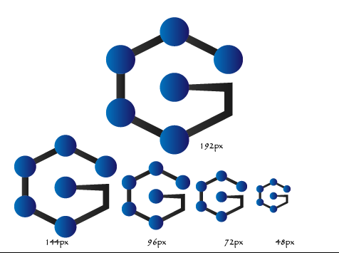
DIFFERENT SIZES
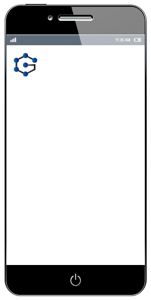
FOR MOCK UP DEVICE
Mockup source
OLD
NEW
For the tools I used Adobe Illustrator 2017.
See the quick preview of my work below.
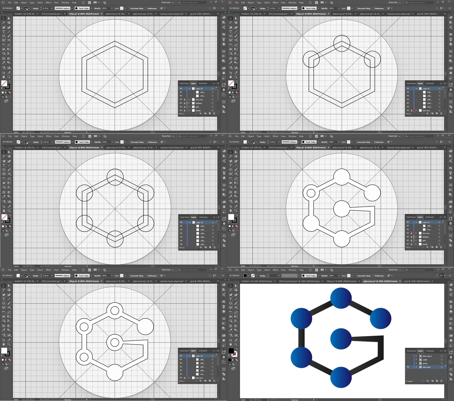.gif)
Original files
https://drive.google.com/drive/folders/1BV1Z_9C4VibypS26JJVpGRepCbZxDUcb?usp=sharing



Your contribution cannot be approved because it does not follow the Utopian Rules.
You can contact us on Discord.
[utopian-moderator]
Hey @andrejcibik, I just gave you a tip for your hard work on moderation. Upvote this comment to support the utopian moderators and increase your future rewards!
@imgee, Contribution to open source project, I like you and upvote.
I like the concept, but it does not look like commits. Please use your idea, but make in in the style of the orignal logo. Make sure it works well as an app icon and in small size.
Utopian moderator
@anrejcibik Hello I already tried in small size and it still look fine. what you mean also in not look like commits?
You dont use github, right? You would know.
Try to pick projects you are familiar with
@andrejcibik should I change my design sir?
Make a new one of you want.
@andrejcibik ok sir thank you. you mean I should create again and post it here too by edit? or new contribution?
You cannot repost the same work.
@andrejcibik ok sir i will edit it here
@andrejcibik hello sir I already edit the files you can check it. I changed it to new one and I will update/edit the post after maintenance thank you.
@andrejcibik you can check it now sir thank you