Amazing Style Logo Design For DuckDuckGo Android
Details
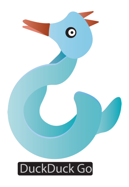
Too many people believe you can’t expect privacy on the Internet. We are striving to change that, and make it our mission to set new online trust standards. Install DuckDuckGo and regain your privacy
Benefits / Improvements
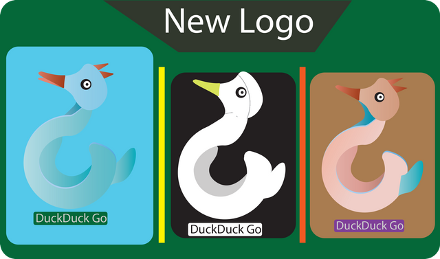
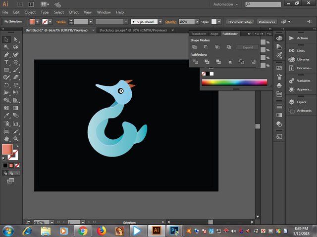
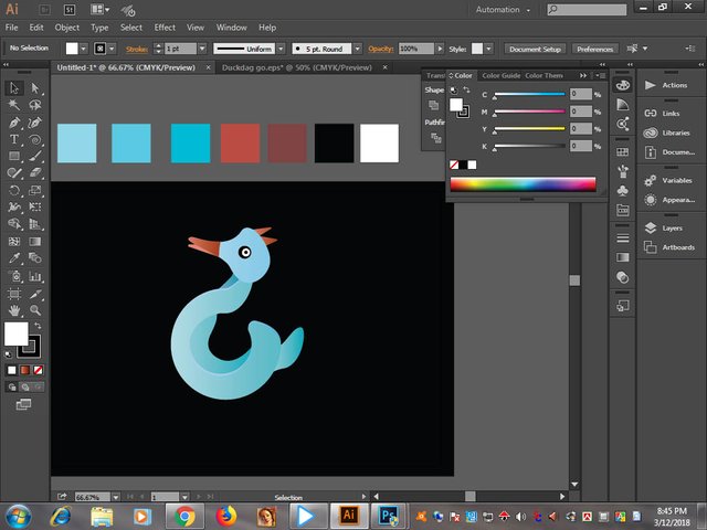
I designed the logo for a more attractive looking logo DUckDuckGo.
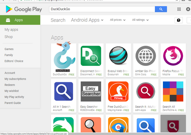
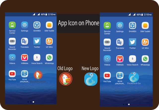
Logo Mockup. Old Logo & New Logo
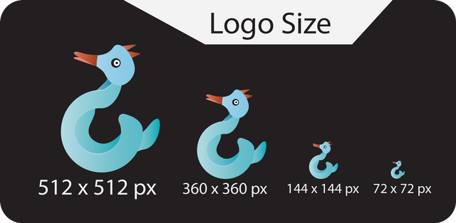
**Logo Size **
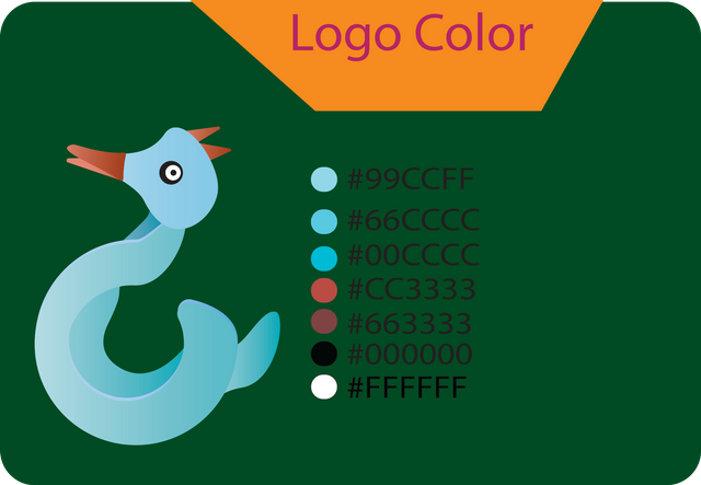
**Logo Color **
Tools
adobe illustrator cc 2017
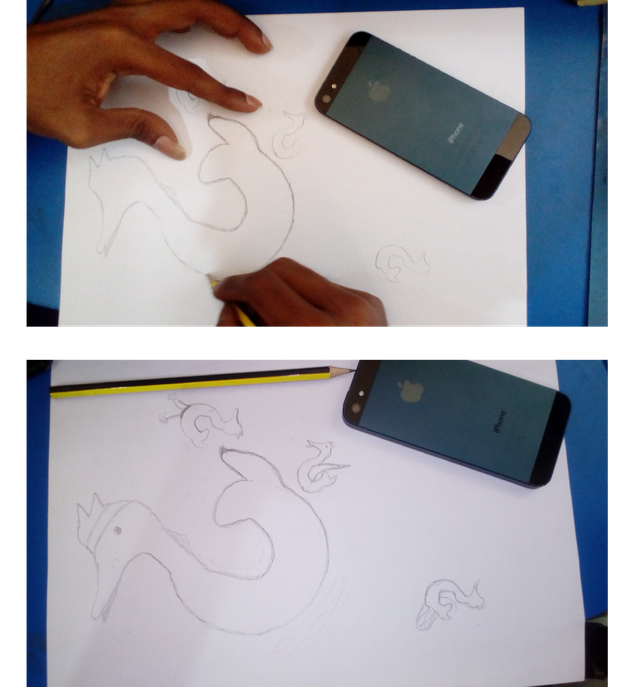
Proof
[Logo Font Link ]http://www.fontpalace.com/font-download/MyriadPro-Regular/)
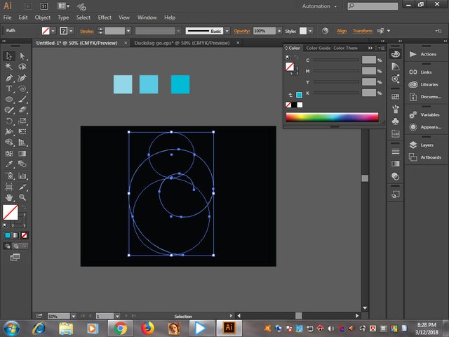
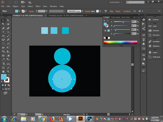
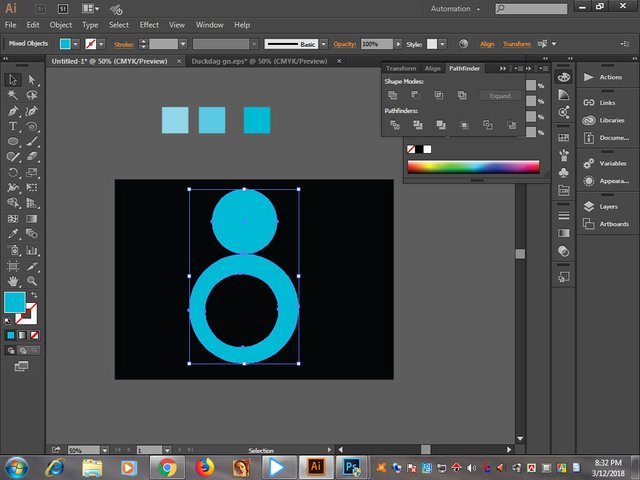
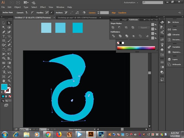
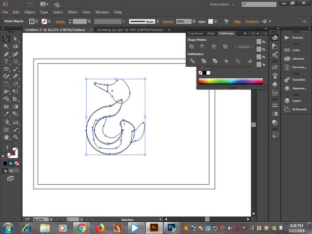
**Logo Idea **
Original files [Download
](https://drive.google.com/open?id=1q9tSPtzcZgQQCIc2YgSPZ025KGkN_bC9)
Logo Animation
Posted on Utopian.io - Rewarding Open Source Contributors

Nice
Congratulations! This post has been upvoted from the communal account, @minnowsupport, by badsha162916 from the Minnow Support Project. It's a witness project run by aggroed, ausbitbank, teamsteem, theprophet0, someguy123, neoxian, followbtcnews, and netuoso. The goal is to help Steemit grow by supporting Minnows. Please find us at the Peace, Abundance, and Liberty Network (PALnet) Discord Channel. It's a completely public and open space to all members of the Steemit community who voluntarily choose to be there.
If you would like to delegate to the Minnow Support Project you can do so by clicking on the following links: 50SP, 100SP, 250SP, 500SP, 1000SP, 5000SP.
Be sure to leave at least 50SP undelegated on your account.
Nice sir
vai apnar logo ta sundr hoyse...gd
nice
Your contribution cannot be approved because it does not follow the Utopian Rules.
Hard rules broken:
Suggestion:
You can contact us on Discord.
[utopian-moderator]
wow
nice your logo brother.
good