Coinbreze Trading Page Overview

The trading platform for cryptocurrencies must be user-friendly. Colours, constructions, locations, etc. are important for the creation of an API that will manage the trading of your clients in the future. A fresh organisation needs to attract the crowd by establishing a healthy trading environment. A healthy and organized trading platform will improve the number of traders on the internet. Keeping in mind that what’s going to be an easy-to-use tool for traders on the coinbreze page, we’ve developed an easy-to-use task guide for customers.
Let’s figure out what we’ve got for you at the coinbreze.
Coinbreze has introduced you a phenomenal design with a fully customizable design. The trader can model or alter the Graphical User Interface as needed. With a foundation colour of black that is user-friendly for day and night sessions with marked colours such as green, red, blue, grey, yellow, etc. Check this out, man.

Isn’t that colourful and appealing as well? Sure, it’s — now I’m trying to elaborate in-depth on the design and what the sophisticated characteristics it’s all about.
As you can see in the image, I’m splitting the device into five components.
One shows current trading with beautiful graphical representation.
Order book,
Recent trades
Your order section
There is another section located in the south-east corner of the interface in the form of buttons for buy and sell.
Now, what’s in the first chapter?
The interpretation of the image is always useful to the viewers. So, look at this image closely.

This component can be customized with a sophisticated instrument. Look at the bottom of the south-west and discover the small green key. It’s going to look like this by pushing it in the highlighted blue region.

Here you will have access to multiple tools like
Trend line
Pitchfork
Brush
Text
XABCD
Icon
Measure
Zoom in
Zoom out
Magnet mode
Stay in drawing mode
Lock drawing tools
Hide drawing tools
Show object tree
And the last function includes removing drawing tools
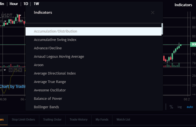
Now, look at the north-east corner where two functions help you to get more accurate trading, full-screen mode and indicators.
When you tap on the indicators, a tiny screen will occur from which you can choose distinct metrics. Drag down for a number of alternatives.

Each index can be customized individually. Let’s see how the picture is illustrated.

Now, take a glance at the two successive photos above. I turned on the Accumulation / Distribution and then went to the silhouetted region of the trading graph. Here, I pointed it out with a blue oval. These three mildly noticeable icons can be used whether you want to display/hide or delete or not. In this image, I turned on the layout and see how this screen works with another custom portion.
You can see a starting icon in the south-east quadrant that will direct you to the characteristics of the scales. After pressing on the settings icon, take a glance at the screen.

You can also choose instant and custom scaling by pressing on Auto Mode. If it’s green, you’re in instant mode. Now go to the next chapter where I’m going to clarify more about the order book segment. Take a close perspective of that clip before referring to each segment.

This portion of the software will hold every file bought and sold in both BTC and USDT. The chapter will be updated on an ongoing basis as it is a real-time trading database. Four distinct colours are used to show various tasks. Red specified sales and blue colour indicators for the purchase cost. In order to distinguish between purchase and sale, two colours show a very effective sign. The grey colour shows the quantity of trade in BTC.

In that blue oval, you can acknowledge three parts of diagonal lines intended to customize what you want to see in the order book. Whether you want to see just purchasing, selling or both at the moment, you can readily customize it by pressing on them.
Now I’m going to move to the next portion. Let’s see the picture once to comprehend what I’m trying to do.
The recent Trade segment will stay up-to-date like the Orderbook segment. Here you can see two associated BUY and SELL switches in purple and blue, respectively.

Have a glance at the parts to purchase and store, alternatively.


Now you can see that both parts are comparable, but their activities are distinct. So, what we’ve got here,
Balance
Amount
Price
You can get all the data about your trading. Here is also an extra function that enables you to put the cost. You can choose between restriction, price and halt cap in the equilibrium segment. There will be a distinct User Interface for each of them. These activities are the same when it comes to purchasing and selling, but in the sale key, the equilibrium segment has another choice that is leading.
So, where are you going to monitor the file of your summer exchange?
You can enter your request here. The personal parts are intended to provide you with data about your trading, such as halt limit order, tracking order, trade background, your money, and a check roster.

Now the Manu bar also has something to give like the present deadline and moment, the reload icon, the alert icon, and the menu bar. Just press them and see what’s going to happen.

The reload icon will reload your website. The narrator shows the notice of coinbreze. And the menu bar will offer you immediate entry to the industry, log in and sign up for applications.

Another unique feature that implies a coinbreze tool is the drag option. Each of the parts I’ve outlined above can drag to size as required. Drag the coinbreze plant allows you to focus carefully on each portion.
There is another context in this user interface that will render your work simpler. In this blue circle, you have the power to zoom in and tune out, as well as forward and inverse mode for the graph.

So, right here it is. The most creative software is on coinbreze. The strength to optimize your perspective based on your need is just coinbreze.
Why do you discover that coinbreze has an easy-to-use functionality for your trading rather than others?
Let me clarify this to you. When someone trades, he/she intends to manage everything. With the fully operational Drag unit on the coinbreze plate shape, that’s precisely what it provides. I’m trying to make a visual comparison with the other trading tool to clarify how coinbreze is distinct from the others.
Let’s take a visual of binance’s and BKEX interface for example:
Binance Interface: One of the Highest trading Volume Exchange

BKEX Interface: Popular exchange among Chinese and Koreans

Now see the comparison list below:

Hope this article brings the value to the cryptocurrency space. After registering feedback of its users, Coinbreze has set up one of the best User Interface with a mission to give an extraordinary trading experience in cryptocurrency.