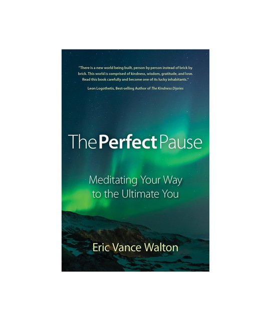
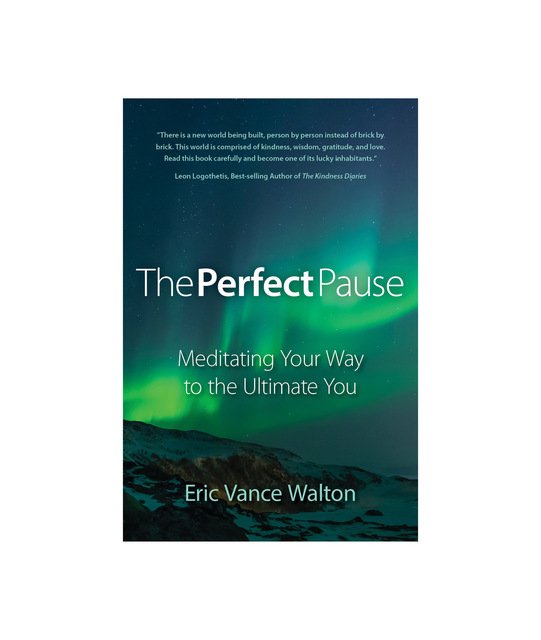
Will You Help Me Choose My New Book Cover?
Well, the day has finally arrived. Once again, I have a renewed appreciation for graphic designers. Graphic artist, Lubosh Chec has exceeded every expectation. Working in collaboration with another human being and starting with a completely blank canvas is a very difficult thing to do.
The examples I'm presenting to you today are actually the second round of the book cover concepts. Many of my original ideas had to be scrapped because they just didn’t work.
An effective book cover has always been important for authors but never more so than today. There are now millions of authors who are self-publishing books every year and your cover is what introduces your book to the world. It must look good on a shelf as well as in thumbnail format online. It’s important that your cover stands out from the crowd and makes an instant impression with the reader.
With this cover, my aim was to convey the importance of meditation. The image of the aurora borealis (northern lights) on the cover symbolizes how meditation can free you from the darkest night and awaken the light within. This image is also strikingly similar to what I see during deep meditation.
I’m unveiling these covers here on Steemit exclusively, even before I reveal them to my author newsletter subscribers. Why? Because this community has been so extremely supportive of my work.
So without further adieu, here they are. Which is your favorite? A, B, C, or D and why? I’m going to take each opinion into account before I make my final decision. I thank you in advance for your feedback and support!
A

B

C

D

*I am an American novelist, poet, traveler, and crypto-enthusiast. If you’ve enjoyed my work please sign up for my author newsletter at my website. Newsletter subscribers will receive exclusive updates and special offers and your information will never be sold or shared.

Eric Vance Walton - Media


I prefer A. It makes me feel the calmest.
Thanks @exyle!
That's also how I think, the stale water make me think of a "Pause" more than the other ones.
hey eric
regarding the 3 images, C/D i like the best.
1
to evoke the meditative state whilst looking at the image:
A - water and reflection is the best idea for evoking the meditative state. however the overuse of yellow colour in mass, wipe out that advantage.
B - the silhouetted pines in a spear , sharpish shape - not conducive to the meditative state.
C/D - yes, observing the beautiful swirling sky can be conducive to the meditative state. and importantly, the direction of the mist, guiding the eye and spirit from earth to heaven.
2
regarding the artwork of the cover itself, before consideration for the subject matter, ie artistically speaking:
A - too much yellow in contrast with green - kind of. bilious-making. A perfectly balanced image/text and mass/tone in relation to the text also, perfect.
B - colours of sky are too wishy-washy. too many elements, filagree black edges from the silhouetted pines, and wispy colours where there needs to be more solid colour.
C/D - the contrast is right, the balance of text to mass and tone is right. (one can enter the meditative state by many paths. one of the ways is to look at a perfectly harmonious artwork. - i choose C/D)
C and D appear to be the same, if C is more contrasted than D, then CCC.
if C and D are the same, C & D.
if the colouring in A was better, little if any yellow and less dark green to begin with (the greens and blues in the sky of image C/D are far more harmonious and peaceful and pleasing) .... then i would have chosen A.
cheers from mim
I really appreciate your thorough comment! Thank you.
cheers eric .... i wish you well
Thank you!
thank you for voting for me, @kevinwong @ericvancewalton and @gardnercalibuso - that is a lovely surprise. it encourages me to comment. i am not really sure what the voting is all about .... but i like it! thank you!
For me, it's B. But I like A too.
Thanks, @vcelier!
"A" for sure. The reflections of the lake are given a second meaning with the reflections contained in meditation.
Thanks! "A" was my least favorite at first but now I like it best.
A. seems as a actually good book, and not just another motivational book
Thanks for your comment!
You're welcome
Mixture of A and B
Though versions C) & D) are my colours, I strangely feel more attracted by B)! I'm so glad to see you book coming out. Good for you, good for us all!
Namaste :)
I really like the sky in option "B", for some reason the trees don't click with me. I think it's how they're sloping. Thanks for your comment and kind words. Namaste, my friend. : )
Interesting, as it was the presence of the trees that actually got me! ;) Namaste
I prefer A as well. It seems more peaceful somehow. The fonts and size are good too.
A is my favorite, for a couple of reasons. I like the Borealis there, but I also think the water works very well as a reinforcer of the calming influence you're looking for. I don't get the same sense from B, and there's nothing immediately apparent to differentiate C from D. If I were picking up a book in the store--or sorting through the blizzard of meditation books online--A would catch my attention better than the others would.
You cannot work too hard on the cover. In today's publishing environment, it's the make or break of a book, probably even more than the reviews it gets, though those matter a great deal. What you have here is a good, solid cover that speaks to professionalism and argues that you probably know what you're doing with the material between the pages. Godspeed.
Thanks, @cristof! I appreciate your feedback very much. You're 100% correct about the cover. When I saw the nearly unanimous choice of concept "A" I made it the wallpaper for the lock screen of my phone so I could see it several times a day. It did a good job of catching my each time, even in the smaller format. I just delivered the news to the book designer that "A" is the final choice!
I would say C. I like the mountain image, and it always reminds me of my favourite meditation quote:
"There we sit, the mountain and I, until only the mountain remains."