# Psychology of Interior Spaces: The Science Behind Clients Satisfaction
Hi Steemians. It has taken me quite a time to finish this post. I’m glad it is finally here and I hope you enjoy reading it. It’s just something from my profession I want to share with you.
Have you ever been in a space and you are scared? Do you feel insecure in the spaces you find yourself? Do you feel like you might just get choked up in the space you are? Do you feel like the world is about to come to an end as a result of the space you find yourself?
Ok….what do you see? What do you think brought about all these feelings? Now let’s reason together.
- Is the headroom of the space too low or too high?
- Are the wall coverings of the space unpleasant to the eye and body sensation?
- Are the doors and windows too small or too big?
- Probably, is it the space that is too small and unbearable for you to exist in?
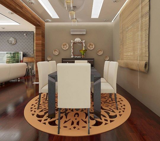
Now let us analyze some of the occurrences that could bring about these awkward feelings.
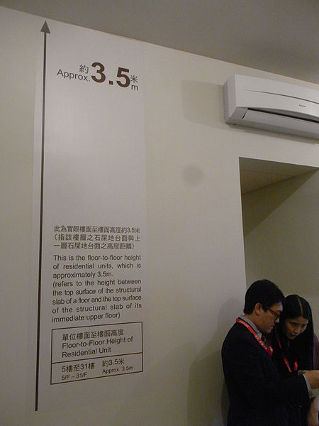
[image credits: Wikimedia commons under the Creative Commons Attribution Share Alike 3.0 Unported license]
What do I mean by wall coverings? This can be explained as the finished look of a wall. It could either be inform of wall paint or wall finishes such as, but not limited to wall paper, 3D panels, faux panels, bricks, wood panels etc.
As we further our discussion on wall coverings, I want us to highlight some factors that need to be taken into consideration.
1.Color
2.Heat absorption and reflection
3.Illumination
4.Aesthetic
So let’s discuss these one after the other.
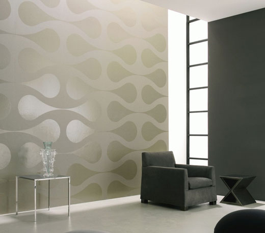
[image credits: Flickr]
Most times when wall paint is been discussed everyone thinks of the color to apply first. Yes, color is a very important factor as to how we relate in our spaces. Let me divert a little. Are you aware of color psychology? (I guess that will be a topic for another day) but here is the thing, every color makes an impact on us knowingly or unknowingly. What I am saying in essence is that the colors we are surrounded with, whether we like it or not has a psychological impact on us. That is why you will see someone going into a restaurant with an hungry friend without the intention of eating, but feeling hungry all of a sudden. Why is this? The restaurant has some colors in its wall that gives you the hungry sensation once you step in. We need to understand how individuals relate with the surrounding colors so that we can be guided in choosing the perfect colors for them. People react differently to the colors they see, some colors makes one happy, some sad, angry, depressed, hungry, sleepy, etc. all these need to be properly studied so that we will know the color that best suit a space in term of beauty and psychological effects.
Heat Absorption and Reflection
Surprised? Don’t be. I know that many of us might not be aware of this, but here is the fact. A color has the ability to either absorb heat or reflect heat. Little did we know that many of the colors we apply on our walls absorbs and reflect heat? This principle need to be properly understood before choosing the color for a space.
Let me explain further by saying that the amount of light an object absorbs/take in determines the amount of heat the object generates. I call this the “give and take principle”. Are you still unclear? Let me break this down, have you heard of the saying that dark colors absorb heat while light colors reflect heat. When a dark color such as black (simply black body) is used to coat a wall, during a hot weather, the wall absorbs heat from the environment releasing it to the occupants of the building thereby causing a feel of inconvenience. But when a light/bright colors such as white is used, rather than absorbing and retaining the heat, it reflect it instead thereby reducing the effect of heat gained within the building.
Understanding this principle will guide us in selecting colors wisely so as not to make a space either too hot or cold at any time of the day.
Illumination
Just as earlier discussed in the heat absorption/reflection principle, the same applies to the illumination of a space.
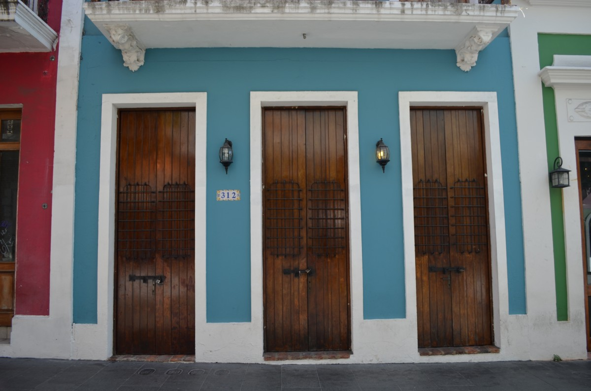
We will notice that spaces painted with dark colors gives an impression like the room lacks light and need to be brightened up. Why? This is because dark surfaces do not reflect light. A space like this feels small. On the other hand, spaces with bright colors such as white have an airy feel. The light reflected on such spaces makes it feel big even if it’s just a small space.
Aesthetics
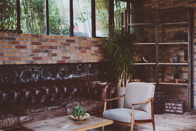
[image credits: Pixabay: Creative commons CC0]
[image credits: Pxhere:CC0 Public Domain]
When you enter into a given space what is the expression that leaves your face? Is it the “wow” look or the “confused” look?
Everyone like their space big, spacious, and well arranged. But the obvious fact remain that we cannot all have that luxury of a big space but here is the little secret, you can have a small space but the way we arrange it gives it a feel of a large space while some people who have the luxury of big spaces don’t even have an idea of how best to keep it organized making it look all chocked up and small.
The way we manage our spaces goes a long way on how we feel comfortable within the space. For instance, some people feel that a 3600mm x 3600mm room is just perfect for them because they have mastered the tips of space management while some will still have to struggle with a 4200mm x 4200mm room making it look like the space should have been bigger.
In conclusion, the psychology of interior spaces should be studied, putting into consideration the purpose of use as well as the end users of the spaces, that is, is it for commercial use (public spaces) or private use for example residential buildings.
Know that when dealing with commercial spaces the end users would vary from different races and tribe, they will be tall, short, slim, fat, etc. All these people would react differently to the space they find themselves. Therefore, such spaces need to be designed to suit everyone irrespective of their personality. But it is easier in the case of private spaces, since it is just one individual/family that is involved, all that need to be done is to study and understand how they relate with their spaces.
References
Interior design psychology
How Your Interior Design Is Influencing Your Subconscious
Design psychology
Congratulations @archipels! You have completed some achievement on Steemit and have been rewarded with new badge(s) :
Click on any badge to view your own Board of Honor on SteemitBoard.
To support your work, I also upvoted your post!
For more information about SteemitBoard, click here
If you no longer want to receive notifications, reply to this comment with the word
STOPPhysics in architecture! Back then in school I use to have some architectural students come to me for tutorials. I remember they use to demand for specific topics like blackbody, moment, and vectors (forces).
Now I know they are in the "Applied physics"...smiles
nice and simple post!
Congratulations @archipels! You received a personal award!
You can view your badges on your Steem Board and compare to others on the Steem Ranking
Do not miss the last post from @steemitboard:
Vote for @Steemitboard as a witness to get one more award and increased upvotes!