Steeve Update #5 - Favorite Users, Condensed Card View, Story Rating, Faster Startup Time and More
Good day to you, fellow Steemians and Steevians,
Even though the dropping price of Steem can make people low on energy and slightly depressed, we are still on fire, implementing new features for Steeve almost every day.
This is another Steeve update to summarize what was changed and improved since the previous update.
New Features
As usual, let’s list the most notable features first:
- Added a condensed card view.
- You can add users to favorites.
- Steeve users can now rate stories using stars.
- Steeve startup time was dramatically reduced.
- Steeve now checks for updates regularly, prompting you to reload when a new release is detected.
All changes are listed in the release milestone.
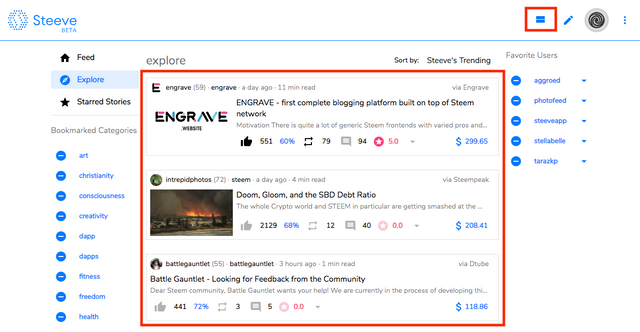
Condensed Card View
Some users were complaining about the current card view. They didn’t like every card to occupy so much space. So we implemented a view similar to the one you can see at Steemit where every post card occupies very little space on the page.
Favorite Users
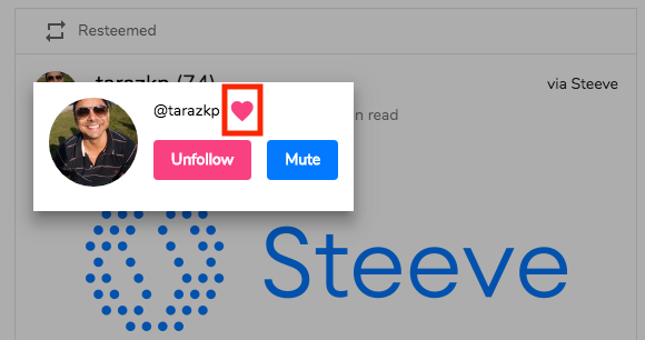
Since bookmarked categories are pretty popular, we decided to let you add users to favorites as well. Just click a heart icon anywhere in the web app.

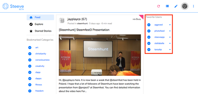
The favorite users are then listed on the home page in the same way as bookmarked categories are.
Story Rating
@tarazkp blogged about letting users influence the platform without spending RC and needing Steem Power. We were listening and implemented such a feature.
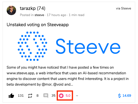
So, you can now rate stories with stars from 1 to 5. The rating bar can be found in every story footer:

The average rating is then visible on the story card.
The rating is not affecting any other parts of the application currently, but we are planning to use it for a new story sorting based on rating as well as to improve Steeve’s recommendations.
@tarazkp already managed to write the review of story rating on Steeve with additional proposals what can be done with it.
Post Card Simplification
Post cards were getting a bit bloated with too many icons and numbers, especially after the story rating feature implemented, so we decided to simplify the post card footer by removing downvotes and also moving story starring to the “More” menu.
Way Faster Startup Time
In case your browser supports Service Workers, Steeve will use that feature to cache the application bundle locally so that it doesn’t have to be re-downloaded every time you open Steeve, which results in way faster startup time.
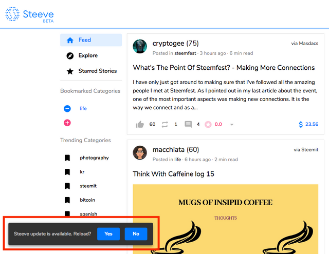
Steeve will also check for updates regularly, prompting you to reload when a new release is detected.
What is Next
We are working with the community closely to learn what your needs are. Some of the features implemented newly were proposed by people using Steeve. And we want to continue in this manner so that everyone can be a part of Steeve’s community as it evolves.
@hr1 is also spending quite some time on updating our business plan. It looks like he managed to come up with a win-win-win scenario. Stay tuned for more details!
@mor managed to improve recommendations and she is going to continue that way, to make it faster and more accurate.
And @void is just going to keep turning coffee into resolved issues from the issue tracker.
Support Steeve!
Steeve can be huge. But we are only a team of 3 with limited resources. In case you believe in Steeve and want to see it moving forward, consider helping somehow. Do you have a killer feature on your mind? Do you want to write and publish a review? Are you an investor that wants to support Steeve? Be creative and let us know!
Feel free to join our Discord to have a chat about Steeve or anything else.

In case you are using Steeve regularly, and we are hoping so, or just want to support the project, think about setting @steeveapp as a beneficiary in your Steeve account settings to help fund further development.
Last but not least, there is a public issue tracker where you can always post your ideas and we will discuss them and reply as soon as possible.
I like the simplification of the cards and as you know, I am really hoping that people start using the rating system heavily to test out future capabilities. I wonder if it would help (or be annoying) to have a tiny little popup reminder near the stars so when they scroll toward the end that it says something like:
"Would you like to rate this post
It would really help our testing"
Thanks for the mentions and inclusion in the post. Keep up the good work.
@tarazkp ,,, I want to focus here and promote in Indonesia and hopefully the station will be victorious ...
Get to know @steeveapp during @hr1's presentation at SteemFest 3 and I'm looking forward to trying it out.
By the way, the discord link isn't functioning, please fix it 🙂
Fixed! Thank you :)
Posted using Steeve
Awesome!
Posted using Steeve
🔥
I waited for the application on PlayStore.
Posted using Steeve
Well, we are not planning to create a mobile app yet. But you can still view Steeve on mobile in a browser! :)
Posted using Steeve
Ouhh Right.. thank you very much.
Posted using Steeve
But actually I noticed that using a service worker enables similar functionality as a native app, we would just have to tune the app to be usable without a URL address bar a bit.
Posted using Steeve
I think so. but the smartphone application is also very helpful. I agree with your opinion.
Posted using Steeve
This is a good move, we will bring it to Indonesia ...