Recommendations to improve the experience in steemnova
hello guys, this is my first post in which I want to talk about some improvements that have occurred to me while playing steemnova, and which I would like the team of game developers to read to see if they can be applied within the game.

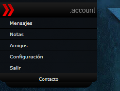
Today I will talk specifically about the area account, that within the short time that I have been playing I have felt that from the beginning this is badly located, since one of the problems that I always present is that I can not visualize the messages that I have in my inbox , but I must go down every time to see if I have a message or not, the same with the other options that the area has.
so my proposal is to locate this area at the top of the page, thus facilitating the display of the input tray.
one of the options that for my easiest to apply is to place this area first above wirtschaft.
another option that has occurred to me has been to take advantage of this space that I am pointing out with the red box and place the following information:

-name of the user (which would be a link that leads directly to the overview)
-name of the alliance (which would take you to the area of the alliance)
-place an icon of an envelope (which would indicate with a number the number of unread messages in your inbox)
-an icon of a person (which would be the link that would take you to friends)
-a post-it icon (which will take you to the notes)
-an icon with the paid button (that makes you leave the page)
-an icon of a gear (to go to the settings area)
Until now this has been what I have come up with as improvements and new designs.
Later I will propose new recommendations that help improve the game, and that is more friendly to new and old members of this community.
follow you
if you clear this game first in the world, the game company will give you 1BTC(1000dollar)
https://steemit.com/steemhunt/@greatstory/montecrypto-if-you-clear-this-game-the-game-company-will-give-you-1btc
when you have new message the information appears here:
@mkdrwal is working on new design for the game, so probably it will look different in final version, hope he will see this post.
thanks sarmaticus, we expect the new design, I think a more visible notification would be the right thing to do, since being giving a general view (which up to now presents bugs) or downloading to see the messages is not very tedious for the player, because if is in other sections of the game is only the resource to download to see the messages, but as I said before we hope the new design.
Will it be mobile friendly? Would be great
from what i know thats the first priority ;)
I would rather see comfort functions like send fleet from simulation to planet or Highlighted defense structures/ships in spy raport than a new UI.
Congratulations @carlosgaluem! You have completed the following achievement on the Steem blockchain and have been rewarded with new badge(s) :
Click on the badge to view your Board of Honor.
If you no longer want to receive notifications, reply to this comment with the word
STOPCongratulations @carlosgaluem! You have completed the following achievement on the Steem blockchain and have been rewarded with new badge(s) :
Click here to view your Board
If you no longer want to receive notifications, reply to this comment with the word
STOPDo not miss the last post from @steemitboard:
Congratulations @carlosgaluem! You received a personal award!
Click here to view your Board
Do not miss the last post from @steemitboard:
Vote for @Steemitboard as a witness and get one more award and increased upvotes!
Congratulations @carlosgaluem! You received a personal award!
You can view your badges on your Steem Board and compare to others on the Steem Ranking
Vote for @Steemitboard as a witness to get one more award and increased upvotes!