Steem Monsters Logo Refresh
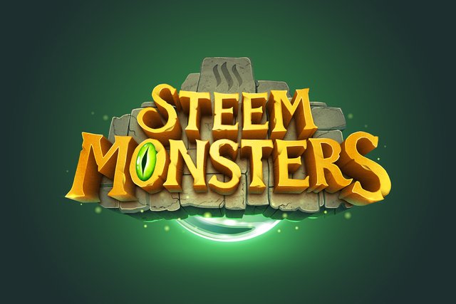
I'm only a few weeks old on Steem, but I've come across some interesting blogs. One of which is @steemmonsters. If you don't know, Steem Monsters is a collectible trading card game on the Steem blockchain. I love seeing old ideas remodeled into new, unexpected territories, and I was inspired to create a rebranded logo as a little exercise.
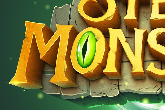
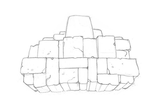
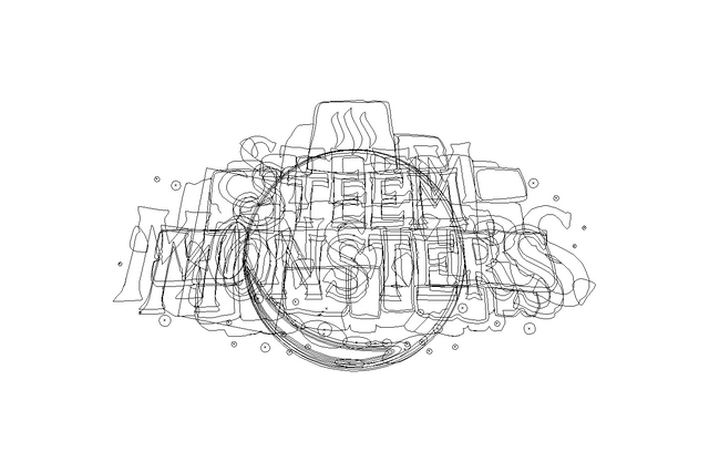
I start most of my work with pencil and paper, especially with a very illustrative piece like this. From there, I like to block out all of the basic shapes inside of Adobe Illustrator. Not only does this give me sharp edges to work with, but I finish with a fully vectorized version of the logo that can be used at any size. Finally, I add and brush on all of the complex shadows and textures inside of Photoshop.
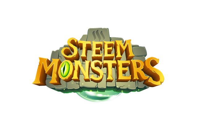
Flat vector shapes without shading or texture
I'm the Lead Graphic Designer and Associate Art Director for the creative team at The Imagination House in Orlando, Florida. I also freelance - living, working, and traveling out of my 1984 Volkswagen Van named Nathan. If you have a project you'd like to talk about, email me at [email protected]. I accept Steem and SBD as well as traditional currency.

This work is licensed under a Creative Commons Attribution 4.0 International License.
Very cool! I was sketching out various concepts a few weeks ago, and this is similar to one of my favorites. I really like the style. Great job!
For branding purposes, I'm not always a big fan of being dependent on the entire name. For instance, take away the word "Nike" and you still have the swoosh. Take away the word "Apple" and you still have the iconic image of their apple.
To properly pursue this concept, I had toyed with the idea of minimizing the skewed perspective of the monster eyeball. That way, the eyeball could be used as the iconic branding image when utilizing the entire name is too cumbersome (ie, as a social media avatar, etc).
Overall, I like where your head is at. Maybe I can contact you in the future.
Thanks for taking the time to offer your thoughts @nateaguila!
I agree that a logo should be flexible in all different applications. Something that this design kind of lacks. Following your idea of using the monster eyeball as the iconic brand image, I sketched a quick idea that can be used as an "alternate" to my original design. Mostly for social media avatars like you suggested.
I've placed the eyeball front and center and added some floating stone debris behind it to support it. I think once pursued, both designs will be clearly part of the same family.
I think I might take the time to complete this idea. Honestly, I'm just having fun playing around with this concept :)
Shoot me an email if you need an extra hand or if you want to collab on future projects!
Nice! I dig it.
Although I should warn you. We’ve been working through color, typography, and layout guidelines. But working on the actual logo itself has been dependent on finalizing the theme and identity of the project.
What started off as a monster fighting game is evolving into a fantasy world with a depth that extends beyond the original scope.
As such, that vibe may bleed into the branding and how it’s conceptualized. In other words, is this a monster game or a fantasy game? I think we’re getting close to a balanced understanding of the final destination (and how to best emphasize those theme attributes, whether they be monstrous, magical, warfare, faction-based, or otherwise).
It’ll be a lot easier once that stuff is settled.
Right, I understand what you're saying. It's hard to finalize a brand image for something that's very much still in the development stages.
Either way, I'm just happy to provide some inspiration at the very least. I'm excited to see what direction the game and brand goes. I'll be following closely!
Great job? This is from another planet.
Good job, the original was ugly in more ways than my vocabulary can describe.
THANK YOU FOR CURATING THIS CONTENT HE IS QUITE TALENTED !
This undoubtedly should be the logo for Steem Monsters. Great work.
We'll see! Maybe they'll be interested in switching over :) Thanks for the kind words!
It´s amazing, I´m voting for this new logo as soon as possible!
Great job!
Thanks! Glad to have your vote :)
100% upvote, this is awesome..... Great work, ReSteemed.........
Thanks so much! I appreciate it!
That is impressive! Maybe a bit to much of a "clash of [....]" and "Heartstone" vibe. But I like it none the less! Let's see if they pick it up
That looks awesome! I really do like it. Just out of curiosity - how long did it take?
Thanks! Hard to say. I was working on it here and there in my free time. I'd say maybe two working days in total?
Awesome artwork @mrgodby. I also use Illustrator and Photoshop in my website design quite a bit. Do you use the trace tool in Illustrator to turn your pencil work into vectors?
Followed and Resteemed
Much appreciated! I don't normally use the trace tool unless I'm doing something really rough. I've never been able to trust it to create clean and accurate lines. I always spend more time fixing the lines than I would if I just banged it out with the pen tool.
Cool, yeah I've had some success with the trace tool but, like you say, it can be a little hit-and-miss.
I'd love to see a time-lapse of one of your projects on @dtube, if you ever have the time. 👍
This is awesome! Have you posted it in the discord to show people there?
Just did! Thanks for the idea! Hopefully someone over there gets their eyes on it.
I gave you an upvote on your post! Please give me a follow and I will give you a follow in return and possible future votes!