Woww! New Steemit Logo! New Website Interface! Congratulations Steemit Community!
Change is a sign of evolution!
Like everyone, we wake up and…
New Steemit Logo & New Website Interface!
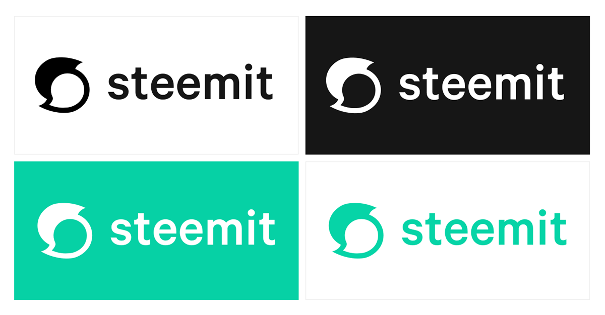
The Steemit crew have worked hard to implement the new rebrand of the Steemit platform in honor of SteemFest which is taking place in Lisbon. Presenting a fresh new visual identity, Steemit is now ready for the next step towards mainstream adoption!
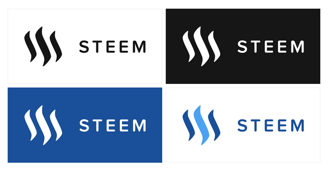
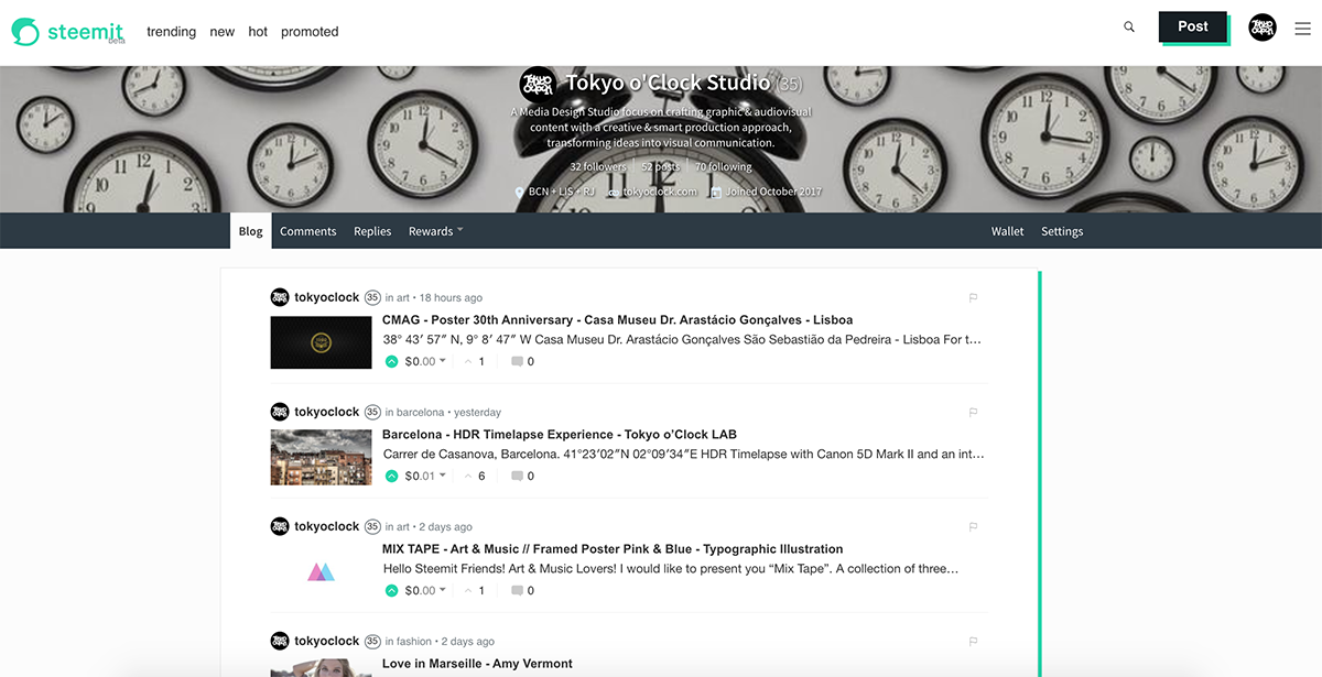
We are loving the new colours palette, the new green and the contrast between dark gray and white, simply great! The visual system looks more comfortable and user friendly, moving away from any visual resemblance with others social networks, clarifying at the same time the distinction between Steemit and Steem Blockchain and STEEM currency.
Steemit Logo :

Steem Logo :

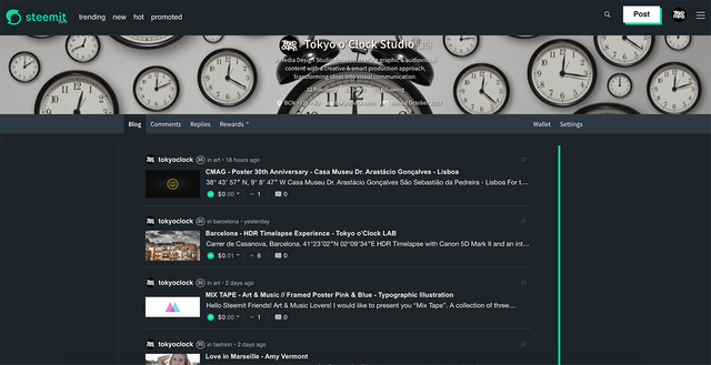
NIGHT MODE : Awesome!
The introduction of a new dark theme as feature to night mode navigation is a clear sign of the good work done improving the user interface and the user experience.
We love the new layout colours of Steemit!
Bright Mode :

Night Mode :

Let's wait for more updates!
Congratulations to everyone behind it!
Huge Thanks & Steem On!