Steemit Home Page Redesign Part VI - Visual Styling
Steemit Home Page Redesign Part VI - Visual Styling
Visual Styling: Time to Polish it Up - Taking the Conceptual Design to the Real World
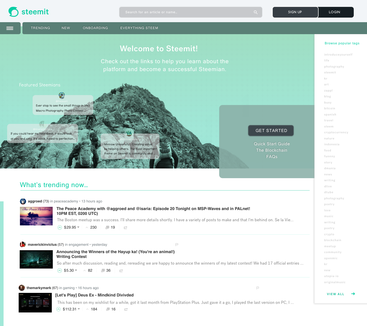
Check out the first pass at the New UI for Steemit Home Page - New User!
Construction Zone! - Polishing the UI from Conceptual to Design
Logged Out - New User Home
Persona: I am a new user accessing Steemit.com for the first time.
UX Designers Direction
- I wanted a modern look and feel with a sense of easy adoption to the platform
- I wanted a user to easily identify with the platform
- I wanted a user to easily understand where to start as well as explore and browse new content
- I wanted to create a new engagement with curated content to provide a sense of familiarity to users wanting to engage with content that interested them.
- I wanted to improve the search tool functionality to help assist a new user in searching for content.
- I wanted to create a form on personalization for the platform. The platform should have an easy way to resonate with new users to improve interaction and engagement.
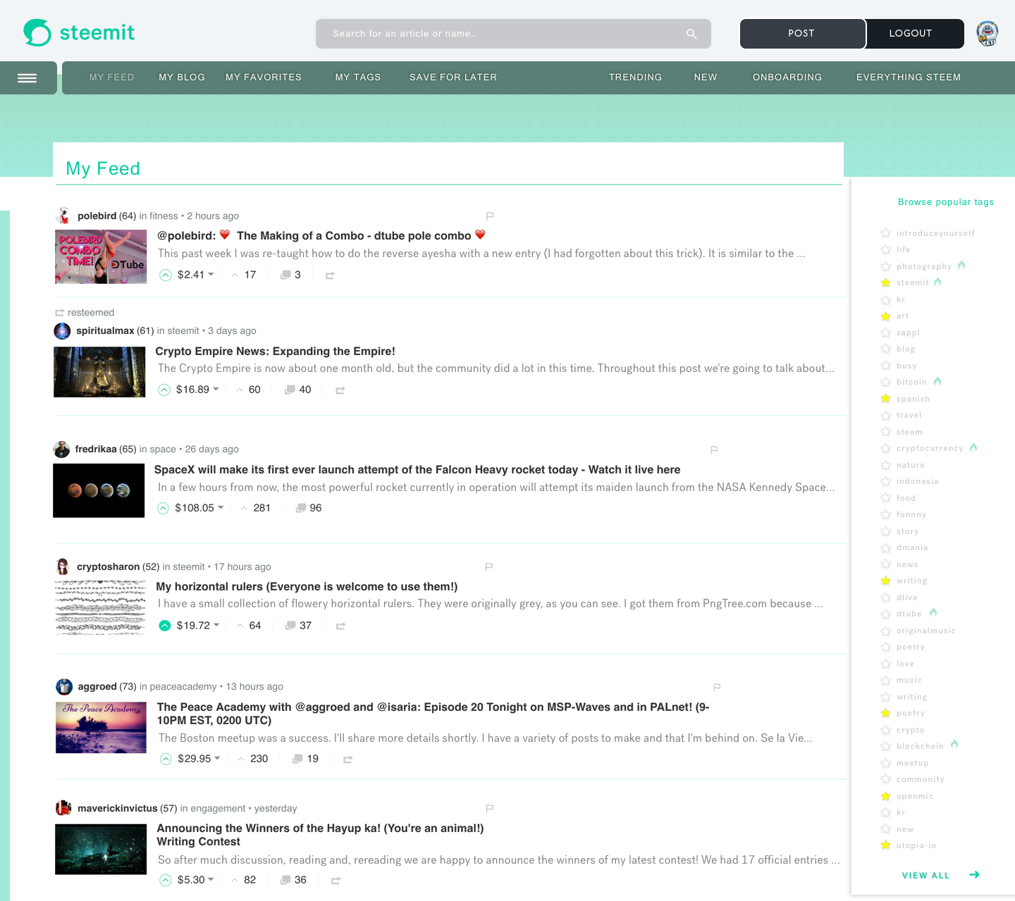
Logged In - Returning User Home
Persona: I am a returning user and see additional personalization that is catered to my interests.
UX Designers Direction
- I wanted to create a strong personalized dashboard as the homepage curated around top navigation that is dynamic to user selection.
- I wanted to add a way to favorite both a user and tags, and then allow a sort method in the top navigation.
- I wanted to surface both “my feed” and “my blog” at the home page level.
- I wanted to allow for a way to “save for later” the content and then access it easily from the home page by a dedicated tab.
- I wanted an improved search tool with an easy way to find a user or topic.
Conclusion:
New User
I wanted to create a new user home page that would allow the user to become engaged with the platform easier. It’s been an uphill battle for me and other users trying to adopt the arcaic on boarding UI of what exists today. Many Rage Quits, many fallouts users, many people slowly falling away from the platform so an easy way to improve user retention, and overall engagement was the goal.
Returning User
I wanted to create a more personalized experience for a returning user without all the infinite combinations and features. Lets create a solid back-end methodology that allows a user to simply select users and tags they like and allow them to be easily accessible at the top. Allow users to select content they’d like to save for later vs saving as a bookmark or tab that eventually gets lost or never seen. Surface the “my feed, and my blog” to the top level for improved engagement.
This Home Page will be updated based on feedback from the community and additional improvements in my redesign series to come.
I will be moving onto the "My Blog” Page next.
Focusing on
- How to favorite a follower
- How to view my analytics of my Voting Power, Vote Value, Rep , Band Width, Incoming Rewards
- What does my profile page look like when I'm Viewing it.
- What does my profile page look like when another user is looking at it
- Inserting Notifications and where
- Stats about other users in the content feed
- How to display content in “my blog” and how can I sort the content as a logged in user.
Additional Pages in the Works!
- Content My Feed Post - how to improve the display of it, How to show analytics better, alt views: List layout vs Grid View
- My Wallet - Complete redesign of this
- My Profile - As I see it
- My Profile - As another user sees me
If you’d like to review the Redesign Series and see how we came to this solution in our series here are the other redesign posts.
Part 5 of this Redesign Series
Part 4 of this Redesign Series
Part 3 of this Redesign Series
Part 2 of this Redesign Series
Part 1 of this Redesign Series
THANK YOU

First off a BIG THANK YOU to my newest discovery for Design Talent and my sole helper in the Visual Design @itinerantartist.
- We are VERY aligned with creative and what a great discovery on the Steemit Platform for me to have found her. Solid design work, speed, direction and very sweet. We will be doing all of these installations together.
Thank You Steemians!
It’s you that use the UI and you are the voice that allows me to help shape this community, and empower my creative skillset to work hard into the nights on rebuilding these pitch proposals.
@aggroed, @themarkymark, @velimir, @fredrikaa, @fulltimegeek, @brandonp, @geofftk, @fourfourfun, @dlew, @venalbe, @grizgal, @shawnvanderveer, @dedicatedguy, @datascience, @mitneb, @edicted, @jlordc, @arcange, @spiritualmax, @makerhacks, @isnochys, @dlew, @mikesthoughts, @rock220, @daan, @davidshaw, @rawdawg, @yogajill, @mcblessing1, @patrice, @princessmewmew, @kerlund74, @yabapmatt, @ma1neevent, @poeticsnake @shadowspub, @folken, @whatsup, @kubbyelizabeth, @freedomexists, @shawnvanderveer, @bbrewer, @kurtgrey, @swolesome, @flemmy, @reewy, @leonard17, @syednur47, @amisteem, @memocorredor, @outtheshellvlog, @moreseke1, @travissilvers699, @artizm, @mafi001, @queenbee12, @blusky, @jerrybanfield, @gomovies, @theversatileguy, @theb0red1, @thecryptogold, @strangevision, @atmosblack, @drmake, @tattoodjay, @futurethinker, @rondak, @ashleykalila, @jpederson96, @therealwolf, @thebugiq, @minatubo, @el-cr, @thewayiseeit, @princessdharmy, @crystalpacheco30, @aleksandar.vasic, @gcamkerten, @cryptical, @itinerantartist, @libertyranger, @mikesthoughts, @dedicatedguy, @theversatileguy, @austinhopper, @masscollective, @multi4g, @giddyupngo, @pittsburghhodlr, @charitybot, @pathtosuccess, @minnowsupport, @socky, @swolesome, @thehoneys, @yogajill, @zahril, @funbobby51,
Your comments, criticism, pain points, and praise help drive successful change.
Thank you. Don’t forget to leave your comments below, and upvote if you liked the design work and the direction.
To the corporate steemit team @ned @pkattera @andrarchy @sneak please review my design series of exploratory UX research, testing, community engagement and revisions.
If you liked what you read, Please don't forget to Upvote, Resteem, and follow me. There's much more great design work to come. Everything helps allowing me to expand my posts to reach the community!

@theUXyeti - Geek of all Trades, Master of Many! Had over 200 clients building UI for websites, mobile apps, mobile games, console games, VR/AR games, wearables, Appliance UI, Aerospace and Military UI. For lifetime fun I’ve been an Ex reality tv guy, competitive card player both pretor MTG and WSOP, scuba instructor, dart thrower, hearthstone mechanic exploiter, sports handicapper, movie metaphor gif commentor and all around humorous and fast wit jackass.
How to find me
Steemit: www.steemit.com/@theUXyeti
Discord: TheUXyeti or TheUXyeti#5698
Dtube Channel:


WOWWWW @theuxyeti, YOU-KILLED-IT! In a good manner ;)
Its very impressive and the results are great, I really like the new modern look and also these tool for e.x. voting power will be cool if it was just integrated with steemit it self. You solved many problems and I can't wait to use the new design in the future :P
When does it come online? :O or did I missed a point?
Please let me know, I think its insane. Big kuddo's for you my friend!
Thank you! Yes I’ve touched on most pain points and have a user strategy on the next pages to improve the sorting of content functionality. I’m in the works of pitching to them. Thanks for the response
hi friends - did this little steemit redesign and if you check out the images, you can find yourselves and your posts referenced!:) wanted to give you all a little shoutout as a thank you for the amazing camaraderie you've shown me. it means a lot. stay wonderful <3
@cryptosharon @maverickinvictus @polebird @spiritualmax @minnowsupport
So this is what you have been up to! Hahaha thanks for those Easter egg drops IT :) cool seeing myself on that.
of course mav! its the least i can do for all your supportive comments. they really keep me going sometimes <3
Are you crazy you are so talented and beautiful. If I had half your talent and looks I would be taking over Steem!
So keep Steeming IT you are a wonderful addition to the blockchain. especially your songs.
Always love the maverick name
Hey IT, yeap, talented and beautiful, I subscribe to that... simply loved it! Amazing work you two did.
Kisses!
The question is are you subscribed to me lol even if I’m not a pretty girl lol
I am following you indeed.
Yes that was Our plan to drop in @fredrikaa @aggroed @themarkymark on my side too
just so you know - i went through a few of your posts while i was gathering the info to include in the designs, and i feel like we all need to meet now. its kind of like i already know you each a bit :) @fredrikaa @aggroed @themarkymark
Overall awesome work! One criticism is that I feel like the new user page could lose the large mountain image as it takes up a lot of the screen and adds little.
Your missing it then. It adds tons of value for new users. Curated content by users for users as well as onboarding shortcuts to understand the platform.
Those designs look really great! I've said for some time Steemit needs a much nicer aesthetic if we want to attract the masses.
Agreed! Attracting is only part of it. Retaining it is more important
Hi theuxyeti
I wish there was a "Favourite" button so we could follow our special Favourite Steemit posters more easily!
I also would love to have a "resteemed" page to separate my posts from those that I have resteemed. This would also make it easier for my followers to see our posts - while keeping our blog's theme less diluted by the posts we want to resteem.
It would be great if you could incorporate these ideas.
Keep well :D
already have them. if you notice at the top of the logged in version there is a MY FAVORITES and a MY TABS section. This will allow you to follower favorited users and favorited tags. In addition to your ask about resteems. I have that as a sorting functionality in the build to come when I address the Content space for My Blog... it will have sorting tabs for My Feed / Resteemed / ALL
HOLY COW! THANK YOU STEEMIANS
for your upvotes, support, comments, KEEP it coming. WOW! Thank you so much. This is proving to me that my efforts in ux/ ui / design are being used effectively on the platform and most importantly the COMMUNITY appreciates my dedicated efforts to building a better STEEMIT....
To hear the speech version of this post click the play image.

Brought to you by @tts. If you find it useful please consider upvote this reply.
thanks for the post cool feature. I like this for Accessibility for UX hearing impaired. Great to see this widget.
Thank you for Steemit Home Page Redesign Part VI - Visual Styling.It is useful to engage people for my blog.
thanks for your support. Its new followers and taking the time to comment that grows the community and makes me aware you are alive :) so thank you
This post has received a 3.34 % upvote from @boomerang.
thanks Boomerang... who ever did this THANKS
hehe that was me :)
Thank you for sharing and nice post.
Thank you!