Have you MAXIMISED the FULL potential of your profile banner? Tutorial from a visual magician
I have noticed some wonderfully original banner designs popping up recently & realised that a lot of people are missing out on this prime opportunity to tell potential followers a bit more about themselves.
Why are personalised banners so important?
The first thing it shows is that you are seriousness about this platform.
Make that little bit of extra effort and it immediately gives a message of intent to your potential followers.
As someone who has put in the time to make an original & eye catching banner, there is a good change that your steemit articles will be of a similar visual quality. Increasing the chance of gaining more followers.
Banners also provide a crucial opportunity to get across a little bit more about who you, what you represent and why people should follow you!
You can be totally creative about this using home made funky fractal based visuals like @chron here who used JWildfire to create the fractals and chose to retain his anonymity by hiding behind the head of a robot... which is actually quite amusing at times ;)
...or if you prefer, you can just be simple about it, adding in a few descriptive words on a darker (but still relevant) background.
@halcyondaze has done this particularly well:

Here is a recent banner I created for the famous UK megaphone 'performance artist' @dannyshine who speaks the truth (in the face of angry policemen) on the streets of London!

And another I created for @copa-communion a man who has the ability to change the way you look at the world forever in his Church of Perpetual Astonishment.

Notice how I have made the central section of both banners darker to allow for the white words which are added on Steemit.
Finally here is the one I created for my @steemmasters account

The Unconscious Tipping Factor
The banner creates a STRONG VISUAL feeling which can be a big factor in tipping the balance between someone hitting that FOLLOW button or moving on to check out the next person. Sometimes they don't even need to read the words. I can only speak for myself but I have followed people based on their banner design alone.
So, there are a few are things to be conscious of when creating your banner.
As an example I give you my first banner design for my @samstonehill account
created the day the banner feature was activated on Steemit!
To make the colourful sunrise panorama backdrop for my desired banner I shot four HDR images using a motion control tripod panning system to span a 180 degree angle. I would normally use this device for my time-lapse shots.
You can see the four processed images here.
After this i did my best to stitch them together in Adobe After Effects and created my panoramic shot.
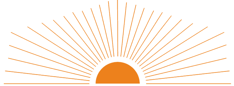
Then I added a Steemit logo, enhanced with some glow effects and a PNG of an lovely orange sunrise:
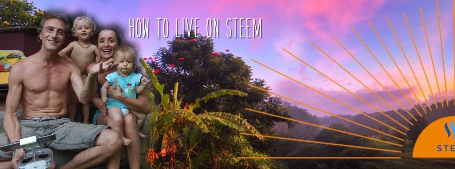
Here are all the elements combined.
and now with the new elements added this morning
and here is what it looks like when a potential follower views my blog page.
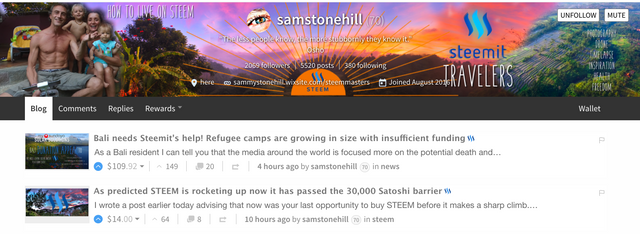
Take note of the two tabs UNFOLLOW & MUTE which should be factored in when creating your design because these tabs are not visible when looking at your own account. Only when other people are looking at it. So it's worth logging in with a different account to check what it looks like to other people.
I have intentionally placed my little list directly between the two white tabs.
NOW I AM TELLING A STORY WITH MY BANNER!
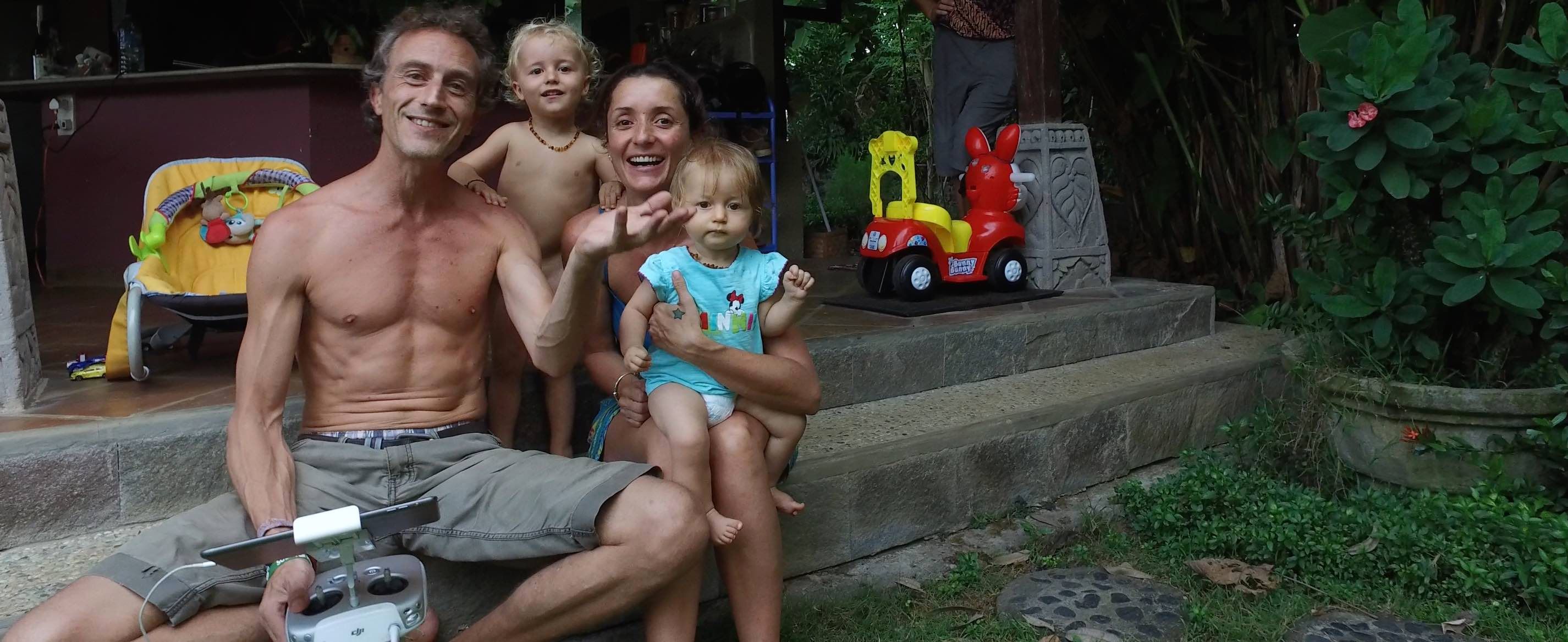
You can see my beautiful happy, healthy family. You can see that we live on Steem. You can see that we are travellers and if you are clever, you can see that we live in Bali. And the list to the right of the banner gives people a few more words which may resonate with them enough to hit UPVOTE, RESTEEM & FOLLOW!
Vibrational Resonance
Take every chance you have to create a vibrational resonance which will attract exactly what it sends out. You don't want the kind followers who still think Beyonce is the best thing that ever happened to them (I assume!) so make sure the vibration you create represents all that is BEST about you and all that you would love to see more of :)
I'm not going to say that my design is 100% finished yet...it was put together very quickly this morning before the kids woke up and I feel like I can do better still. But it is certainly better than it was before!

Final things to look out for
Having an accurate measurement of the required aspect ratio for this very skinny banner is a good place to start.
I use shift cmd 4 on my mac to create a screenshot of my desired aspect ratio and use this as my size template in Photoshop.
Spend some time thinking about this shape and the areas which need to be relatively clean, visually speaking, to permit for the small white words which are added on Steemit.
Have a look at @sirwinchester's banner design here, which I particularly like... Classy & effective. Has a clear vibe to it.
He has made a real effort to create something instantly original and eye-catching. Including his Facebook & Instagram links too.
Be conscious too that many people use their browser window zoomed in at 80%. This may or may not be intentional but it will display the banner in a different way. So always work with your view set to actual size... and encourage everyone else to do the same!
Hope this has inspired you to pimp out your banner immediately...
remembering that the purpose is to tell others more about who you really are and why they should follow you!
The more you enjoy getting stuck into the visual arts, the better you will get at creating that which others don't see. A feeling. A resonance. An ENERGY. Others feel it. Subconsciously. And that is all part of the magic of creativity my friends 🙏🏻





I figure it's difficult. I know i need something dark or black in the middle but my main bug is the thing look very different when view on mobile phone versus a bigger screen device.
I hadn't thought of how it looked on a mobile??? Thanks for the reminder!
Checking mine now! Perhaps it will need adjustments....
I think a patch of black in the middle like sirwinchester is good. I am close but still nkt as good 😎
Thanks for the shoutout, Sam! I agree with you, a little light branding never hurt anyone! Especially when you give your followers an idea of what to expect when they follow you :)
~ Kevin
You inspired me bro. I really thought yours was clear and strong. Thanks for that ;)
Great banners! You should join #steemcreations
Thanks! I will check that out now...
Looks great! Love your banner. @daisyd is looking for someone who can help her out with hers if you're interested? You can see our conversation below.
Thanks for putting me onto #steemcreations ...I have so many to share!
Glad you like it :) Will see what I can do for her :)
I didn't put you on steemcreations yet because I need your consent. Because If I put you on steemcreations that means you give away your rights to the community and I can't do that for you.
You can contribute by using #steemcreations tag, including steemcreations in your title and saying something about the project in your post so that people can actually know your work is free to use.
Can't wait to see what you post.
Have a great day.
Cheers!
You took a very interesting topic for me. I can work in Photoshop, I tried to create my banner as soon as this opportunity appeared. But, unfortunately, I did not manage to put it correctly. My banner is automatically cropped, and the picture remains only partially
Keep playing with it. You will get it perfect in the end ;)
Great job , lots of information , thanks for sharing with us !!💙👍👍👍
Thanks Karen. So lovely to see an 'old friend' here under one of my posts! Sorry I'm rubbish at commenting on your work. If only there were more hours in the day!
Big hugs from Bali :)
So true my friend! Im the same way , there's never enough hours in the day and im running two accounts plus my Power Of Positivity POP Contest ! No time for nothing !! Haha ! Keep up the great work , good night !👍👍👍✌💕
Thank you for this, I've seen the banners but to be honest - being a little computer illiterate and mostly here to read and write - I had no idea how to create one. I'm still not sure, but now I want to know so I'm going to have a google and give it a go. Thanks for sharing. Upvoted and resteemed. Have a nice day
I admit it must be quite daunting to someone who is not familiar with photoshop or after effects type programs.
There are some amazing people on Steemit offering the banner design as a service. Write me a PM in steemit.chat if you would like me to dig them one of them up for you. From what I saw, she did some really magic work and it was very inexpensive. Steem accepted as payment ;)
Thank you @samstonehill I've been playing around with one which is a hell of a lot better than the plain blue but probably not nearly as good as it could be :) it's been fun to use canva though! Would really appreciate if you could put me in touch, cost depending would love a professional looking one! Have a great day ✨
hey @daisyd I can help you out. Lets talk on discord more so that I can see what you actually want in the banner. my name on discord is same as here
Hi @runicar - sorry I just picked this up, will message you on Discord tomorrow. Hope you've had a good weekend 💫
Inspiring! Such an underused resource, the profile banner is prime real estate and deserves to be used to its full potential.
Upvoted, followed and resteemed! Bravo @samstonehill !
Thanks for the very encouraging comment!
Visual stuff is so much fun for me. Guess that's why I became a filmmaker ;)
Very interesting, good post and I like, hopefully the next post better with a more perfect idea. follow me @pojan, Upvote and give a positive comment for me.
https://steemit.com/introduceyourself/@pojan/the-next-introduction-for-me-introduceyourself-2017928t182549442z
Great points @samstonehill very creative.
With these imaginative banners it all adds to the positive evolution of Steemit.
I have been a bot lazy with my own and just had a couple of photos until I got time to work on a decent one. Your post has given me motivation to get on to it now. The point about taking into consideration the buttons on the right was well spotted. Love you banner by the way - really cool,
Thanks bro! Appreciate your comment.
I really enjoy visual design stuff and looking at my banner now... a week on... there are so many things I would love to change if there were only more hours in the day!
Thanks for the great information. @fitinfun resteemed your bali post. I biked around the Island. So sad to hear what's going on. I think it's great what you are doing for the community. You're blog is awesome. Up-votted and following!
Thanks so much for your support! It's always great to meet new people here.
I will check out what you are up to....