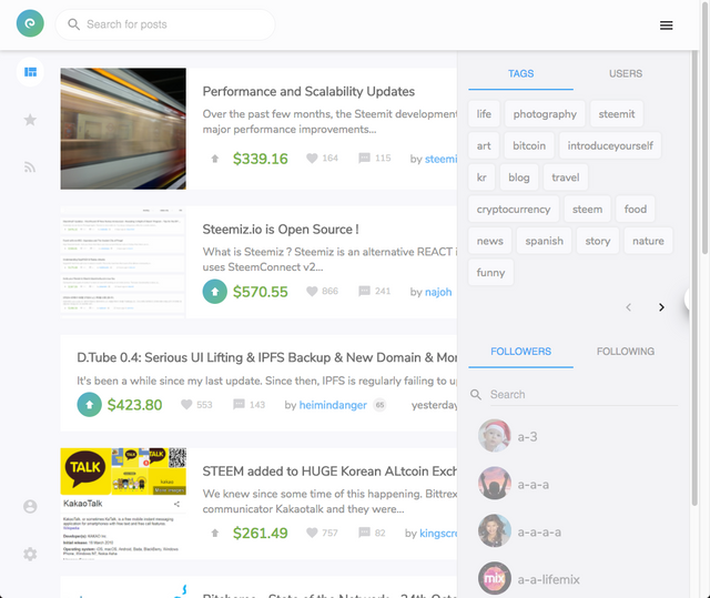
What do you think about the new Steemit interface? What is Steemiz?
What do you think about Steemit's new interace?
The new interface looks a lot cleaner and more modern. It now contains a "Links" section with links to your blog and your wallet (you no longer have to open the user image dropdown to get to your blog!).
Here is a preview of the new and improved interface:
Steemiz is a new platform built by @nahoj running on the STEEM blockchain with a more interactive and eye-catching user-experience for the average user.
They ended up running out of funds to invest in the platform and decided to make the project open source. Now that the project is open source, you can contribute via Utopian.io, the platform where you can earn STEEM for your Open Source contributions.
Here is a link to their Github: https://github.com/steemiz/steemiz
Here is a screenshot of what the site looks like currently:
Sources:
- Steemiz.io - We ran out of funds by @nahoj
https://steemit.com/steemiz/@najoh/steemiz-io-we-ran-out-of-funds - Steemiz.io is Open Source ! by @nahoj
https://steemit.com/steemiz/@najoh/steemiz-io-is-open-source


oh dope. I didn't know about Steemiz
Yeah, their User Interface is pretty nice...