How to Write a Sexy Steemit Post Step-by-Step
Imagine this: You’re up late at night casually scrolling through your Steemit feed. You slowly scroll past 20 posts. Until you see come across THE ONE. She has the headline of an angel. The featured image of a supermodel. And the introduction text that shines brighter than a diamond.
This one post is so unexplainably irresistible. You have no choice but to click on it. Inside the post is the most incredible content you have ever seen in your entire life.
You, my friend, are in love.
As a writer, how do you create a post that’s this attractive? What makes a Steemit post so visually appealing?
Through my research, I have discovered 7 KEY ELEMENTS of what makes a blog post so amazing. Using these tactics, you’ll be seducing every reader you come across in no time. Let’s get started.
1. Come up with a juicy title.
On Steemit everybody is competing for attention. Make sure your headline is specific, unique, and useful.
If you want to master the art of creating headlines, you NEED to read 7 Simple Tips to Crafting the Perfect Steemit Headline. It heavily goes into detail on making your headline stand out from the crowd, and making your headline the best it can be.
As an overview of the post, follow these tips the next time you’re trying to come up with a headline.
- Be specific.
- Use numbers.
- Follow the 3 U’s method.
- Use adjectives.
- Use statistics.
- Use rationales.
- Capture attention.
Keep in mind that you can follow all of these without making your post complete click bait.
If you do have a great headline, make sure the content of your post is just as good or even better.
2. Open with an enticing introduction.
Your introduction is what sets the stage for the rest of your post.
Turn your introduction into a story.
An exciting story that invites people to read more of your post.
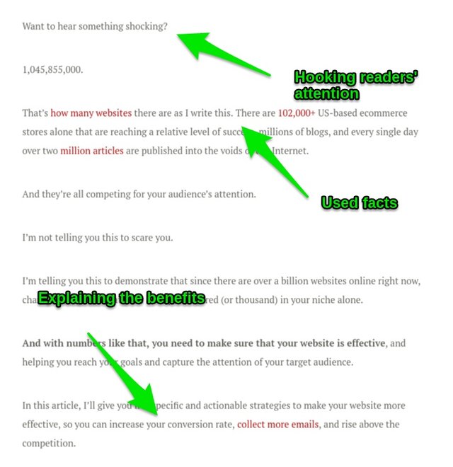
In your introduction, make sure to tell people why your post is important and what benefits they’ll get out of it.
Try to hook your readers with a question.
Ask them if they have a specific problem and then tell them that the post has the solution (make sure it does and you don’t just mislead or manipulate them into reading).
Use facts.
Let them know that you know exactly what you’re talking about.
Make sure to relate to your readers problems and tell them how you got out of them and how they can do what you did.
Next to the headline, your introduction is the most important element of your post. Don’t waste it.
3. Sculpt an attractive thumbnail image.
A photo speaks a thousand words.
If your photo is garbage, people will think that your post is garbage.
Here are some tips for creating your next thumbnail image.
AVOID STOCK PHOTOS. You know that cheesy picture with the two smiling businessmen shaking hands? AVOID IT. What about the photos of those 3D white characters? AVOID THEM.
Again, if your photo is cheesy, people will think that your content is cheesy.
Use a photo that’s clean, simple, attention-grabbing, and represents what you’re talking about.
For SteemRocket’s featured images, I create my own. I personally use Snappa. It’s the easiest graphic design tool you will ever use. You get 5 free designs per month if you’re not a member.
However, you’re able to take advantage and create new accounts under 10minutemail.com and enjoy unlimited usage of Snappa.
I also recommend Canva. It’s just like Snappa only with fewer features. It’s the best alternative to Snappa. (In my opinion.)
4. Use desirable subheadings.
People are lazy. They don’t like reading big bodies of text. Break up your text into sections by adding subheadings.
Try to make your subheadings almost as good as your headline. This keeps the post interesting.
Subheadings allow the eye to travel through the text without getting tired. They’re essential to making your post scannable.
Humans are scanners. Very rarely do we read entire blog posts. Very commonly, we only pick out the headings/sub-headings, the bold text, italics, bullets, and lists.
Make sure you add all of these to your writing to keep your readers attention.
5. Break up paragraphs.
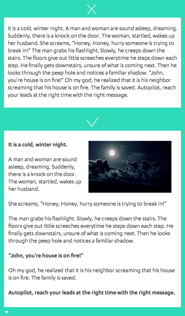
As I said in the last tip, people simply can’t read big paragraphs.
Long paragraphs create a sense of urgency to just try and make it through that paragraph. So instead of people focusing on the words that you’re writing, they get worn out really fast.
Solve this problem by keeping your paragraphs under 5-7 lines (for computer viewing).
Short paragraphs improve quality of understanding, reader engagement and increase focus.
6. Add stunning visuals.
The majority of people are visual learners.
Use images.
Articles with images get 94% more views according to Jeff Bullas.
Try to add custom, handmade, original images to give your post a personal touch. For custom images, try to keep the images consistent in terms of style.
If you look at my photos, I have a consistent, personal style for my thumbnail images. I’ve made the flat designed images with my own signature taste.
Use videos.
One study showed that landing pages with a video increases conversions by 86%!
If a photo speaks a thousand words, then a video is priceless.
For your Steemit post, use videos for how-to tutorials, explainer videos, demonstrations, etc.
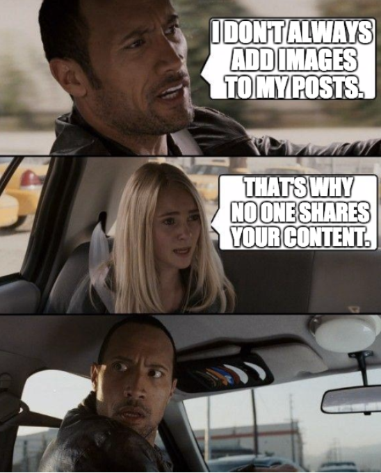
Use memes.
Add a bit of humor to your posts! Nobody likes a dry, boring article.
Memes are really easy to create and more importantly, really easy to share.
Make sure you use memes for the right occasion though. If you’re targeting a post towards an older demographic, you probably shouldn’t use memes as you’ll likely be viewed as immature.
However, if your demographic is 15-30 year olds, memes are a great way to spice up your post!
Use gifs.
Gifs are great for two main things:
- Entertainment
- Tutorials/How to demonstrations
Show off your personality with gifs.
Or share a tutorial on how to do something.
Use graphs and charts.
Show some statistics.
Use graphs and charts to show the effectiveness of something and/or the result of that something.
7. Write a charming "about me" paragraph.
An about me paragraph isn't the most important thing on your page. However, that doesn't mean you should ignore it.
A good about me paragraph can make you stand out from the crowd simply because you put in the time and effort to include it in your post.
Your paragraph should describe you (or your brand) in 30 seconds or less.
In your about me, be sure to include these 4 things:
- Name
- Who you are
- What you do
- How your readers can benefit
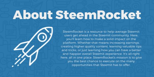
Copy and paste this paragraph at the end of each post, or turn it into an image like I did.
Conclusion
And that, ladies and gentlemen, is exactly what makes a post so dang sexy.
Go out and get em’, tiger.
If you liked this post, make sure to upvote and follow for more awesome content. Also, please share this with anybody you know who is struggling to get their blog off the ground.
Make sure to express any questions, comments or feedback you may have down below.
Links:
Follow SteemRocket on…
Let’s talk business: [email protected]
Check out the new Steemit Forum!
Recommended Posts:
7 Simple Tips to Crafting the Perfect Steemit Headline
Why 95% of Steemit Blogs are Doomed to Fail Before they Even Start



In the comments, make sure to add any thoughts, questions, or future post suggestions you may have!
How do you center the image ? Thank's
Hey chrisaiki, here's an article I found on how to center images on Steemit. I'm not sure how it works in markdown, but if your editing it in the editor/html, here's how to do it:
https://steemit.com/steem/@tokyo3/how-to-center-images-and-videos-on-steemit-posts-make-your-posts-look-better