SteemField │Mobile development design │ Steemit web service Development and design "SteemField" - English translation

This is an authorized translation by STEEM Witness @roadofrich, and is part of a series of posts that the ROR team has been making on its @steemfield account in its ongoing effort to contribute to the development of the STEEM blockchain. You can read the original post here.
Hello, this is the ROR team.
The ROR team is developing the Steemit mobile app version and the web version at the same time to contribute to the development of the STEEM blockchain.
Since the Steempeak site, which was developed with STEEM support, is about to be shut down, we plan to develop an alternative service as quickly as possible and start design work.
For quick work, we plan to produce the overall UX referring a lot to the existing Steempeak design, but we plan to add more convenience features.
If you have any good feedback, feel free to let us know via comments.
The SteemField site was created with the same green color as the mobile app.
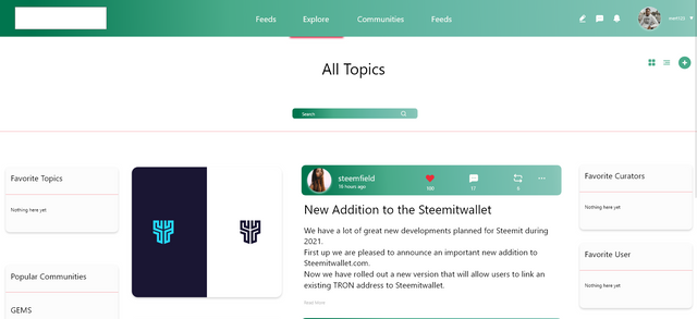
The site logo will be added on the top left side and now we have prepared a browse page and a communities page.
On the left side of the post, we plan to check the image on a large screen and provide a preview function, and on the right side, the post information and the title and content are partially displayed.

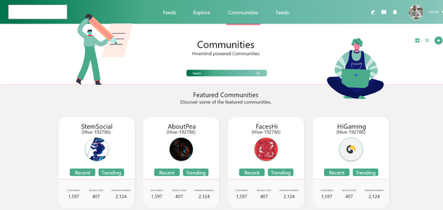
This is the Communities page, one of the important features of Steemit.
We are gathering a bit more information about the community and discussing areas that can improve the UX.
The basic user experience is unlikely to change significantly.
