Chart Shows that Steem may be Turning it Around
Steem Price Decline has Slowed
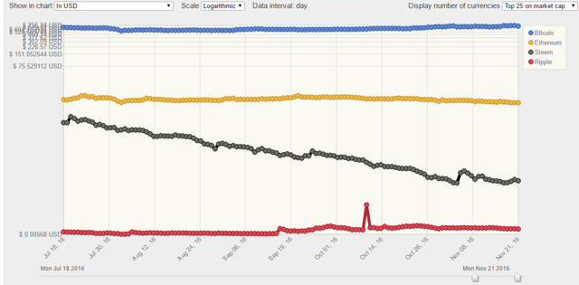
This is a chart of the price of Steem alongside other currencies using a log scale. The black line is Steem in USD. If you're unfamiliar with log scale, see the end of my post. You can reproduce this chart at www.cryptocurrencychart.com
We can see from this chart that the rate of decline was pretty consistent from the July peak to the low point at Nov. 3. Since November 3, the slope of the graph is less steep. We also have gone 18 days without a new low, the longest over the period. For those of us looking to find the "bottom", this could be seen as a sign of a turn around, although fundamental factors should also be taken into account as well. The upcoming change to power down rates is one, which will likely flood the market and unless enough investors have been holding off on buying in, waiting for that moment, we would expect a continued decline.
Log Charts
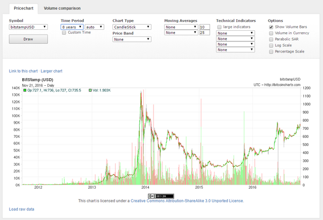
Most price charts you see online are linear scale, which means that every $1 on the Y axis is represented by the same distance. This is useful for short term trading expectations, but on the long run charts it is deceptive. The following is the long term Bitcoin chart in linear scale:
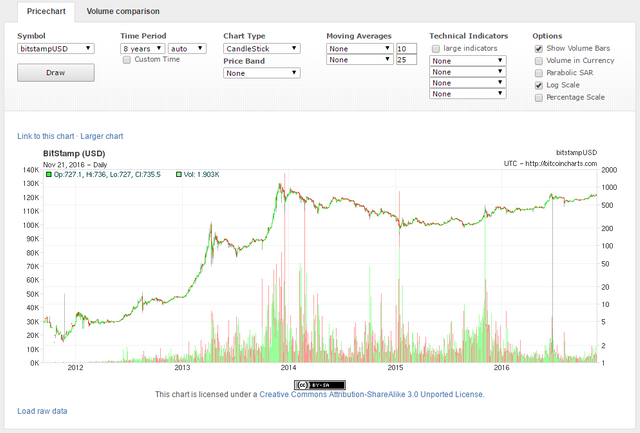
When you see this chart, everything prior to 2013 seems irrelevant, as if the price was totally flat. In fact, the largest price moves in Bitcoin's history were in the early days, such as the price rising many hundreds of times in short periods. When you see the same chart in log scale, it if easier to appreciate that.
In general, log charts are better if you are interested in understanding growth and decline.
Disclosure: As you can see from my wallet page, I hold Steem Power. I have also been a bit permabullish so it wouldn't be the first time I've been wrong on the Steem price.


