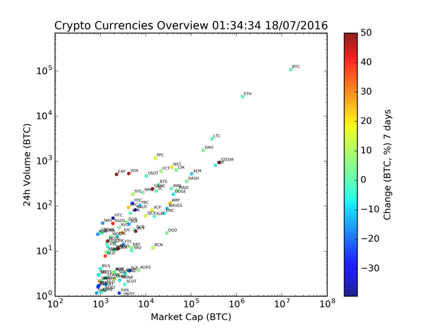
All cryptocurrencies in one visualization. Look, there is Steem!
Look! I can see my Steem from here!
Here is a compact view of all crypto currencies as of today. It is a plot of their current market cap, trading volume and the color of each currency represent its 7 day change of value. I had to clip it on 50%, all because of Steem...
The horizontal and vertical axes are logarithmic, it allows us to view all crypto currencies in a single chart like this. With linear scale, most currencies would actually cluster close to (0,0) since most have a small value compared to Bitcoin. In the chart we see that bitcoin is 10 times bigger than Ethereum (ETH), which in turn is 10 times bigger than Ripple (XRP), Steem, Litecoin (LTC) and the DAO.
What looks like a linear trend is actually a simple rule that most crypto currencies follow. The 24h volume is usually 1% of the market cap. The outliers are the most interesting guys here, both in terms of color and position in the chart. Expanse (EXP), Voxels (VOX) and Steem are all red for instance, meaning they have been raising a lot in value since last week. Dark blue ones, not so much.
I first posted this kind of chart in James Claytons excellent Cryptocurrency Collectors Club #cryptoclub on Facebook about two year ago. All data come from http://coinmarketcap.com. If you see more than me in this chart, or have insight information about what we see, please help me out with the analysis in the comments!

nice
thanks for sharing. A good way to show a summary of coinmarketcap.com . Do you created the visualisation yourself?
Thanks, ofcourse I created this visualization myself. I probably came up with the concept too, since it is about two years since I posted an image like this for the first time. Called it "a birds eye view of crypto currencies". :-)
I like it, there are not a lot of ways to show this kind of information.
Great to have you here!
Here are some tips if you're not aware of already:
Secure your account: https://steemit.com/steemit-guides/@pfunk/your-steem-account-is-worth-money-how-to-secure-it-with-a-new-owner-key-to-keep-it-yours-forever
Verify your account and build your reputation: https://steemit.com/steem/@tuck-fheman/verified-accounts--reputation-system
Contribute with your own contents: https://steemit.com/steem/@grittenald/copy-paste-steal-cite-your-sources, and https://steemit.com/steemit/@pfunk/lets-discuss-verification-of-user-accounts-posting-previous-work-to-prevent-impersonation
Properly tagging your posts, especially when your content is #NSFW or for #test only
Know how Steemit works: https://steemit.com/steemit/@donkeypong/still-confused-by-steem-steem-dollars-and-steem-power-the-power-plant-analogy