SEC | S20W3 | Data Analysis with Excel: (Charts, and Data Analysis Techniques)

Hello steemians,
In this contest, I aim to showcase my understanding of data analysis using Excel by exploring different chart types and data analysis techniques. Drawing from my experience in handling and organizing data, I will demonstrate how to efficiently create and interpret charts, organize data for analysis, and apply sorting techniques in real-world examples. By engaging with these tasks, I hope to provide a clear and insightful explanation of the power of Excel in data visualization and analysis, ensuring that even complex datasets can be effectively understood and communicated.
Task 1 - Explain what you understand by Excel charts and discuss three (3) types of Excel charts that you know with clear screenshots.
I understand that Excel lets you create charts from data to visualize it in a clearer and more engaging way. Excel charts are visual representations of data entered into a spreadsheet that help you understand trends, relationships, and patterns in the data. They are especially useful when I want to compare numbers, track changes over time, or analyze distributions.
Types of Charts I Know
1. Line Chart
A line chart is very useful for tracking data over time. When I want to see a trend, such as how sales of a product are changing or how temperatures are changing over time, I use a line chart. This type of chart shows data points connected by lines, making it easy to see whether a trend is up or down. I find this type of chart particularly useful for visualizing time series.
Example:
If I am tracking my company’s monthly sales over a year, I can use a line chart to illustrate how my revenue has changed over time, allowing me to spot significant spikes or drops.

2. Bar Chart
A bar chart is very effective for comparing quantities across categories. This type of chart uses horizontal bars to represent the size of values, allowing me to visually compare specific data. Personally, I often use bar charts when I need to compare the performance of different products or services over the same time period.
Example:
If I want to compare sales of multiple products during a given quarter, I can use a bar chart. This chart will show which categories are performing better, helping me make strategic decisions for the future.

3. Pie Chart
A pie chart, also called a pie chart, is a great tool when I want to illustrate proportions. This type of chart shows the distribution of different categories of a data series as a percentage of the total. I often use it when I want to represent market share or the distribution of budget expenses.
Example:
For example, if I want to show how my budget is distributed across different categories (marketing, production, salaries, etc.), I might use a pie chart. This allows me to see at a glance which parts represent the largest expenses.

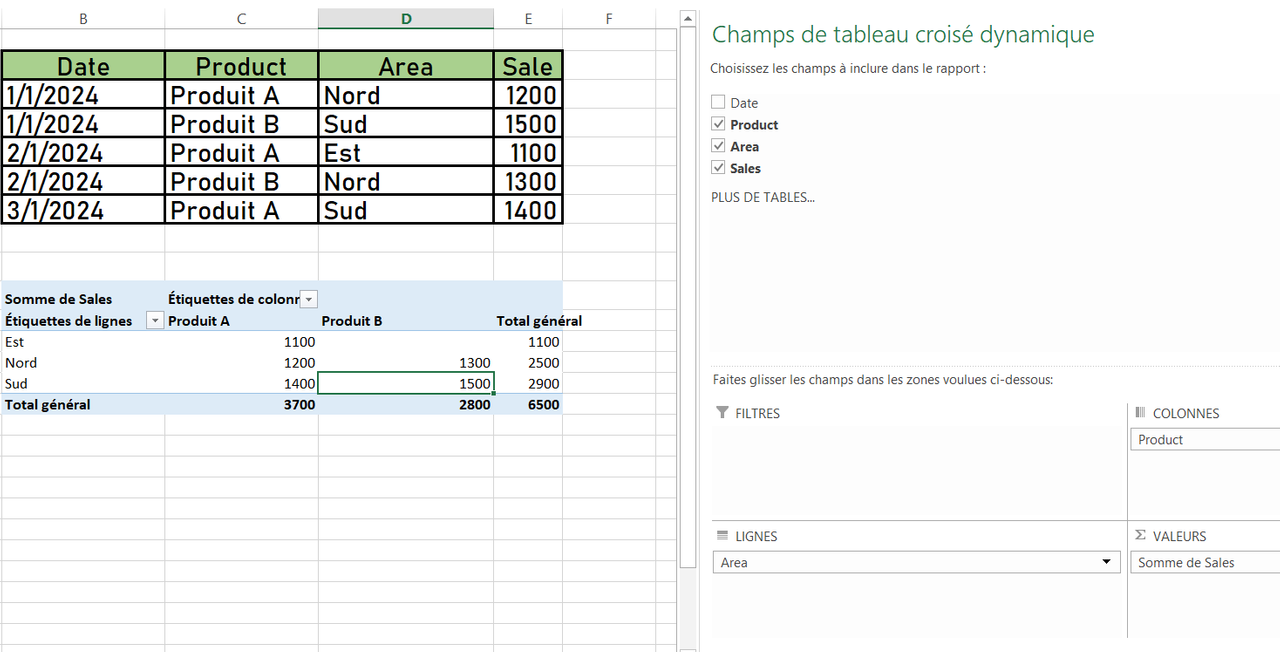
Task 2 - Verify that you can read the information regarding chart location and creation in Excel and interpret it correctly using Bar Charts based on the data given below.

To create a bar chart in Excel from data such as the number of Steemians by country, here are the steps I would follow to do it in a simple and efficient way:

Steps to create a bar chart in Excel
Select the data:
First, I would start by selecting the data that I want to graph. In this case, it is the "Country" and "Number of Steemians" columns of the table. To do this, I click and drag the mouse over the relevant cells to highlight them.Access the "Insert" tab:
Next, I go to the "Insert" tab located at the top of the Excel ribbon. This tab gives me access to several options to insert different types of graphs and illustrations.Choose a bar chart:
Under the "Insert" tab, I click on the recommended charts icon or directly on the bar charts button. Then, I select the type of chart I want to use. I can choose between "2D Bars" or "3D Bars", depending on my preferences. In the image provided, I opted for 3D bars, which gives a more visual and stylized representation of the data.Customize the chart:
Once the chart is inserted, it appears in my spreadsheet. At this point, I can customize the colors, labels, and title of the chart to improve clarity and aesthetics. For example, I would rename the chart "Number of Steemians" to clearly indicate what it is.Analyze the results:
Using this data table of Steemians by country and the associated bar graph, I can further interpret the results.

The bar graph clearly shows the distribution of Steemians by country, with Nigeria leading the way with 122 Steemians, followed by Venezuela with 105 Steemians and Bangladesh with 98 Steemians. These three countries stand out from the rest in terms of participation, which could be a sign of a particularly active community or a targeted effort in these regions to promote Steemit.
Other countries like Tunisia and Romania have much lower numbers of Steemians, with 2 and 4 participants respectively. This could indicate significant growth opportunities in these regions if more efforts are made to raise awareness and recruit more users.
By visualizing this information in graph form, I can easily see the significant differences between different countries and identify geographic trends. For example, South Asian countries like Bangladesh, Pakistan, and Indonesia show a strong presence, while other regions are less represented.
This allows me to better understand the distribution of Steemit users around the world and to think about strategies that could be put in place to boost engagement in underrepresented countries.
Task 3 - Briefly discuss Data Analysis Techniques In Excel and tell us how we can organize data in Excel for analysis.
Data Analysis Techniques in Excel
Excel offers a wide range of data analysis techniques that can be used to organize, manipulate, and interpret data efficiently. Here, I will explain some of the commonly used data analysis techniques in Excel and show how they can be applied in a practical example.
Data Analysis Techniques in Excel
Sorting and Filtering:
When working with large amounts of data, I can use the sorting and filtering options to organize my data in an orderly manner. Sorting allows me to organize the data in ascending or descending order based on specific criteria, such as dates or numeric values. As for filtering, it helps me isolate particular segments of data, for example, displaying only data for a specific country.Pivot Tables:
Pivot tables are a powerful tool that can be used to quickly summarize and analyze large amounts of data. With this technique, I can group and compare data in a variety of ways, such as summarizing sales by region, examining employee performance, or visualizing sales trends by quarter. I can also create automatic subtotals, averages, or percentages to better understand the data.SUMIF and AVERAGEIF Functions:
I can use these functions to calculate conditional totals or averages. For example, I can use SUMIF to total all sales in a particular region or use AVERAGEIF to calculate the average revenue generated by a specific product.Charts:
As explained earlier, I can also create charts in Excel to visualize the data. These charts allow me to quickly see trends or visual comparisons, making it easier to interpret the data.
Organizing Data for Analysis
When preparing data for analysis in Excel, it is crucial to organize it well. Here are the practical steps I would follow:
Structured Table Format:
I always organize data in a structured table format with clear headers for each column. This makes it easy to reference the data and ensures that it can be used in tools like pivot tables. For example, I might have a column for "Date", "Product", "Sales", and "Region".Removing Duplicates and Missing Data:
Before analyzing the data, I make sure to remove duplicates and address missing data. Excel allows me to quickly remove duplicates or identify blank cells using the "Remove Duplicates" option and conditional formulas.Sorting Data:
Once my data is organized into a table, I can sort it to make it easier to analyze. For example, if I'm working on sales, I'll first sort my data by region and then by product to better understand regional trends.
Practical Example
Let's say I'm working on sales data in Excel that includes information about products sold, regions, and revenue generated each month. Here's how I might organize and analyze this data:

Sorting Data:
I start by sorting the data by "Region" to identify regional trends in sales. Then, I might sort by product to examine how each product is performing by region.

Creating a Pivot Table:
I use a Pivot Table to group sales by region and product. This allows me to quickly see which products generated the most revenue in each region.
Visualize with a Chart:
Finally, I create a column chart based on the pivot table to visualize sales by region. This makes trends more obvious and allows me to make informed decisions.

By using these data analysis techniques in Excel, I can organize my data in an optimal way and analyze it more effectively. This allows me to make decisions based on hard data and better understand trends or relationships within my data sets.
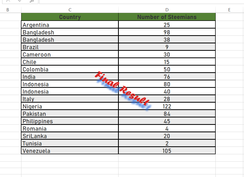
Task 4 - Using the data given in question 2, arrange the names of countries alphabetically using data sorting techniques. Screenshots are needed.
Let's walk through the process of sorting the countries alphabetically in Excel using the data provided in question 2, with more detailed explanations and screenshots at each step.
Step 1: Select the Data Range
The first step in sorting any data in Excel is selecting the data range you want to sort. In this case, I need to select the country names and their corresponding number of Steemians. Here's how I would do it:
Click and drag to select the data in both the "Country" column and the "Number of Steemians" column. The selection should start from the first country name (in cell C2) and include all the way down to the last Steemian count. This ensures that when sorting, the countries and their corresponding data (number of Steemians) remain together.
Tip: If there are headers at the top (like "Country" and "Number of Steemians"), make sure to include them in your selection, as this helps Excel recognize them as headers and avoid sorting them as regular data.

Step 2: Open the Data Tab
Once the data is selected, I need to access the sorting options within Excel. This is found in the Data tab in the Excel ribbon (the toolbar at the top of the window). Here's what I do next:
- Navigate to the Data Tab: I click on the Data tab, which opens up several tools for data analysis and manipulation.
- Locate the Sort & Filter Options: In the Data Tab, the group labeled Sort & Filter contains the options for sorting data. These include sorting alphabetically, by size, or even by custom criteria.

Step 3: Sort the Data Alphabetically
Now that I have the data selected and I am in the Data tab, I can proceed with sorting the data alphabetically. This is done using the Sort A to Z button. Here's how:
- Click on Sort A to Z: Within the Sort & Filter group, I click the Sort A to Z button (shown as "A→Z"), which will automatically sort the country names in alphabetical order from A to Z.
- Automatic Sorting: When I click this button, Excel will automatically sort the selected data by the first column (in this case, "Country"), and it ensures that the corresponding "Number of Steemians" values are moved along with the country names. This keeps the data correctly aligned.

Step 4: Verify the Sorted Data
After the sorting operation, it's crucial to verify that the data has been sorted correctly and that the corresponding values are still correctly aligned. Here's how I do it:
- Check the First and Last Entries: I look at the first few and the last few entries in the sorted data to ensure that the countries are indeed arranged alphabetically.
- Confirm Data Alignment: I also check that the "Number of Steemians" values next to each country remain accurate. For example, if Nigeria had 122 Steemians before sorting, it should still have 122 Steemians after sorting.
- Verify the Entire List: Depending on the length of the data, I may scroll through the list to make sure there are no discrepancies after sorting.
Example of Final Sorted Data:
After sorting, the data will be arranged alphabetically by the country names, and the Steemian counts will remain in the correct order, like this:
Thank you very much for reading, it's time to invite my friends @pelon53, @steemdoctor1, @chant to participate in this contest.
Best Regards,
@kouba01

This post explains the various data analysis methods and charts in Excel in a very good manner. You have explained how to create charts, organize data and filter in Excel. The importance of various charts such as line chart, bar chart, and pie chart is explained with examples.
A bar chart comparing the number of Steemians across countries shows that Nigeria, Venezuela and Bangladesh are significantly ahead.
The second part of this post is based on how to sort data in Excel, where the country names are sorted alphabetically and screenshots are provided.
This post provides an excellent guide to data analysis in Excel, especially for those who want to organize and present data in a better way. you have shared great content I hope this will be number one post stay safe🌟🌟🌟🌟