State of the Sandbox | Thumbnail Contest_ |
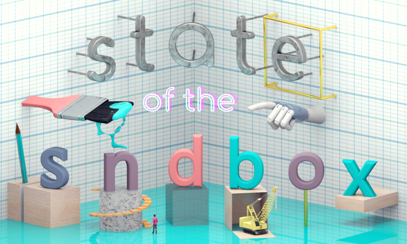
I've been massively busy lately but I just found out about @sndbox's monthly "State of the Sandbox" thumbnail competition and I just knew I couldn't let this opportunity pass by, specially since it's the first installment of it. First and foremost, here is my entry:
I've been closely following @sndbox since its inception and I have to say that I'm specially a great fan of their brand image. I tend to think that they are the only Steemit "presence" with a clear and well defined image. I guess I wouldn't expect anything less from a group of artist and designers trying to help other creatives through Steemit and the blockchain, but it's still worthy of being praised. Having said that, I knew from the very beginning that I wanted to do something that respected their aesthethic values and ideas but that aslo conveyed my "voice" and style.
After a little bit of experimenting inside Cinema 4D, I settled on doing something with a parametric view. I wanted that sense of having the objects and typography look "staged", not "caged", but "staged". Although, I immediately found interesting parallelisms between my "square" view and the idea of designing something for a brand with "box" in their name. Immediatley afterwards I got the idea of covering the "walls" with graph paper. I started to develop a theme. I wanted the scene to "discourse on" about the design process and the tools used in building or creating something.
I started to rig up the letters of @sndbox in different styles of building blocks. Also, the parametric view gave me the sense of looking not at a normal stage, but a miniature one. So I decided to integrate "miniatures" into the whole concept. Nonetheless, I ended up also integrating everyday small objects at a more grandiose scale, like the paintbrush. I ended up really liking this ironic and playful change of scales. I think this reminded me of thinking outside the box, even if you might find yourself inside one. I just loved the poetry in that.
Since I designed my image in 3D space, I could not help to do something that felt also somewhat "retro futuristic". That is where the robot hand, the neon letters (with a little bit of offsetting of color, just like in the @sndbox style) and all the glossy materials come in.
This was a really fun project to work on, even though I had very little time to put it all together. I tried to create something that used geometry and perspective to create something clean, forward thinking and fun, just like @sndbox's aesthethic and design philosophy. What did enjoy doing the most, you ask? Well, I think it must've been putting a Physically Based little light on top of the crane. See if you can find it.
You're welcome to comment, resteem and upvote this post. You can also follow me to discover all the art and designs coming from @Obxidiana

Great to see a bit of C4D work. Well done.
@animate
Thanks @animate! Yep, C4D is one of my main and favorite tools! I also loved your design! Loved how well you used After Effects! Congratulations! Just started following you! Hope to learn a lot from your posts!
Same. C4D is incorporated into After Effects so I'm trying to use it a little more. So it would be great to learn how to use it form you to.
Thanks
@animate.
Lately, I have been giving a lot of thought to the idea of making C4D tutorials, so I'm glad to hear that you could benefit from them. And, yeah, it is just fantastic to know that with AE we get such and amazing program like C4D Lite. Thanks you for the motivation!
Great work!
Those words coming from a guy that can draw like this, feel like a really big compliment! Thanks a lot @erb! Also just started following you and also hoping to learn a lot from your artistic endeavors and processes! Welcome to Steemit!
I really like this one! Glad you design was recognized
Thanks you so much for your support @natureofbeing! Just took a look at your blog and I already know it's going to be a pleasure to follow you! Thank a lot!!!!!!!