Creating Digital Mockups for Cookie Sticker Designs

Image maded by myself on GIMP

Creating Digital Mockups for Cookie Sticker Designs
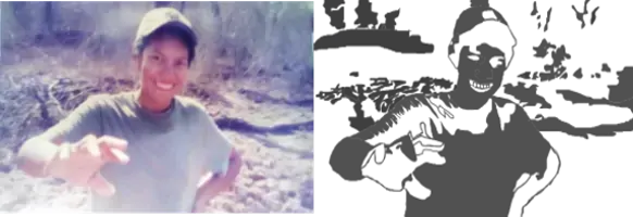
Friends , how are you doing? My post today is to show you this sketch that I made to incorporate it into some stickers that will be the logo of a brand of cookies from the venture of who was my partner at the time.
I want to tell you that I am just learning to do this because I have always been concerned, I saw a tutorial on YouTube, and from there I was encouraged to practice, because all this seems really fascinating to me and I look at the result I got and I don't I can't believe that I could have done something so good, since I am someone who has no ability or knowledge for these things.
To do everything I used GIMP 2.10 and it was done in linux.
The process of how I did it
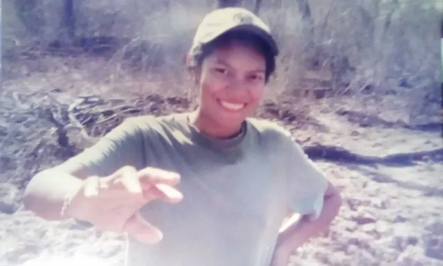
First I show you the original photo I took to make the sketch. This photograph is from 2005 and I had to digitize it by taking a picture with my phone because the photo itself was already deteriorating. Luckily I turned out very well doing it.
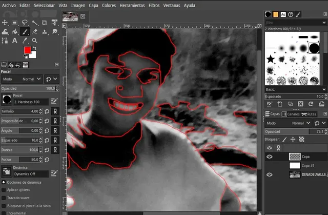
Then I take the original photo and I modify the saturation until I have it in black and white to be able to start working on it as I want, the result was this. The next thing I did was choose a hard brush and set an opacity of 75% even though it was you can adjust for convenience. In this case use brush #4.
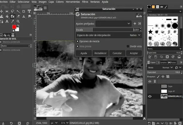
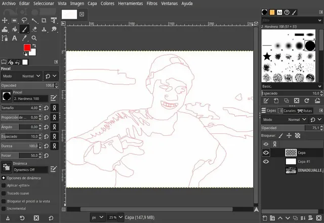
Once with the brush and the image ready to work, I added a new transparent layer and I began to work on the sketch using the red color as a guide to be able to vectorize the entire image, taking care to zoom in on the most difficult parts and taking care that I didn't have any unjoined space left so that later the whole image would not be colored in a single tone.
Once the process of correctly marking the patterns is finished, being a bit intuitive and using common sense to know approximately when it can be right, add a layer of white to see how the work is turning out.
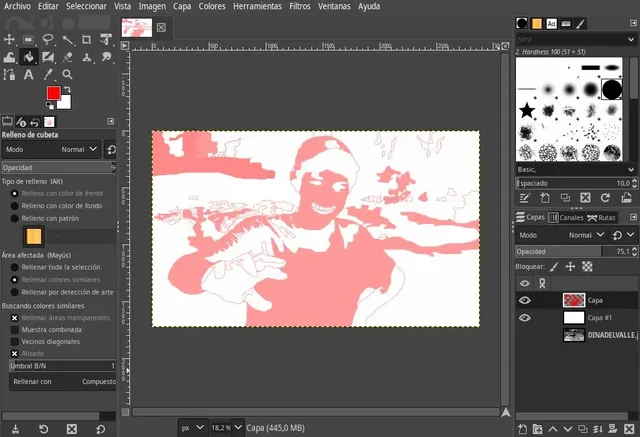
Already being satisfied with how it looks, I proceed to fill in all the spaces with red, taking care that other parts of the image are not filled in because it would be incorrect.
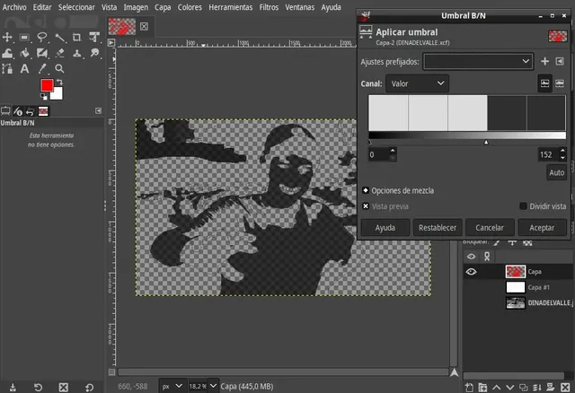
And once this is done, I hide the other layers, leaving only the red one that interests me, making the work have a transparent background. At this point I modify the threshold to look like this.
Resulting in the final art that I convert into a .png to be able to export it and make the vector graphic that I will use for her stickers.
And here you can enjoy the comparison between the original and the sketch for the stickers.
I hope you liked my work, give it upvote and comment.

