Understanding Shopify Sections and Blocks: A Developer's Guide to Custom Store Design
Shopify's powerful theme architecture is built around the concepts of sections and blocks, which allow developers and merchants to create dynamic, customizable, and reusable components within a theme. These elements are essential for creating flexible storefronts that can be managed through Shopify’s user-friendly admin interface. In this technical article, we’ll explore what Shopify sections and blocks are, how they work, and how developers can use them to create highly customizable themes.
1. What Are Shopify Sections and Blocks?
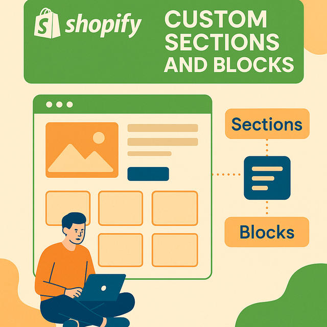
Sections are modular components used to structure Shopify pages. They can be static (specific to a template) or dynamic (reorderable and addable through the Shopify theme editor). Each section is typically defined in its own Liquid file and can include HTML, CSS, JavaScript, and Liquid code.
Blocks are the child components of sections. They allow users to add and customize content within a section. For example, a "testimonial" section might include multiple blocks for individual testimonials.
2. Types of Sections
-
Static Sections: These are tied to specific templates such as product pages, collections, or blogs. They cannot be moved or duplicated from the theme editor.
-
Example:
product.jsontemplate might include a staticproduct.liquidsection.
-
-
Dynamic Sections: Found on the homepage (
index.json), these can be added, removed, and reordered directly from the theme editor.-
Example:
featured-products.liquidcan be added multiple times with different settings.
-
3. Anatomy of a Section File
A typical section file (sections/feature-product.liquid) includes the following:
{% schema %}
{
  "name": "Featured Product",
  "settings": [
    {
      "type": "product",
      "id": "product",
      "label": "Select Product"
    }
  ],
  "blocks": [
    {
      "type": "text",
      "name": "Text Block",
      "settings": [
        {
          "type": "text",
          "id": "text",
          "label": "Text"
        }
      ]
    }
  ],
  "max_blocks": 5,
  "presets": [
    {
      "name": "Featured Product Section",
      "category": "Product"
    }
  ]
}
{% endschema %}-
settings: Controls the configurable inputs in the section. -
blocks: Defines the structure for repeated, editable elements. -
presets: Enables the section to appear in the theme editor’s add section menu.
4. Blocks in Depth
Each block type defined within a section allows for modular input. Developers can use conditionals to render different HTML outputs based on block type.
Example block loop:
{% for block in section.blocks %}
  {% case block.type %}
    {% when 'text' %}
      <p>{{ block.settings.text }}</p>
    {% when 'image' %}
      <img src="{{ block.settings.image | img_url: 'medium' }}" alt="{{ block.settings.alt }}">
  {% endcase %}
{% endfor %}
This loop dynamically renders all blocks within a section, improving maintainability and customization.
5. Best Practices for Using Sections and Blocks
-
Keep It Modular: Break down large features into reusable sections and blocks.
-
Use Presets: To enhance usability, always define presets in your schema.
-
Limit Max Blocks: Avoid performance issues by capping the number of blocks.
-
Use Fallbacks: Ensure defaults for section or block content to avoid breaking the design.
-
Consistent Naming: Use semantic and clear naming conventions for
id,label, and file names.
6. Custom Section Example: FAQ Accordion
File: sections/faq-accordion.liquid
<div class="faq-section">
{% for block in section.blocks %}
<div class="faq-item">
<button class="question">{{ block.settings.question }}</button>
<div class="answer">{{ block.settings.answer }}</div>
</div>
{% endfor %}
</div>
{% schema %}
{
"name": "FAQ Accordion",
"blocks": [
{
"type": "faq",
"name": "FAQ Item",
"settings": [
{
"type": "text",
"id": "question",
"label": "Question"
},
{
"type": "textarea",
"id": "answer",
"label": "Answer"
}
]
}
],
"max_blocks": 10,
"presets": [
{
"name": "FAQ Accordion",
"category": "Custom"
}
]
}
{% endschema %}
Add CSS and JavaScript to style and animate the accordion functionality.
7. JSON Templates and the Role of Sections
As of Online Store 2.0, Shopify supports JSON templates which allow dynamic section rendering for more than just the homepage. Each template (like product.json) can include multiple dynamic sections.
Example templates/product.json:
{
"sections": {
"main": {
"type": "product"
},
"related": {
"type": "related-products"
}
},
"order": ["main", "related"]
}
This JSON structure maps section files to a product template and defines their order.
8. Benefits of Sections and Blocks
-
Merchant Flexibility: Merchants can update content without editing code.
-
Reusable Code: Sections and blocks can be reused across templates.
-
Faster Development: Developers can ship components that scale easily.
-
Enhanced UX: Merchants get a preview of changes in real time.
9. Debugging and Troubleshooting
-
Use the theme preview in Shopify to test block rendering.
-
Validate your JSON and Liquid syntax.
-
Use comments and clear schema structure for easy navigation.
-
Check the Shopify Theme Check CLI for errors or deprecations.
Conclusion
Understanding Shopify’s section and block architecture is critical for building themes that are scalable, maintainable, and merchant-friendly. By mastering the creation and customization of these components, developers can deliver powerful storefronts that offer great flexibility without compromising performance or design consistency. Whether you’re working on a custom theme or modifying an existing one, embracing sections and blocks is the key to modern Shopify development.
If you're unsure about building or customizing these elements yourself, you can always hire expert freelance Shopify developers to bring your vision to life with precision and performance.
