Rock Paper Scissor Logo entry 1
Hello all,
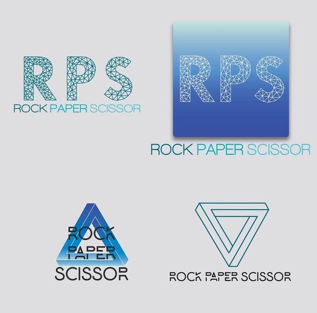
Wanted to get the first few concepts out and have a couple more designs in the works. This design challenge for Rock Paper Scissor (RPS) by @PeerPlays allows for designers to have a lot of creative freedom and there are a lot of great designs thus far; good luck to everyone!
Description:
-Color palette is the blue-aqua (a nod to the platform brand) swatch which relates to trust and stability.
-All type is free or purchased and all designs are in vector format (final hand off is logo package with various sizes, formats and master files) and my own.
-The 1st design is geometric and minimalist, using type treatment of 'RPS' for the wordmark.
-The second design is geometric and minimalist as well, with a different typeface and it uses the Penrose Triangle as the symbol.
Both designs signify inter-connectivity, technology, trust, simplicity and modernity.
The second design with the triangle symbol adds motion and the 3 points of the triangle are representing rock, paper and scissors in an abstract way; this provokes intrigue as well.
Let me know what everyone thinks, crits., suggestions, etc...
Thanks for checking out my designs!
Stay Rad!
Jeremy Kane
Hey man yours looks good as well! You captured the "decentralized blockchain" characteristic well. I was thinking of how to do that without being hackneyed but didn't come up with anything in time. followed you back