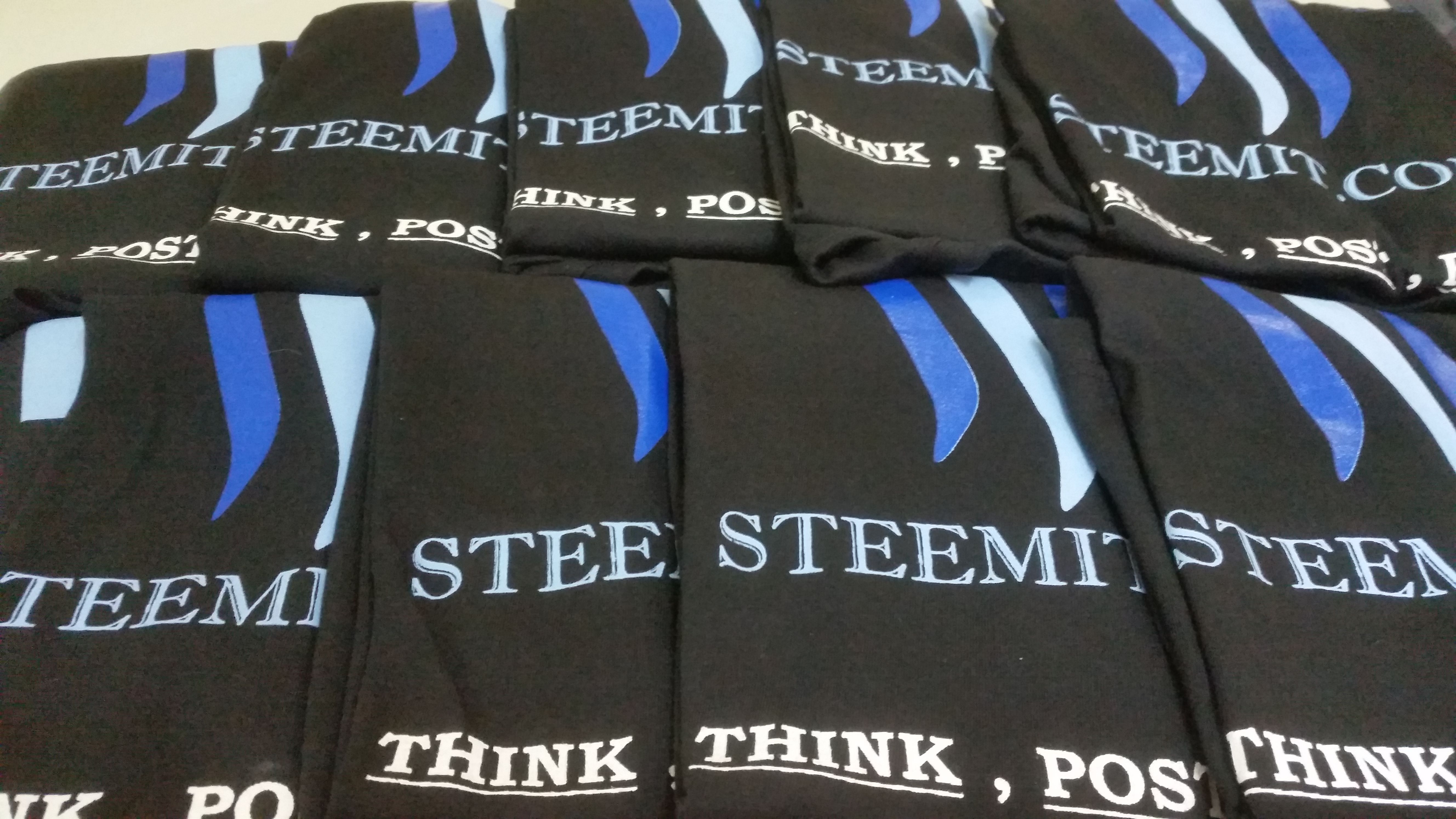
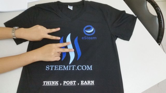
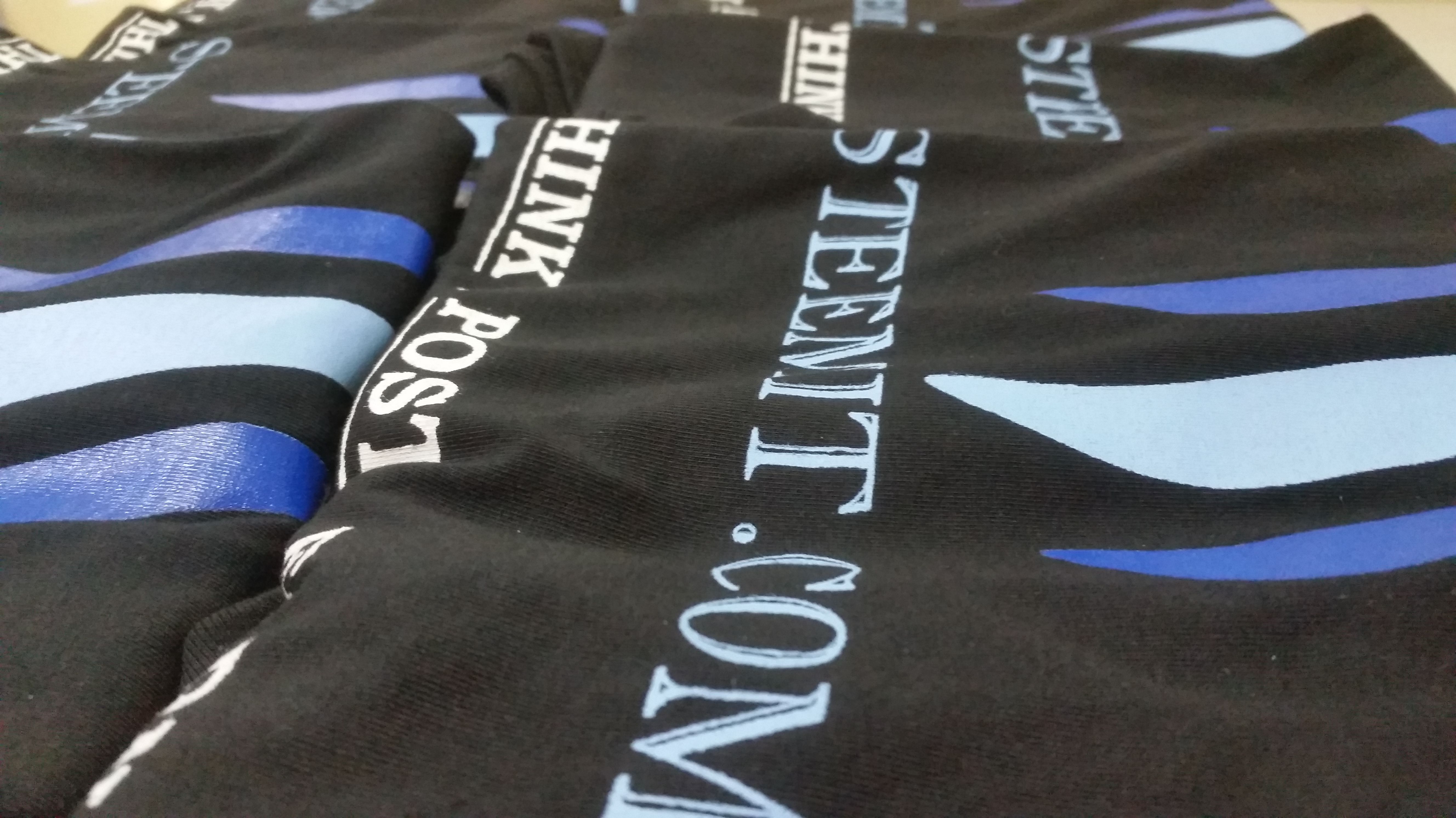
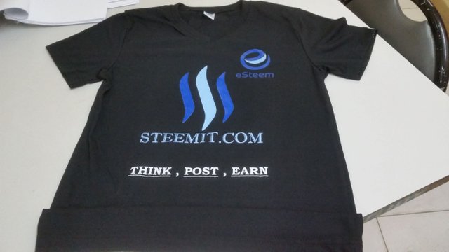
Steemit Shirts are ready ! Everything is All set for our First Steemit University Campaign!
Never get tired of doing little things for others, sometimes those little things occupy the biggest parts of their hearts.
Hi Steemit!
I'm happy to share this to you - Steemit shirts are now ready!
This time, everything is all set and good to go! The Steemit shirts, Flyers and plackards are all ready! The orientation made by me @jassennessaj and @themanualbot will be direct and simple. These lucky University Students will be given Steemit shirts, Flyers, plackards for FREE!. Plus we will assurethey will be guided properly by us.
Ten shirts were initially printed, along with 250 flyers thanks to @timcliff for his 10,000 flyers campaign and @eirik for the design. Big thanks to these people!
What are your thoughts on the design? I have saved my design and can edit if you wish to. We woud love to hear your thoughts!
Again, as a way of giving appreciation to @donkeypong's generosity. I thank you for such an overwhelming support. The first Steemit University Campaign will never happen (or sooner) without your help.
Things are looking good and were settinf a perfect date and time to gather all these promising individuals. I've recruited almost 10 and praying they will succeed here in Steemit. This is also a way of sharing blessings to others. This is a great initiative to replace facebook or somehow limit time of using.
I'll give you an update about the conducted seminar and who are these people we expect to join.


Omg so nerdy I love it! Haha promptly resteemed.
That said, one little tweak - I'm not the biggest fan of the "think, post, earn part"...sounds a little too businessy and not the type of message I'd want on a casual tshirt. I don't know, maybe that's just me.
On a slightly different note, if you do decide to keep that part, I think it would look a bit cleaner on the back of the tshirt. It's a bit too much crunched in at the bottom IMHO.
Ok last thing... having the .com part is a bit too early 2000's, I might remove the .com. Think of it this way, if you saw a shirt of a famous website like Facebook or Google etc etc, would it say Facebook.com or would it just say Facebook? ;)
Just my 2 cents - great concept though! :D
Agree with you, the .com is not needed and the message should be at the back.
Thanks, I've designed a few company tshirts myself...not saying I'm a professional or anything but I do have a bit of experience :)
Hi @jobsande! I learned a lot on your comment and I appreciate the time and effort you've showed. I like the ideas your presented. But there are things I looked why I picked that :
The "Think, Post, Earn" part - the best strategy I think to catch their attention. A lot of people here are hooked to facebook, instagram, and twitter. The worst thing is : They didn't get nothing. So the word "earn" will surely catch them. In terms of online earning, I feel Filipinos are more hyperactive if they are rewarded/get paid of doing something.
"The Steemit.com" - The idea was really just STEEMIT. However, introducing the site to them will be a key for them to be curious. But as soon Steemit.com will be known here in our place or gain some recognition from our community. The .com will be removed :)
Glad you found it helpful! Fair enough, and it's ultimately your project and your decision...I was just chiming in with my thoughts like you asked in your post :)
Great post, thanks for sharing!
Im following you !
Resteeming this to my followers. Hope it helps a little.
will you gift me a shirt :)
How about this "Get Real rewards for YOUR content"
upvote & resteem
Good luck on your recruiting efforts.
Following you because I LIKE YOUR name My name on here is sinned backwards so i am going to roll with backwords people
Great post. upvoted and resteemed. Please visit my blog @bikash-tutor. Thank you.
Good idea with the shirts. But other colors with would be even better. :)
nindot ni bai! @jassennessaj ako e resteem then e follow pd tika :)