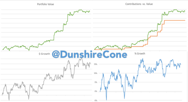
Four Charts a EVERY Portfolio Needs.
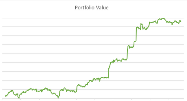
I know a lot of us are investors, so I thought I'd share with you some of my own personal methods. Now, I don't know what every investment firm delivers its clients, but the firm I use only gives you one detailed chart on your dashboard.
But the only thing this chart tells me is how much my portfolio is worth. It doesn't really give me a solid visual for actual performance because it includes contributions and withdrawals to the account. The simplest way to fix this is to keep track of your contributed base and include that data series in a double-line chart: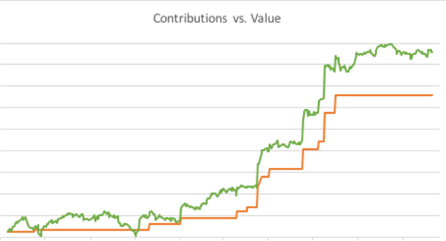
Here, you get a very bare-bones comparison of your portfolio value vs your contributed value. I will say that my investment firm provides a chart that compares value and contributions, but only through monthly data points, and only for a year at a time. Not exactly the most informative. I mean, compare 24 data points with the more than 800 data points you see in the graph above. It certainly gets the job done. At a certain point though, even this chart will be difficult to analyze for the performance of the account.
To help, I supplement this chart with a Dollar Growth Chart. Basically, it measures the distance between the 'Green' data series and the 'Orange' data series, and grounds the contributed value (Orange line) down to a flat standard to measure pure dollar growth of the portfolio. It's a calculation is simple. Just subtract contributed value from portfolio value (portfolio - contributions)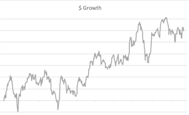
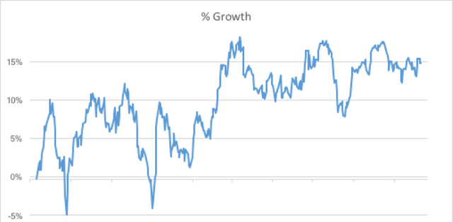
Lastly, I need to analyze how my portfolio is doing per dollar invested. This is essentially a return on investment (ROI) over time. To keep it simple, there is no weighting involved. This does distort perception of performance in the short term when a large amount of money is invested in a short amount of time. However, it gives a pretty good gauge on your portfolio. It's a simple calculation, just divide Dollar Growth (calculated above) by Contributions:
[(portfolio - contributions)/contributions]
My favorite part about these charts is that I set a macro to automatically resize each chart with the single click of a button. I began by just adjusting the boundaries of each chart individually whenever the data set out grew the prior ones. I'm still working on a way to adjust the time frame to limit the chart display to certain periods of time, e.g. 1 year, YTD, 6 months, etc. I hope to one day have all of those features and a custom timeframe option in my spreadsheet, but we'll have to wait a bit.
Well thanks for reading my blog. I hope I shared some ideas that are worthwhile to you. You may get the sense that I like charts. I get the sense that you are on to something...
Yup. Charting is where I find all the fun. Happy steeming everyone!
