As an analytics professional, I have a deep love for Tableau. Pairing it with my love for cryptos, I've created a few easy to read charts that help show some high level info about the crypto market:
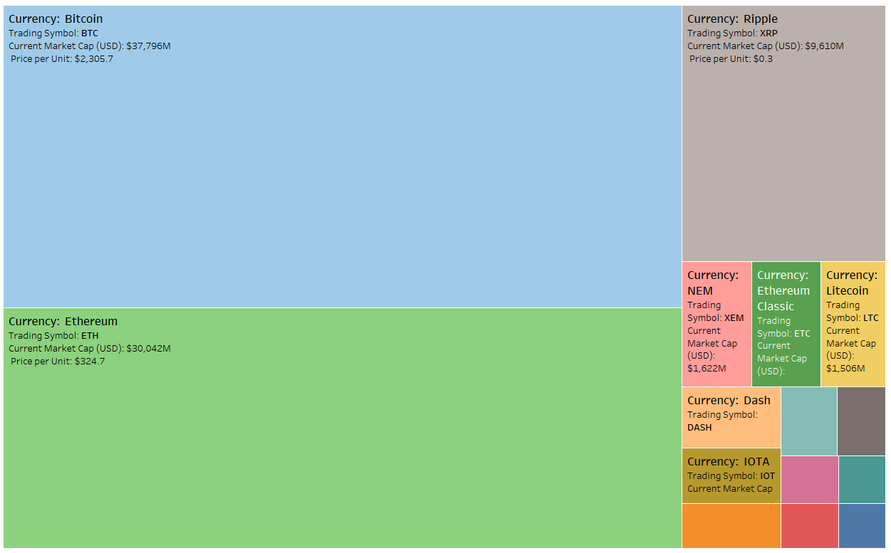
Bitcoin & Ethereum Dominance - Treemap on Market Cap:

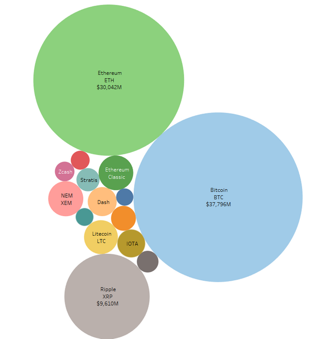
Bitcoin & Ethereum Dominance - Packed Bubbles:

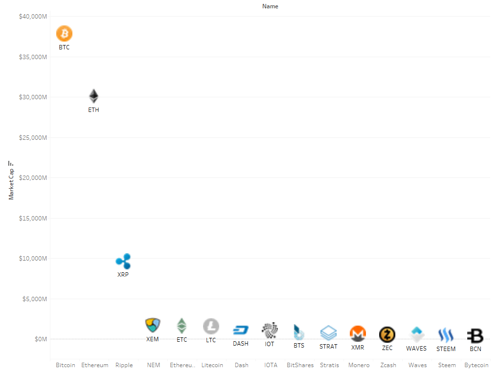
Market Cap w/ Shapes:

I agree with @somethingsubtle. Your on to something great here... More please
thanks @bitcoinbill
let me know what else would be of interest!
Nice graphs. Tableau is pretty awesome.
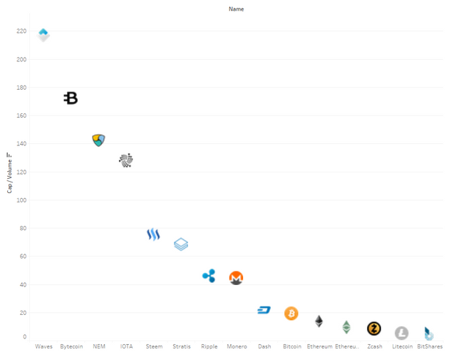
I'd be curious to see a snapshot of MarketCap to Trading Volume, or that ratio over time.
Ask and you shall receive! I'm still looking for a good means to get historical data (there are many APIs out there but I'm no computer whiz so no idea how to leverage), but below is the gross volume (calculated on a per unit), and then below that I normalize it based on price (because obviously we expect more volume for something worth $.01 vs $10000). Bitcoin is still the king!

You can get decent data from bitfinex. (just one place I've found handy) Also this is pretty cool (if not slightly unrelated...): http://github.com/butor/blackbird
Thanks!
Congratulations @canuckpride! You have completed some achievement on Steemit and have been rewarded with new badge(s) :
Click on any badge to view your own Board of Honnor on SteemitBoard.
For more information about SteemitBoard, click here
If you no longer want to receive notifications, reply to this comment with the word
STOPBy upvoting this notification, you can help all Steemit users. Learn how here!
Excellent work. And very much appreciated. 👍