Making Premium Quality Logo for my Thumbnail on Fiverr

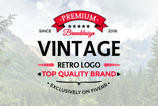
In this post, I want to explain the interesting story of this Premium Quality logo. The logo is design by me for my Fiverr profile gig. This logo is a pure top quality vintage that I have made it form my heart and soul to give the real eye-catching luxury design. The best part of this logo is only text-based and simple that means!
"Simplicity always attracts everybody"
I have made many vintage or retro/badge logo in my life with different style. But every logo has its own identity and means to represent the brand. I have shown many of that on steemit as well. I believe in that if you are a designer and you have to show your work in front of people then it might not possible to get good reviews and work as well.
some people thinks that if I showed my design to other they will surely copy it and make as it. They hidden there design and never shows. But in my point of view, I appreciate the person who likes my work and tries to make it as they can. It clearly shows that people appreciate your work as a designer you must show your work never restricted to just your self and feel free that anyone can be copied it or else.
Let me show you one more Top quality logo!
This is a pure premium quality retro logo That I have made for my thumbnails on Fiverr. Basically, I made this logo as retro or badge type which shows the speed art and for gaming purpose. This retro logo also looks in embossed effect as well as you can see the texture of that logo which demonstrates this premium quality logo.
The Vintage or retro logo is always treated to watch they grab the attraction of the customers especially for Restaurant, Coffee Shops, Hotels, Schools, institutions, business branding, also for great taglines for their business.
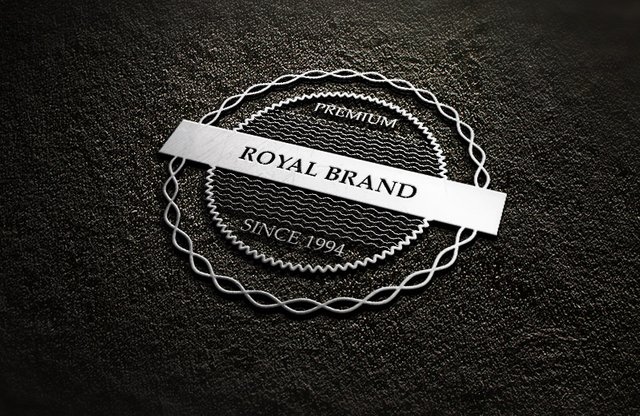
Here is another one logo that I have made in the previous lecture!
As you can see that there are more style and options to try some eye-catching and real premium quality logo. These type of logo are always liked by the people because it's never gonna easy to make such silver texture logo. This logo take a lot of time and give you hard while designing this cool one.
As you know you have to make the silver texture first then you are able to make go further. So you can imagine it that they will take your lot of time.
"But practice makes a man perfect"
You are never being able to design such logo before a lot of practice. So keep the practice of it and enjoy the real pleasure.
Important Note before design this logo!
As you can see ribbons that I already discussed in the previous lecture and I hope you remember it well. Second thing is that used the simple and eye-catching fonts because a logo like this will never be eye-catching if you use the wrong fonts for the wrong place. So be careful and choose the best fonts that are attractive and according to design else it would destroy the whole concept of the design and it might have a chance that no one can like it and you feel bad for it.
I will make the next article on the fonts. Which font is best for that work and according to work tell you which one suit more as well. let's say you use the brushes fonts and you are designing a logo which needs bold text and straight fonts then you are in trouble because you kill the means of that what is the requirement of the work. So think and made a mind mapping before any work.
Here is the link to join this channel for any work or query regards anything that comes to your mind!
Note!
If you want further details about this you are most welcome I will provide you what you are looking for :)
Hope you guys like this interesting article that have never share on the steemit so far keep watching these informative articles to enhance the knowledge about Graphics Designing and art.
Here is the link of my page like please and share it and like it with others
https://www.facebook.com/Graphics-Channel-151412682234319/
Here is the link of my youtube channel "Graphics Channel
https://www.youtube.com/channel/UCSQy1JJthJG3l0MI6RR4Rew/featured?view_as=subscriber
Please Like it share it and also subscribe it
I'm here to showcase my talent in front of you guys need your huge support and motivation. If you guys keep in touch with me and support my work. I surely gonna rock-on the steemit
Please share your valuable feedback about this post. So in future, I will make better as I can. Thanks for your precious time to reading this post
Regards: Aqib Ashiq
CEO of "Graphics Channel, Rainbow Warriors, Cross Technology"
Fiverr profile
https://www.fiverr.com/aqib_ashiq
Facebook Profile
https://www.facebook.com/aqib.ashiq.31
Upwork Profile
https://www.upwork.com/o/profiles/users/_~0169657518d328561e/


nice logo :)
Thanks for appreciation stay in touch for more eye-catching logo
sure....my friend...keep steeming :)
You design so well
Nice logo
Thanks for appreciation O:)
You are welcome
This is awesome... You're good to go 👍
Thanks for appreciation O:)
Excelent post bro..
Thanks for appreciation bro. O:)
You design is simple enough to catch the message that you want to deliver to the common mass
Thanks for the appreciation and for precious time to read this article
welcome
This post has received votes totaling more than $50.00 from the following pay for vote services:
minnowbooster upvote in the amount of $85.14 STU, $164.67 USD.
For a total calculated value of $85 STU, $165 USD before curation, with approx. $21 USD curation being earned by the paid voters.
This information is being presented in the interest of transparency on our platform and is by no means a judgement as to the quality of this post.
i liked this article. Thanks
Thanks for like this article O:)
That's really pretty, i love this kind of style!
Resteemed your article. This article was resteemed because you are part of the New Steemians project. You can learn more about it here: https://steemit.com/introduceyourself/@gaman/new-steemians-project-launch