Graphic Design Class 4 | Colour Combination

How to combine Colours.
Pattern of Combination
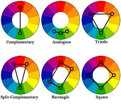
- Complemetary colours combination.
Complementary colours are colours that spice up your dominant colours. In every design, there is a dominant colour, your complementary colour adds more beauty to your design. And these colours are always on the opposite side of your dominant colour in your colour wheel.
- Analogous colour combination.
This position of these colours is contrary to that of complementary, these colour sit next to each other on the colour wheel they look almost alike but have their distinct identity, you can tell this based on “colour code”. Here one colour dominates, the other supports and then one other can accent
- Triadic colours.
These type of colours are strategically and evenly spaced on the colour wheel, one of their major feature is the brightness , harmony and cordial interaction these colour possess such that they can stand out and also appealing to the eyes.
In addition, we also have the split- complementary, Rectangle and square colour combination pattern. The usage can be seen in the image below. You do this by selecting the points/ edges of the as shown in the image
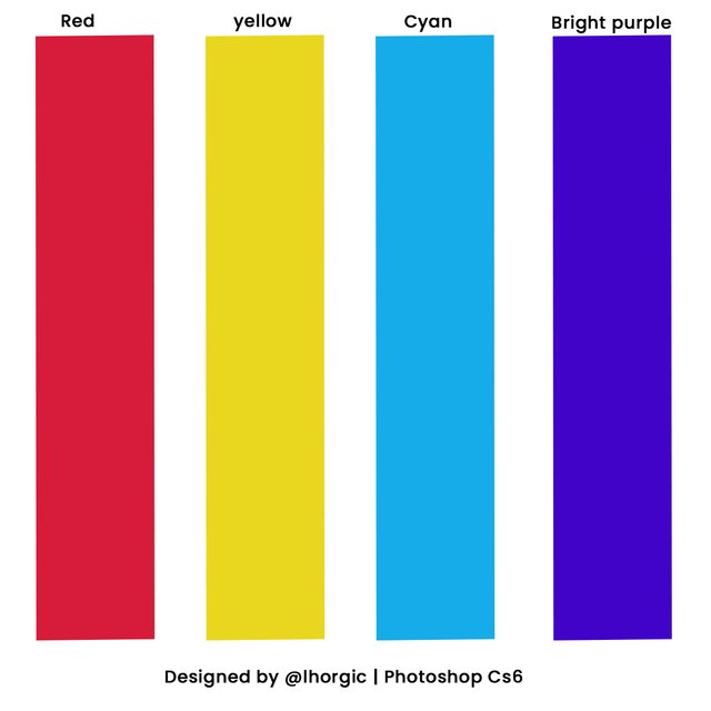
(1) Red, yellow,cyan and bright purple
Hex code: #d71b3b #e8d71e #16acea #4203c9
(2)Mustard and Black .
Hex code: #f3ca20 & #000000

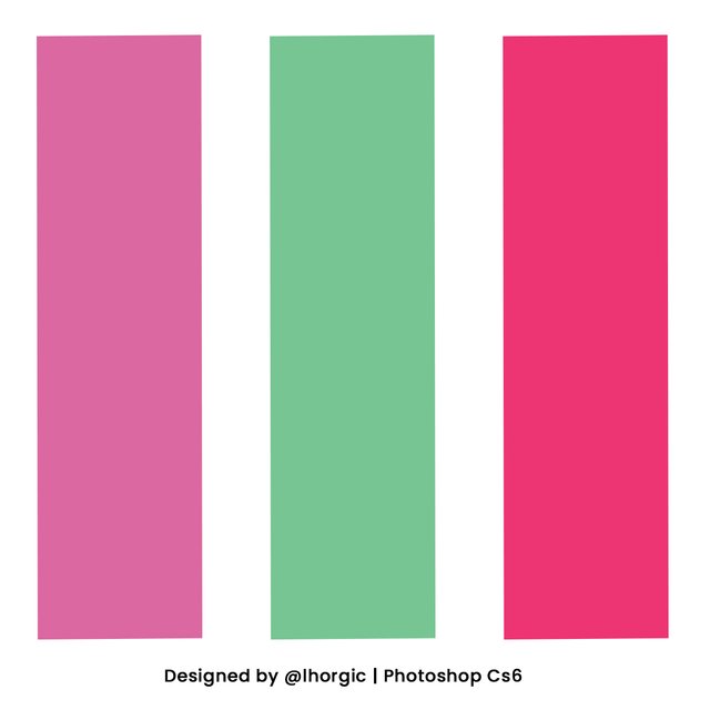
(3) Rouge, Green & Magenta
Hex: #da68a0 #77c593 #ed3572
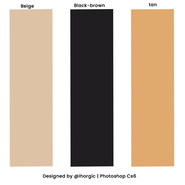
(4) Beige, Brown-brown and Tan
Hex code:#ddc3a5 #201e20 #e0a96d
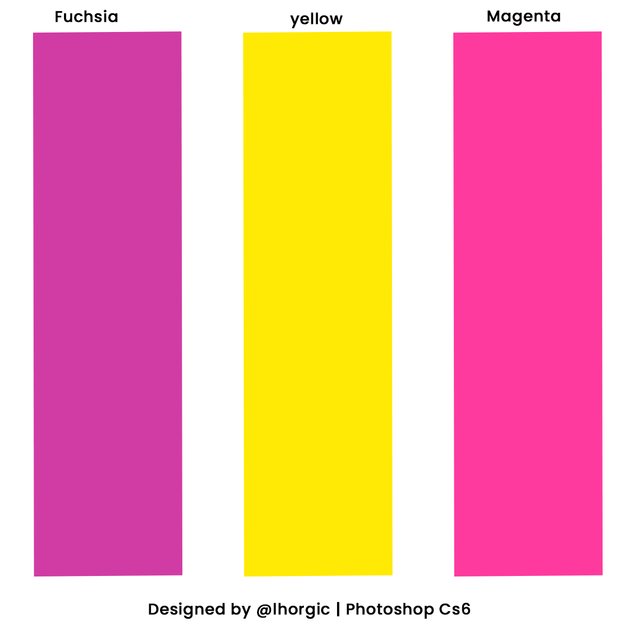
(5)Fuchsia, yellow and Magenta
Hex code: #d13ca4 #ffea04 #fe3a9e
(6) Yellow-green, Olive and forest green
Hex code: #e1dd72 #a8c66c #1b6535.
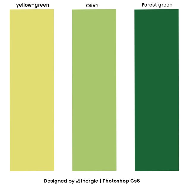
My Example

Conclusion.
Homework
(1) In your own word, explain what you understand by Colour Combination.
(2) Explain in your own words the colour wheel concept
(3) Show with the aid of a screenshot/image 5 more colour combination and their Hex code
(4) Design a simple flier using any appropraite colour combination of your choice.
RULE FOR HOMEWORK.
(1) Give your post the title ; Graphic Design Class 4 | Colour Combination.
(2) Your assignment must be submitted in steem.skillshare community
(3) You have to also tag me in your post for me to easily access it.
(4)Plagiarized content will not be considered
(5)Deadline for submission is 23rd of September.
(6)Use hashtag #lhorgictask
Special regards.
@atim1234
@niglys8
@printskill
@milakz
You have given wonderful information on color combinations and it's code.
Good lecture my dear. Keep up the good work
Colour is always an interesting topic. Before I do my assignment I would to ask for clarification on question number 3… Thank you @lhorgic for this interesting class.
Am sorry am just getting to reply this..I've been a bit busy lately...
Am sorry am just getting to reply this..I've been a bit busy lately...
This is my task teacher
https://steemit.com/hive-197809/@masrull/graphic-design-class-4-or-colour-combination-by-masrull
Good day sir @lhorgic.. Is there possibility for submission tomorrow. I have some personal issues that will limit me from submission today sir
Am Sorry am just replying this @hamzat... we have a time table.we are running with and that what we are following... Tomorrow will just be too late as another lecture will be coming up tomorrow.
I submitted my work just 3 minutes before 12am
Screenshot shows time at 12:01 and assignment submission was 4minutes ago
Hello @lhorgic, here's the link to my assignment post,
https://steemit.com/hive-197809/@stanleynnah/graphic-design-class-4-or-colour-combination
Thanks.
My link sir
https://steemit.com/hive-197809/@dibie/graphic-design-class-4-or-or-colour-combination-or-or-by-dibie
I'm so sorry sir for the late entry.
Here is my entry link please
https://steemit.com/hive-197809/@madilyn02/graphic-design-class-4-or-colour-combination
Entry was made at 11.46 PM, 23rd SEPT. 2021.
I didn't mean to submit so late. Please grade my work.
Here is my entry just few minutes before deadline
https://steemit.com/hive-197809/@hazmat/graphic-design-class-4-or-color-combination