#CLUB5050 - UI/UX Designer Lesson Part 3 by atim1234
Hello guys!!
User interaction with the product will be easier
.Screen designs, buttons, icons, pictures, text, and other visual components such as buttons, icons, images, text, and all other visual elements serve as bridges for product engagement with users.
The Design UI display will undoubtedly promote user engagement with apps or websites, allowing the demands and goals of product users to be satisfied.
And if consumers are happy, this will enhance user loyalty since customers feel at ease with our goods, thus it can be inferred that a decent UI display will be able to compete with other apps or websites.

Sales and Business Growth Will Increase.
.In accordance with why UI is vital, we want users and customers to feel at ease with the goods we build, which improves sales and business growth.
As I indicated in the previous lesson, UI jobs are focused on user happiness and enjoyment, thus a UI designer is very much needed in a firm to promote business progress.

Branding Quality.
.Well, the results of this Design Law should be able to become the hallmark of a product. Because I think that the elements of the UI design that are in accordance with the product concept will certainly be remembered by the user. UI design is not just visually beautiful and pleasing to the eye. but also must reflect the value and quality of a product.

Good User Interface

Then, what is considered to be a good UI Design? A beautiful and good design, like any other, is a matter of perspective, but we must also understand the criteria of a good user interface.
And, in my view, the following are some good User Interface characters:

Clear and Concise.
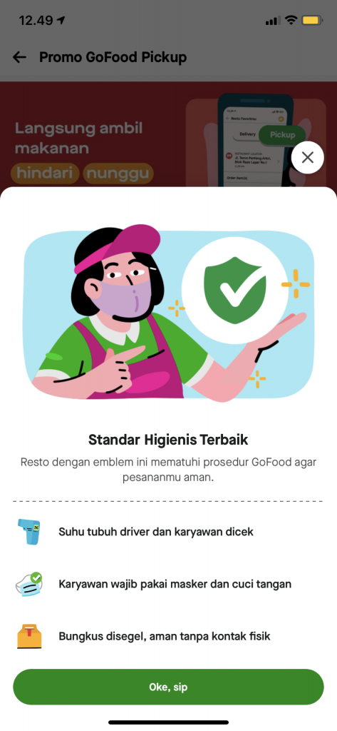
.A good application or website must have a clear and simple design; if you explain your website or application with a lot of rich words, it will seem quite cluttered.
Users will be bored if they have to read extensive explanations, so make them as simple and brief as possible. As an example of an application following:

Source Image
Responsive Design
.
Source Image
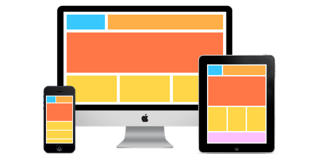
Responsive design refers to the ability of your website or application to be visited on a variety of devices such as desktop and mobile PCs, which will alter the resolution of your device appropriately.
Because a product's interface display will almost probably make it harder for people to see the contents of your website.
Structured Product Information.
.
Source Image
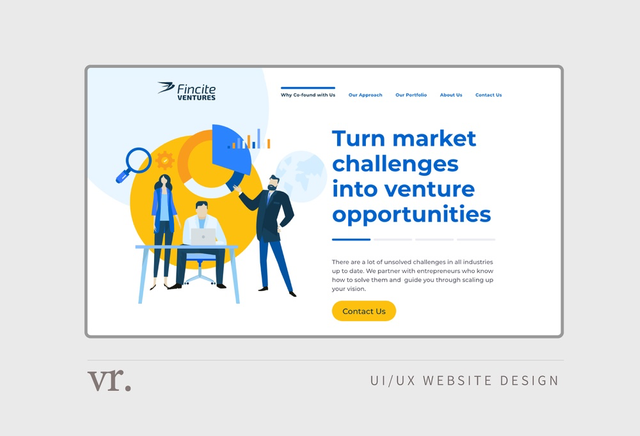
If you show information from apps or websites in a random and overlapping manner, people will have a tough time capturing the information you present.
A smart UI design should use proper font types and colors to arrange information. Highlight the content you want to emphasize by changing the font size or thickness, and avoid including too many unimportant items that will make the design cluttered.
Consistent
.Consistency in UI design means not changing the appearance, elements, and placement features on each page in the application so that a consistent UI will make it easier for users to understand applications and websites and they will easily learn the functions of buttons, icons, and tabs that are on the website or application that you create.
Have Good Color Contrast.
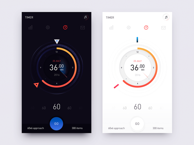
.Color is a very significant component in design, as I have discussed in earlier materials, and this UI design is no exception. If an application or website has almost the same hue, users will find it challenging to capture the information being given.
For example, if you pick white as your backdrop color, make sure your font color contrasts with it. Otherwise, viewers will have difficulty reading the information on your display.
As an example of a UI display, see the image below.:

Source Image
Intuitive
.Intuitive implies that people don't have to think about what they're doing when they use your app or website.
And it is the UI designer's responsibility to consider how people interact with your product and to reduce the time it takes to utilize the product. Users will be able to utilize your product without needing to inquire how to use it.

Well, of course you already know why UI design is important, and what are the characteristics of a good UI design, and in the next lesson I will discuss about the tools that you can use to design UI, and I will make a practice to start designing UI.
Hopefully Helpful, Happy creative!
Thank you
Best Regards To :
@milakz
@daytona475
@papi.mati
@steem.skillshare
My social media
Instagram : https://www.instagram.com/abenk_bolang21/
Facebook : https://www.facebook.com/abenk.bolang21/
Twitter : https://twitter.com/abenkbolang
Email : [email protected]
Join Our Discord


Another great lesson was taught, thanks so much for your kind service to the community.
Thanks for producing this quality post in the community. Please join our discord channel Discord and join our today's meeting at exactly 21: 30 pm UTC prompt.