SEC20/WK5: Graphic Design Hands - On practical 2.
Hello dear friends how are you all? I hope everyone is well by God's grace. I am also very well by the grace of Allah. Today I am here with a contest entry post. The contests running in the fifth week of the Steemit Engagement Challenge Season Twenty are excellent. The teaching contest organized by @lhorgic is, . I am ready to participate in this competition with pleasure. Let's get started.
I first thought to participate here. Then I learned and tried. I have tried to complete the design following the theme mentioned in the course. I will use my efforts and present it through my own creativity. I will present it and add a series of screenshots. Below I will share a series of homework task designs. Below I have mentioned the serial details.
|
|---|
 1 1 | 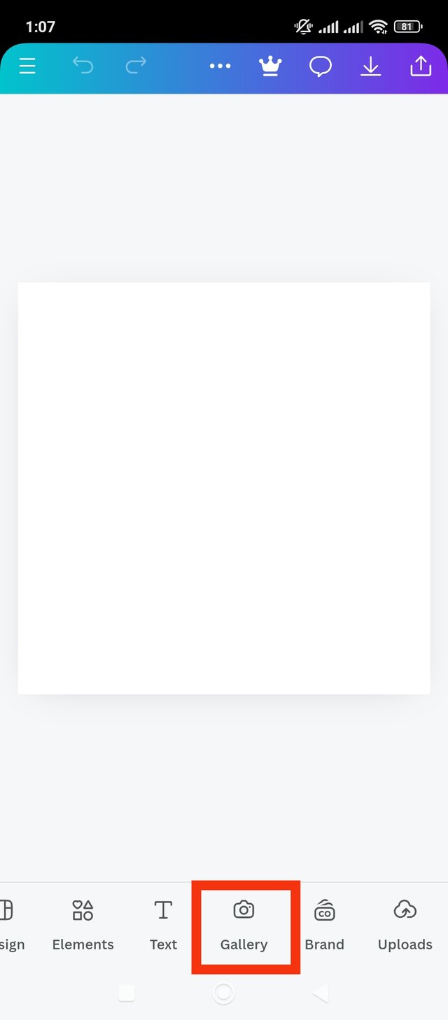 2 2 | 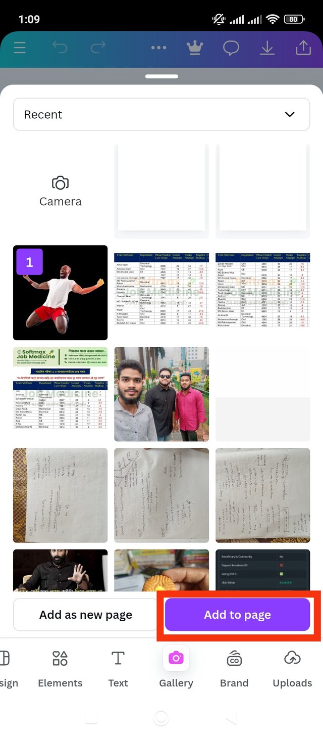 3 3 |
|---|
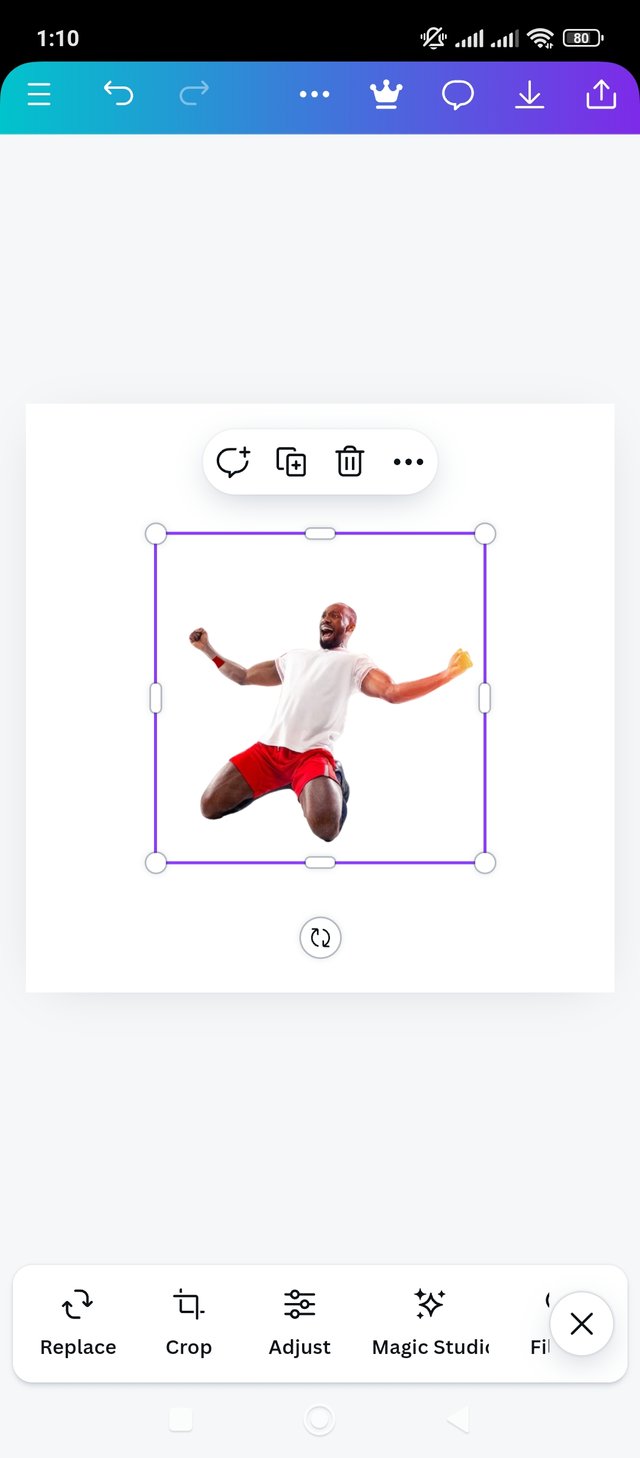
First I opened the Canva app. In the initial stage I completed the process till taking one page. That is, first I took a blank page. I left the page square. Then I will add the suggested image here. For that I have to click on the gallery, which I have marked. After clicking on the gallery I clicked on the suggested image. Then I clicked on the add to page button. Thus I completed the first step.
|
|---|
 1 1 | 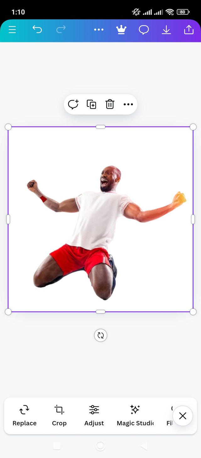 2 2 | 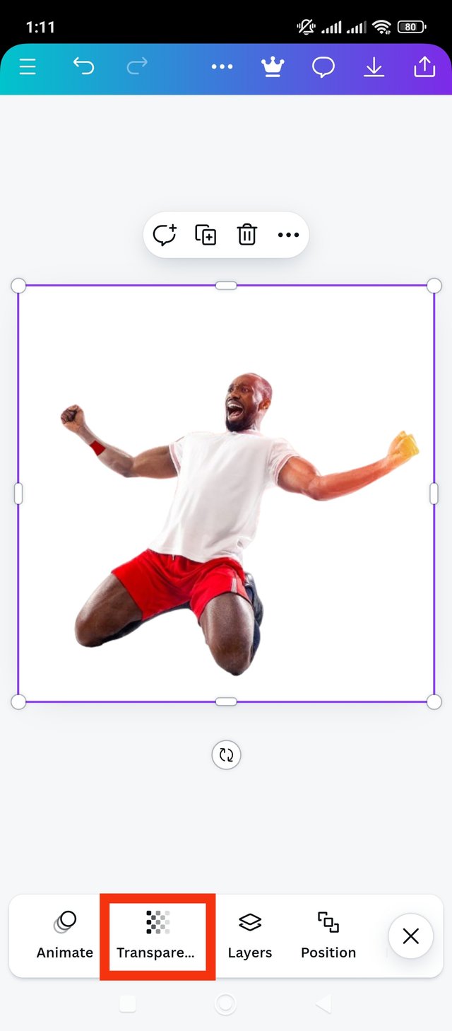 3 3 |
|---|
Notice in this step the featured image is added. Now I will give it the scope I want. I realized that it would fit very well with the entire page. I took a perimeter that was flush with the page. Next I want to lighten or watermark it. I have to click on the transparency button to set the image lightly to the page. I clicked on the transparency button. Second step done, scroll to see next step.
|
|---|
 1 1 | 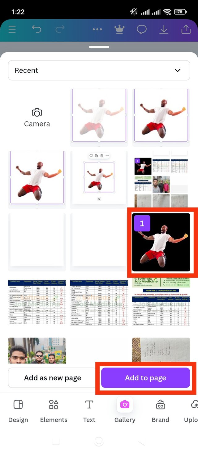 2 2 | 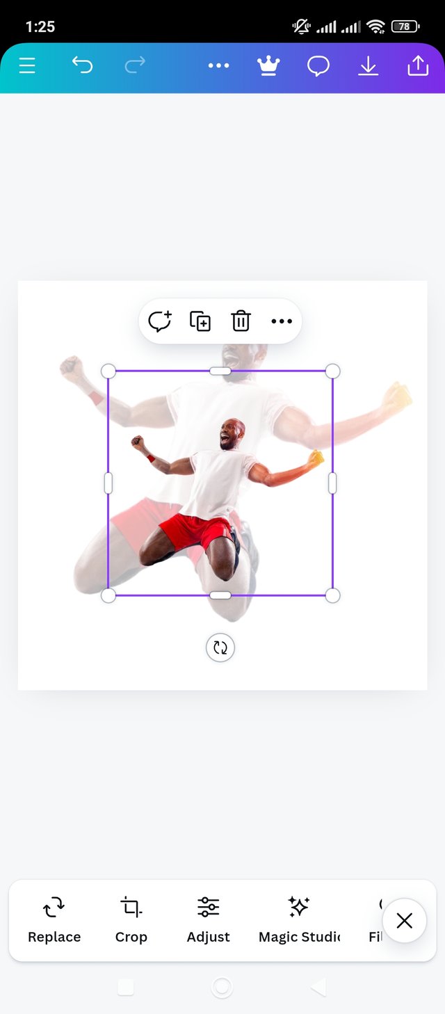 3 3 |
|---|
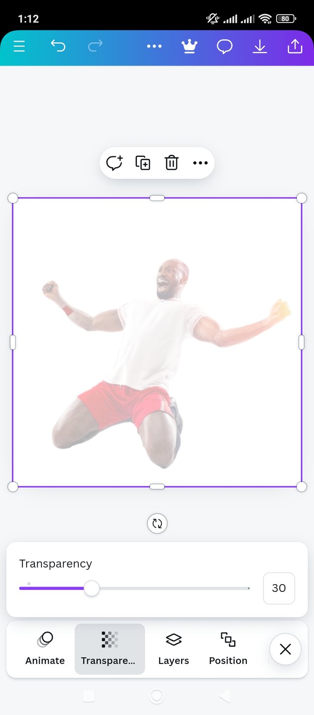
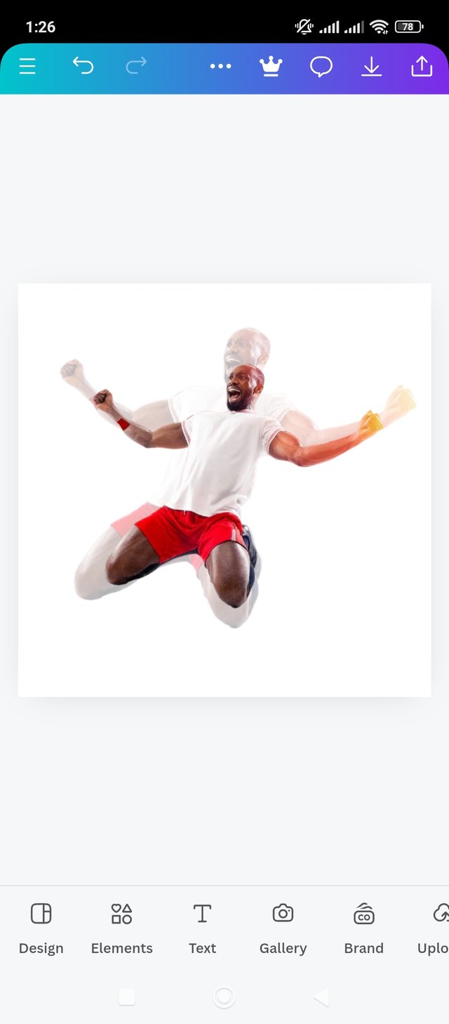
Now it is noticed that the image looks lighter. I set the transparency option manually. I reduced 30 percent out of 100 to make it look nicer and more standard. Anyway now the image will look lighter and watermarked. Then I clicked on the gallery option to add the image again. Then I re-added the image from the gallery to the page. Now it is random I will set it manually. For this let's move on to the next step.
|
|---|
 1 1 | 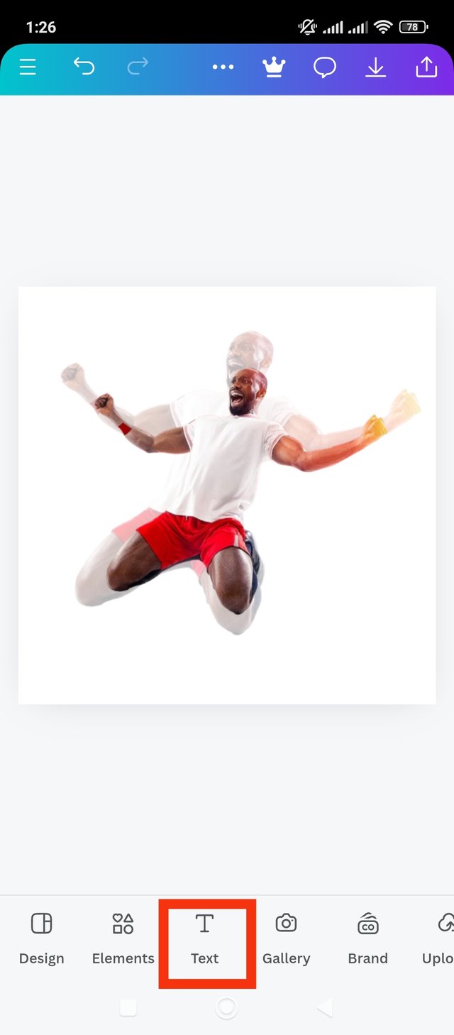 2 2 | 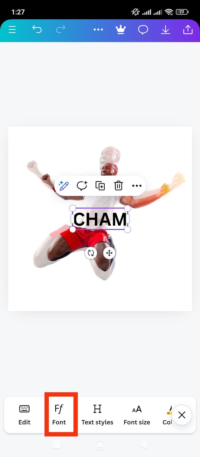 3 3 |
|---|
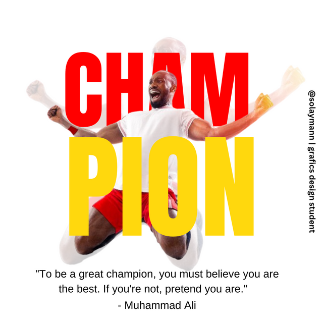
Now I will adjust the image to the background image. It will make the design more beautiful. I scaled the front image down a bit more to match the back image which looks second. I'll add the suggested text here after I adjust the front image. One of the proposed texts is CHAM and the other is PION. I will add the CHAM text first from here. That's why I clicked on the text button. Then I wrote the text CHAM in normal font. Then I clicked on the font option. Then I move on to the next step.
|
|---|
 1 1 | 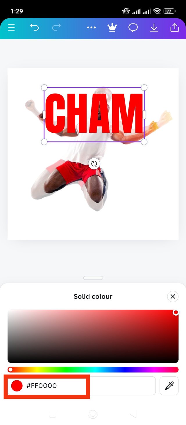 2 2 | 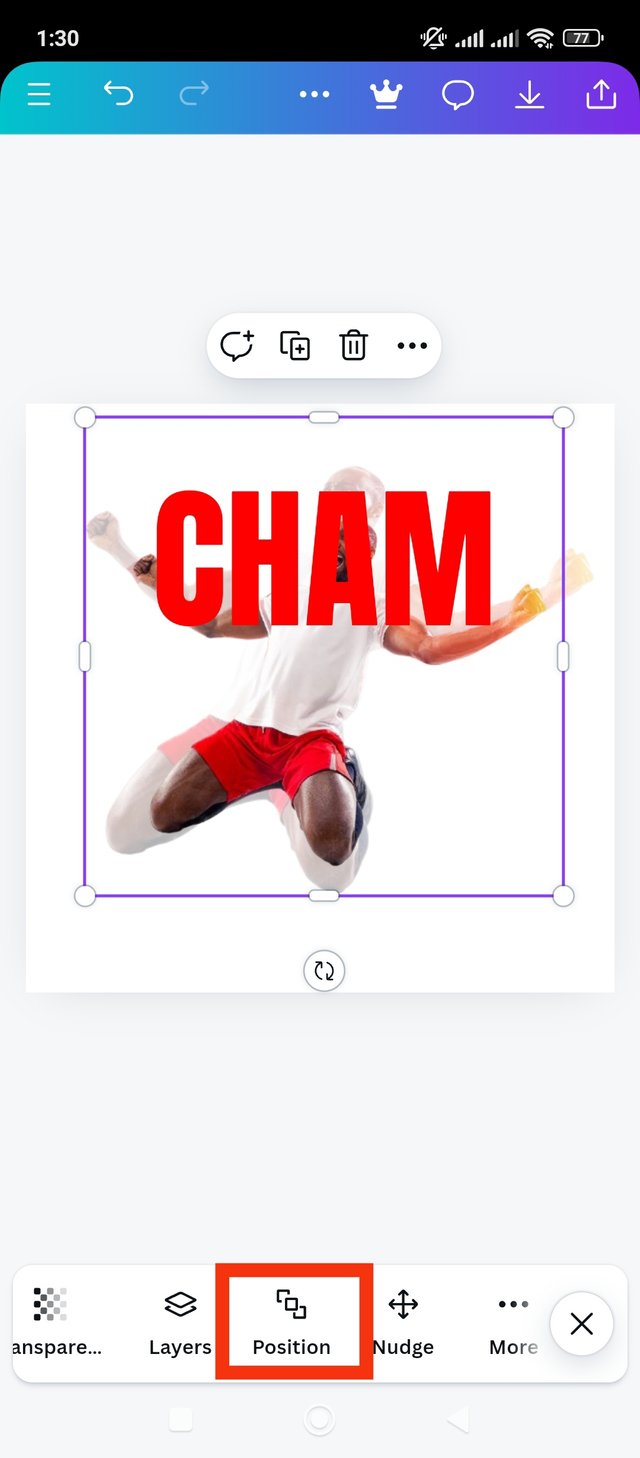 3 3 |
|---|
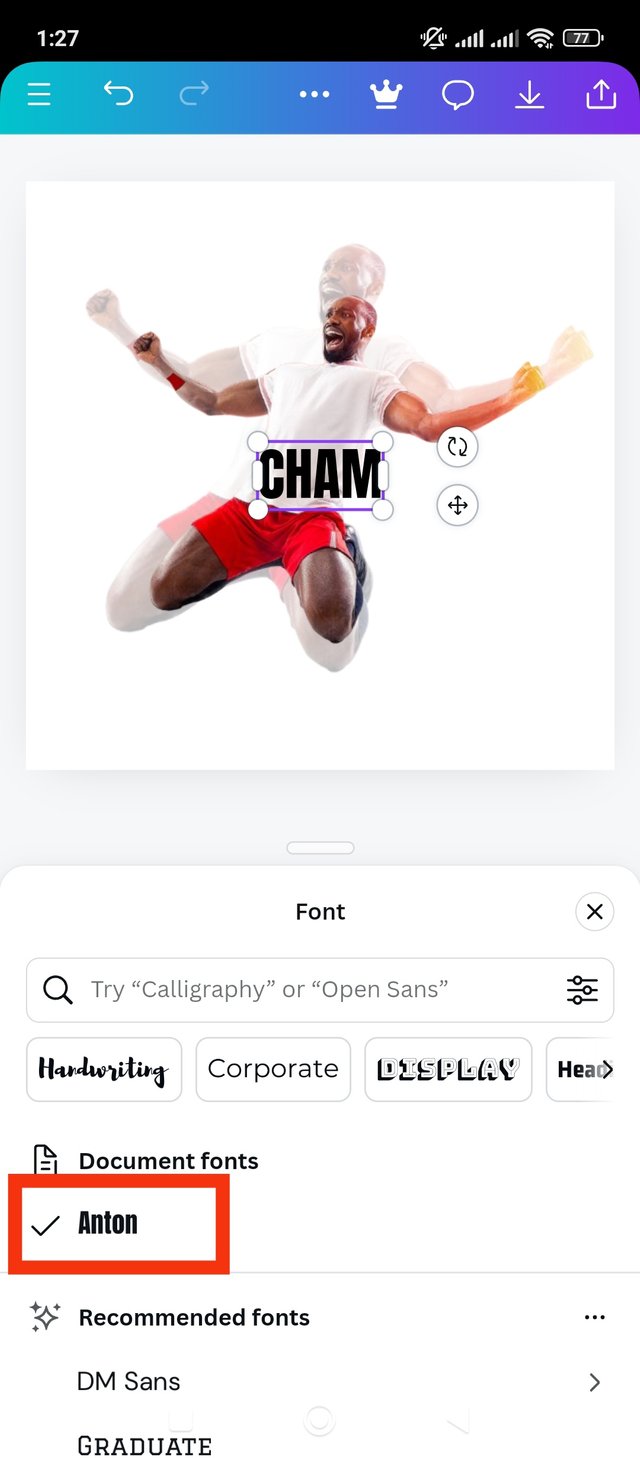
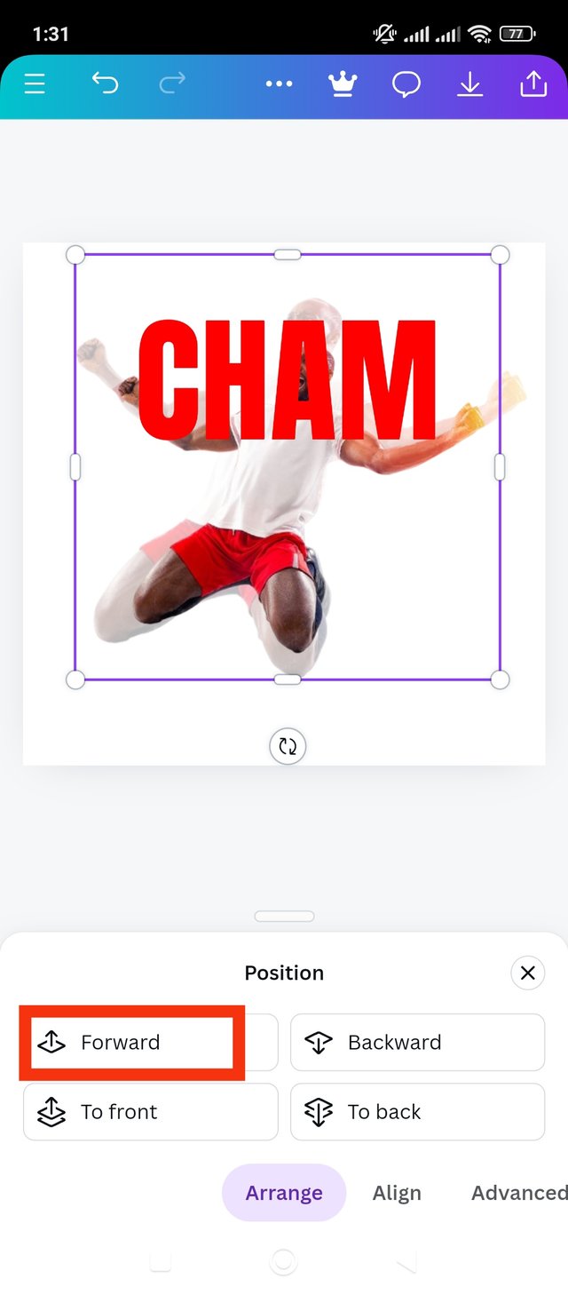
First of this step I will finish using the font. I will use the Anton format in both cases. I liked it quite a bit. Anyway, now I've decided on the font. Then I made the text a little bigger for beauty. Now I will collect its color hexa code. To get the color hex code I click on the color wheel and save the code. I got a color hex code of red which is, #FF0000. Now I will put this CHAM text behind the second image. For that I have to click on the Position button. Then I move on to the next step.
|
|---|
 1 1 | 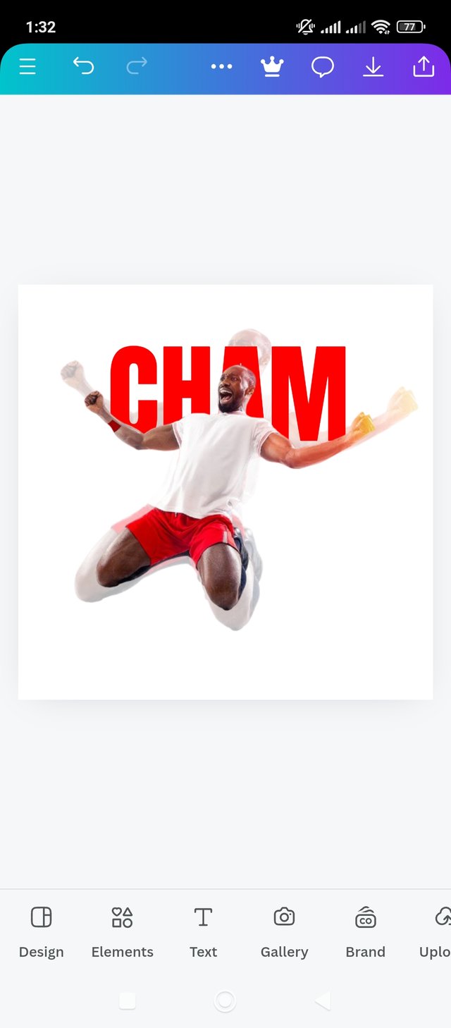 2 2 |
|---|
After clicking on the position button I see four options. Here I identified the buttons according to my function. Since I want to bring the image in front of the text, I clicked on the image and clicked on the forward button. After clicking the forward button, the image will appear in front of the text. Now the text CHAM is positioned behind the image.
|
|---|
 1 1 | 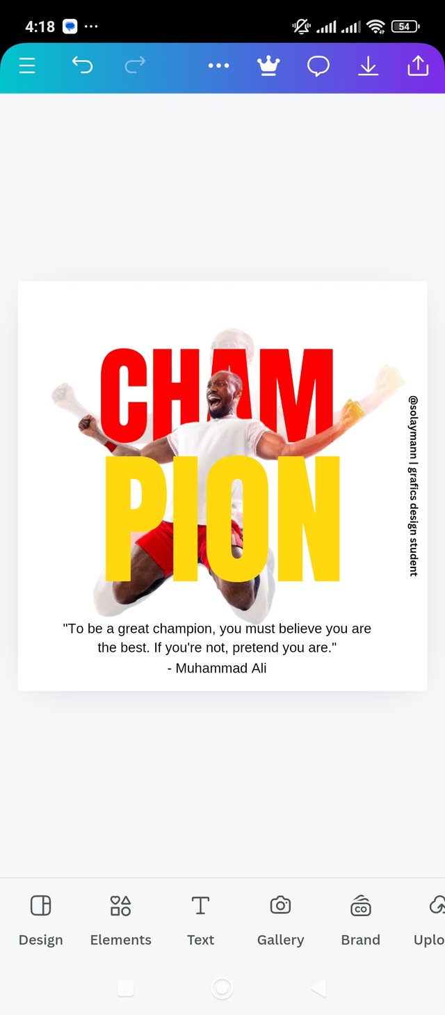 2 2 |
|---|
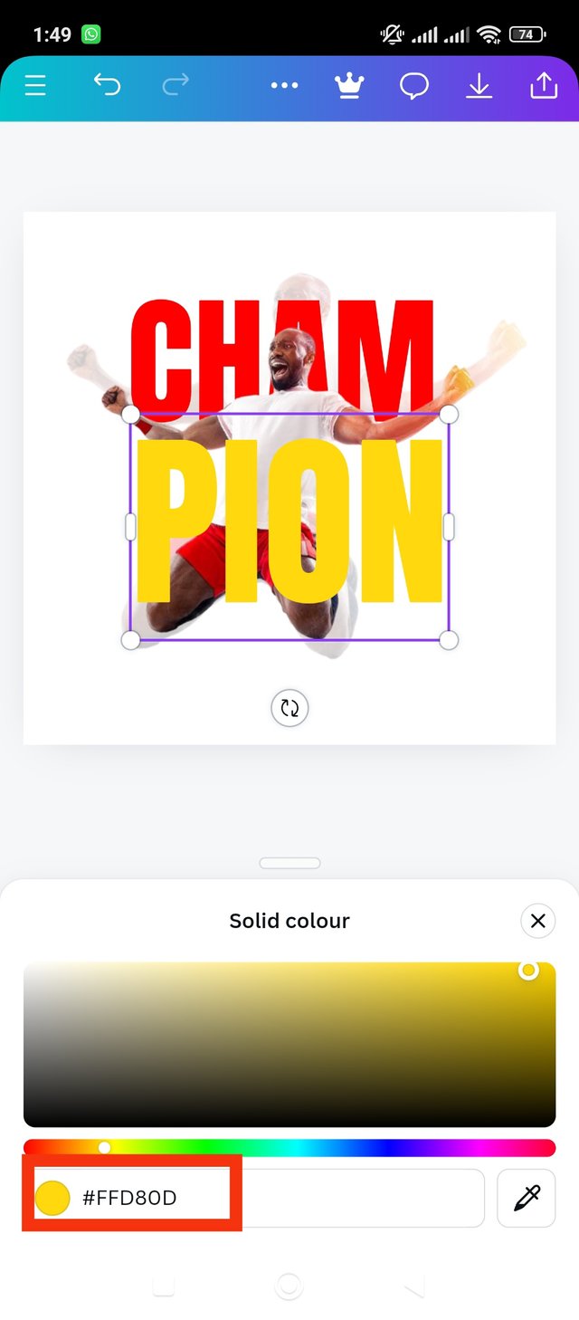
In this step I will set the PION script. That's why I used the same font Anton. so that the two texts look the same. I wrote the text PION in the same font. Then I will add an interesting color to it to make the design more interesting. I used a color like yellow. I must have collected the color hex code of the text to identify the color. I got the color hexa code from the color wheel. The color hex code of PION text is, #FFD80D. Then I added a message for the champions. This quote was taken from Muhammad Ali. The saying is, "To be a great champion, you must believe you are the best. If you're not, pretend you are." Also I added my own username which proves to me that the design is made by me. Then I downloaded the final design.
|
|---|
|
|---|
|
|---|
I try to be very focused in my design. I definitely try to make my work maximally focused and interesting. I have tried to be very focused and well presented to complete this design of mine. I have mentioned the things that I was most focused on to complete this design.
Instructions: I tried to master the instructions given by the teacher before making the design. Because I have completed this design activity from the directions. I love the instructions and tried to use them clearly.
Scope of design: I have used an elegant border to create this design to make it attractive. I have used square ie 1:1 size it should be completely square. And to design with this image I considered square perimeter as best.
type font: I tried to highlight the text that accompanies the design. I was very focused on the writing font to make the writing aesthetic and attractive to the reader. I wanted to use fonts that made the design appealing to look at and read.
Background: I used white as the background here. Because the red text with white stands out attractively. Also, I have used yellow text in front of the proposed image. Because the champion man's jersey was White and red. Above this I added the yellow PION text to make it stand out nicely. I was very focused on the combination of a page with a background on the page.
Proper use of tools.: I was very careful with all the tools I used while creating this design. I tried to make proper use of marked tools while designing each part. Because I want to make the design interesting.
Finally, I would like to say that I spent a lot of time creating this design. Because I tried to present it in the best and interesting way. I tried to convey the design among steemians in a very subtle and simple way.
It is a competition with great talent. I am happy to participate here. So I invite my dear friends to participate in this contest, @stef1 @irawandedy @ripon0630 @kouba01 Hope you enjoy participating here.
| cc: @lhorgic |
|---|
X share link
https://x.com/solaymankabirr/status/1843603607536710052
Upvoted. Thank You for sending some of your rewards to @null. It will make Steem stronger.
@tipu curate
Holisss...
--
This is a manual curation from the @tipU Curation Project.
Upvoted 👌 (Mana: 9/10) Get profit votes with @tipU :)