Making Thumnail || Adobe PhotoShop || Adobe Lightroom || Corel Draw
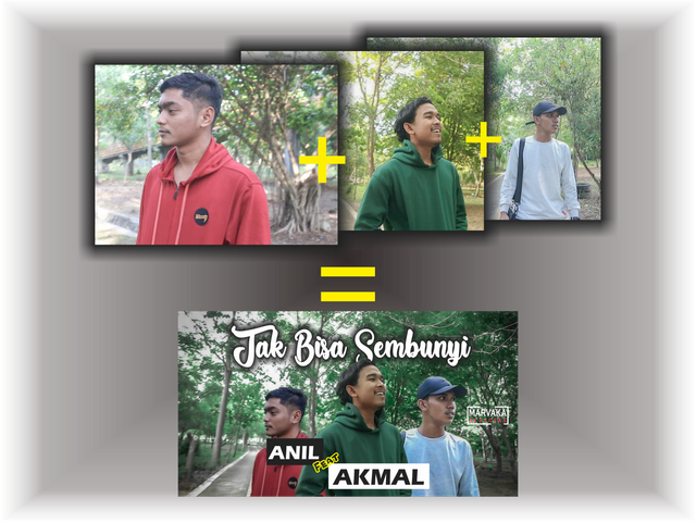
Hello everyone, today I want to share my experience about my activity in designing a thumbnail which I will upload to youtube in my latest project. So as usual, before I design a work, of course I have to get the idea and concept first, in my project this time the concept is very simple, namely combining 3 different objects to become an image that I will use as a thumbnail for my project on YouTube.
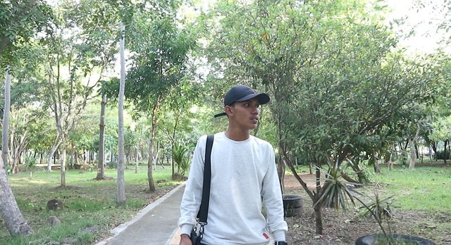
In this project I forgot to take photos of each object that I was going to process, so I had to take it from a video that I shot a few days ago by screenshot, the following is a screenshot of each object that I will use .
1st

2nd

3rd
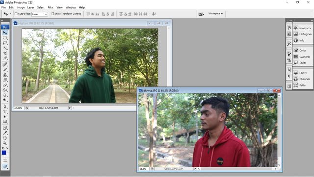
After the material is enough, now I do the process of combining one object with another object. Here I use adobe photoshop cs3 to cut the object, after making the cut I proceed to the process of merging these objects.
Previously, I had arranged for coloring using an android application called Adobe Lightroom CC, why do I prefer to set the color with an application on my smartphone while in Photoshop it can also be done? The answer is because it is simpler and very easy to use, for that I am more interested in using the application on a smartphone than using the Adobe Photoshop application directly in the color setting process.
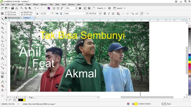
After the coloring is complete, then I combine the previous objects so that it becomes an image as I want, I continue it in another application called Corel Draw. In this application I focus more on designing a text related to the name of the object that I combined earlier and the title of my project. I chose to use Corel Draw because it's easier in terms of making text or writing, whether it's for coloring or shadowing the text.
The materials that I combined in Adobe Photoshop and adjusted the color gradation in adobe lightroom, I did the finishing in this corel draw application, here I added text, set the text color and set the text shadow. This is where I express my creative side, although it is still very far from the word "perfect" but here I try as much as possible.
In addition to the concepts and themes that I really have to pay attention to when designing something, I also have to see where the current trend is leading. Then I combine it with the ideas and concepts that I have got to create a work.
And this is the end result.
In my opinion, the work I have done above has achieved maximum results and I am very satisfied. So what do you all think? Please comment below.
Allright, here's what I can share with everyone about how I design a thumbnail of three different objects and also use three different software
This work of mine can also be seen on my youtube channel MARVAKA OFFICIAL
Thank you