SLC21/WK3: Logo Design - Part 2
Hello, Steemians. I hope you are well and doing great. By the grace of Almighty, I am also fine. Today, with the post, I am going to entry in the SLC21/WK3: Logo Design - Part 2 contest run by our beloved Professor @lhorgic. Let's move to the main point.
| Discuss about each of the logo types we have and then talk about conditions when such logo should be used and when not to be used for a brand. You can do a little research to aid you. |
|---|
Let's talk about all the types of logos discussed in this lesson.
WordMark Logos
Wordmark, aka logotype, is a kind of Typographic logo where a brand uses only its name with a distinct font to grab the attention of people. Very well-known brands can do so that they don't need any slogans to get attention. Perfect examples are NOKIA, Canon, WALTON, etc.
When To Use
- Short brand name.
- Renowned Brand.
- To show a formal vibe.
When Not To Use
- Bigger Brand Name.
- New or Meta obscure brand.
- Brands related to cultural activities, sports, and foods.
Monogram Logo
Monogram, aka lettermark, is another type of typography. But this time, instead of the full name of the brand, use the initial name. When the brand name is too long and can't fit in Wordmark, that time brands use a monogram or later mark for the logo. Perfect examples are LG, CNN, BBC, etc.
When To Use
Almost similar to the wordmark. But most of the time, it is used if the brand is too long.
- Long brand name.
- Renowned Brand.
- To show a formal vibe.
When Not To Use
- Short Brand Name. Because it may create confusion.
- New or obscure brand.
- Brands related to cultural activities, sports, and foods.
A brandmark logo
A brandmark or Pictorial logo is that kind of where a brand uses only an icon or image for its identity. It's a very unique way to introduce a brand. However, it requires advanced knowledge of logo design and brainwork. Perfect examples are Twitter and Windows.
When To Use
- Famous or Renowned Brand.
- Travel Agencies.
- Cultural Related.
- Technology Related.
When Not To Use
- New or obscure Brand.
- Sports Related.
Abstract logo
The abstract is a similar kind of logo to the pictorial. But it’s usually generated from an icon or image. Which gives a different vibe than pictorial. Perfect examples are Facebook, WhatsApp, and Instagram.
When To Use
- Famous and renowned Brand.
- Technology Related.
- Sports Related.
- Food Related.
- Medicine Related.
When Not To Use
- New or Obscure brand.
- Bank and Financial.
Mascot Logos
The mascot is the kind of logo that a brand uses in the drawing format of a mascot.
When To Use
- Food, especially Protein item business.
- Kids-related business. Like Toy, Dress, etc.
- New or obscure brands can go for this.
- Media Related.
When Not To Use
- Financial Services.
- Education Related.
Emblem Logos
Emblem Logo is where a brand uses the symbol or mark to create their Identity. It’s very common in the Sports Sector.
When To Use
- Best for Sports.
- Vehicle Producers.
- Toy Makers.
When Not To Use
- Financial Services.
- Medicine Related.
Combination logos
Combination logos are a mix of Typography and Pictorial logos. This is a popular option. Because the combination logo is for all. It’s fit with almost everything.
So, When To Use and When Not To Use is not applicable in my point of view.
| Pick any two (2) of the Logo types discussed and then practically demonstrate how to make them, showing your detailed process. |
|---|
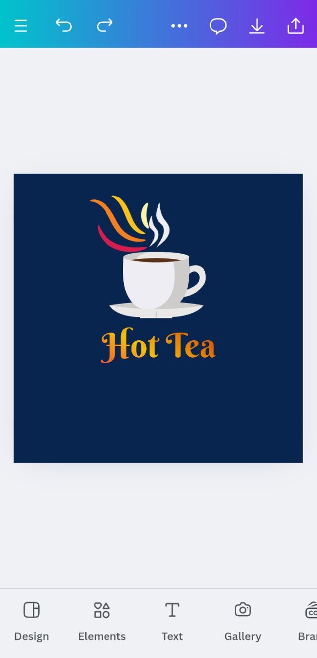
I choose Combination Logo first for a Cafe. The name of the cafe is Hot Tea. Let's discuss how I completed my job.
Step 1
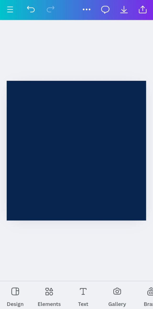
I open my Canva and select Logo 500x500. Select a dark background that is soft for the eyes.
Step 2
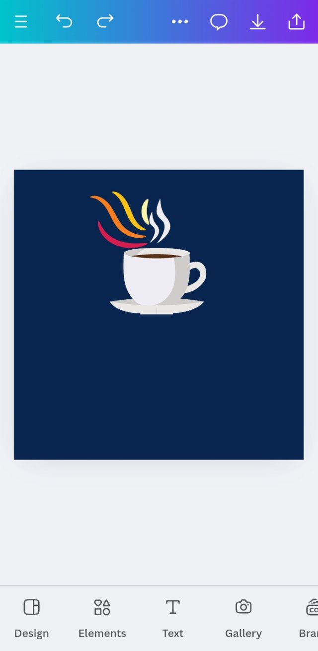
It's the logo of a cafe. So, I put a Tea Cup element on it. Aligned it in the center.
Step 3
I put the brand name down on the icon. It’s a cafe. So I used the Gradient Type option which I learned in the 1st lesson. I tried to give a vibe with colors similar to fire.
Step 4
A cafe isn’t required to have a slogan. But the logo doesn’t provide enough data. So I put the type of brand down after the brand name.

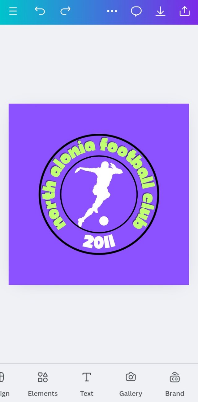
My job is done here. Now, for the next one, it's a sports club. So, I like the Emblem Logo for that.
Step 1
I open my Canva and select Logo 500x500. Select a dark background that is soft for the eyes.
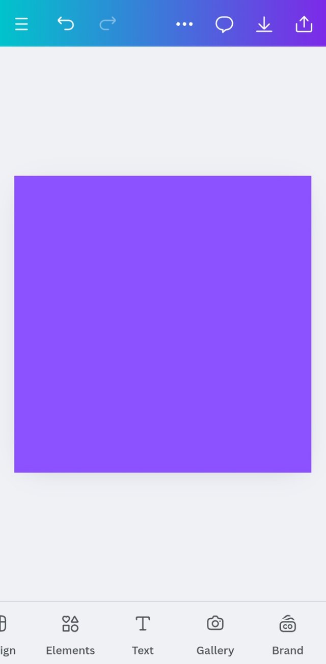
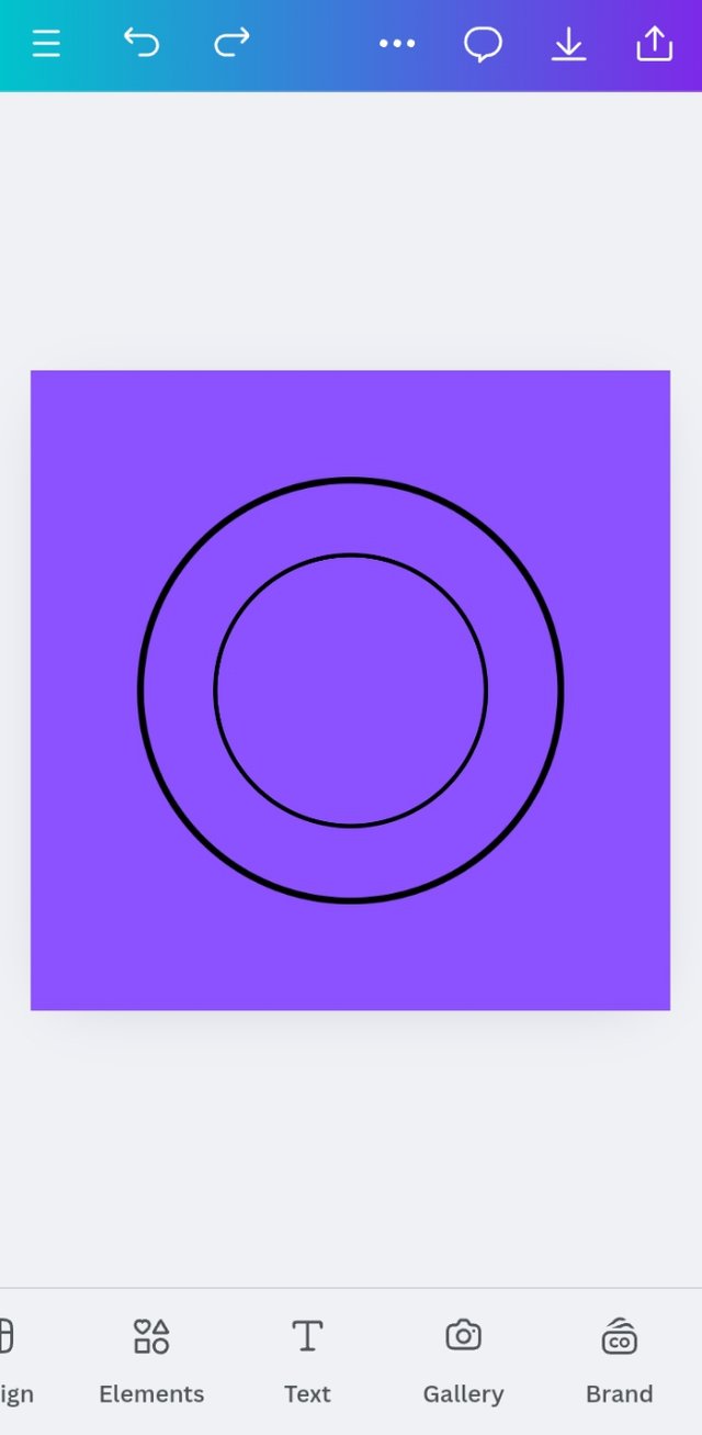
Step 2 To make an Emblem Logo, I put two circles in the center of the logo.
Step 3
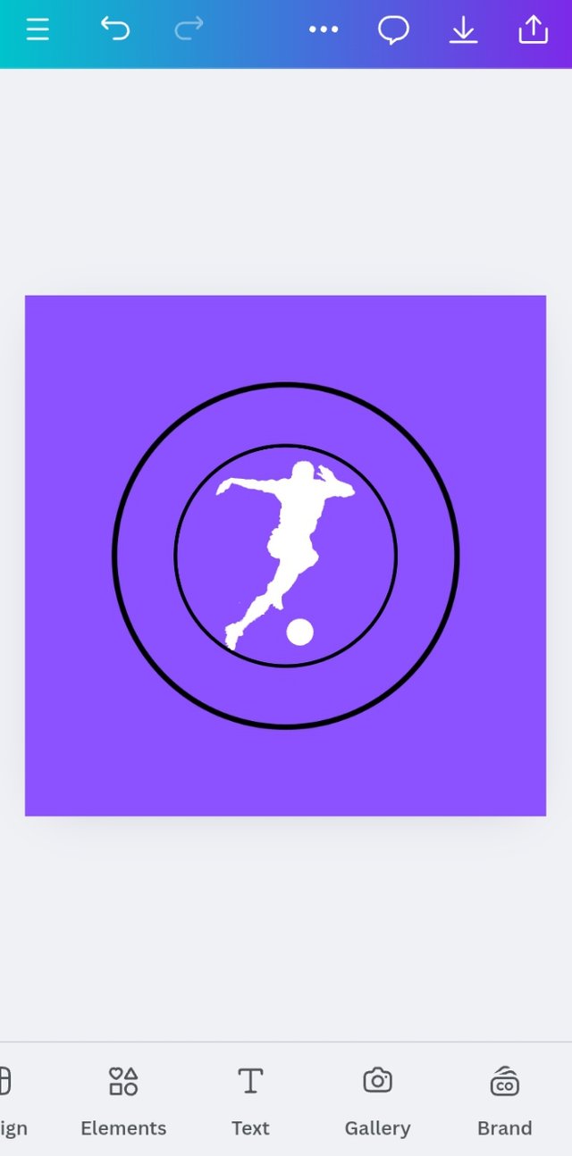
It’s a Football club. So I put an icon of a Footballer in the middle of the circle.
Step 4
I put the name of the Club (or Brand) between the two circles I put earlier. The name provided enough data about the brand. So, I didn’t need to do anything more. To make it more beautiful, I put the established year of the Brand.
| Design a simple flier for your brand and then strategically place one of the logo you made in the flier. |
|---|
