Steemit Learning Club S23W1: Charts created with Microsoft Excel.
Steemian Friends,
Today, I will write a learning post for Steemit Learning Club, new Idea Club Mentor @kafio @mohammadfaisal @alejos7ven Sir Technology and Development Club. Today, I am going to write about a very simple but important topic for the Steemit platform. Different types of reports have to be created on the Steemit platform. Charts using Microsoft Excel or PowerPoint to create reports make very beautiful reports. So, I have shown below step-by-step instructions on creating charts for new users and users who can't create charts. Hope everyone can make charts by reading my post.
Today, I will show you how to create a chart in Microsoft Excel. We create various types of reports on the Steemit platform, such as contest results, engagement challenge summaries, and charts for curator reporting. However, a new user or most users on the Steemit platform cannot create charts. So, I have shown you step-by-step how to create a chart below.
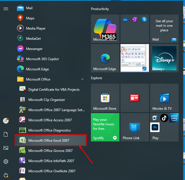
First, I open the Excel seat of my computer. I click on the start bar on the left side of the computer screen. Then, I have Microsoft Excel 2007 set up on my computer, so I click on Microsoft Excel 2007. In the picture, I have shown the red colour block.
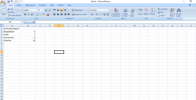
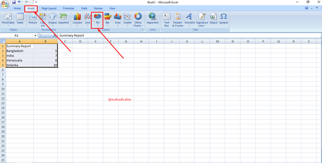
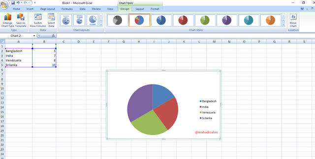
Then, I create a table in Microsoft Excel. I have named the four countries and given the number of users who participated in the contest. Then, I click Insert from the toolbar at the top of Microsoft Excel. Then, I see different types of charts. I have shown it as a red block in the picture below.
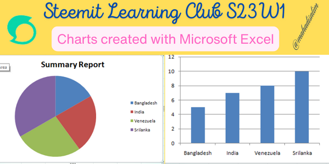
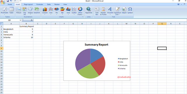
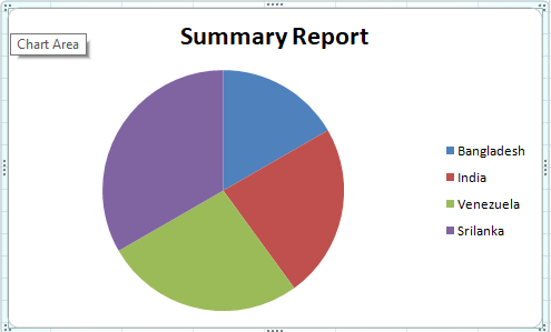
Then I click on the Pie chart from the chart. A 2D pie chart is created based on the data provided in my Microsoft Excel sheet. Then, I use a title called Summary Report. I have shown it as a red block in the picture below.
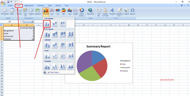
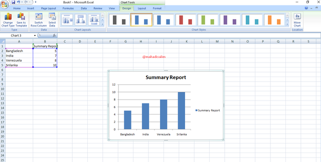
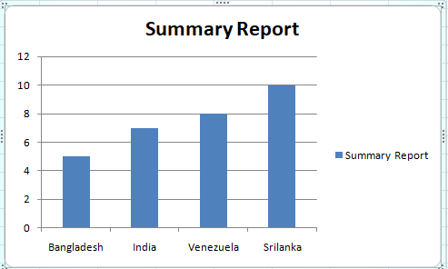
Then, I click on Insert again to create the column chart. Then, I click on Column Chart from the Chart Toolbar. Here, you can create charts in 2D and 3D format. I have created 2D charts and shown them. I have shown it as a red block in the picture below.
In the above way, we can generate different types of summary reports in chart form. We can also create different types of charts with Microsoft PowerPoint if we want. Now, we can use different text colours from the top toolbars. I hope everyone likes and benefits from my chart creation.
| SL No. | My Invited Steemit Friends |
|---|---|
| 1 | @wirngo |
| 2 | @rmm31 |
| 3 | @lirvic |


This is my Twitter share link :
https://twitter.com/mahadih83660186/status/1892279209122525473?t=J_wwVBwJ4bOOVltqc_eYWQ&s=19
I will agree with you that many of us do not know to use excel to create charts for the reports or any kind of data. Thanks for sharing this guide to create pie chart and bar chart.