Breaking down new changes in SteemPro
Hello, SteemPro Enthusiasts
For the past few weeks, our team has made many design changes and fixed bugs in SteemPro. I am here today to break down all the changes in a simple way. As you all know SteemPro is an open-source project means you can read or request changes at any time.
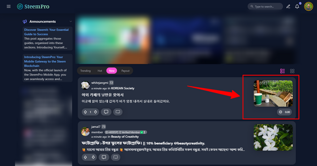
The first major change is in the design of the List-style feeds, a thumbnail of posts is now bigger in list view and also it's navigatable to the post directly.
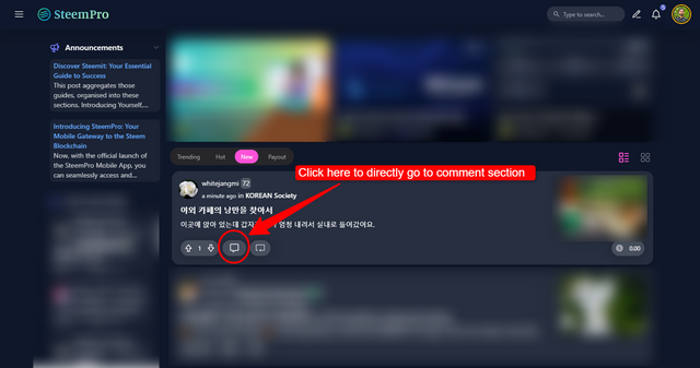
Secondly, we add open the comment section directly from the feed comment button. You can simply click on the comment button in the feed and it will take you to the post comment section and load the comment automatically.
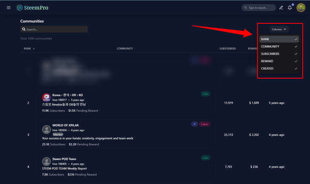
Third, we add the column filter for the communities page so that users can easily sort the community by subscribers, rank, or pending reward.
Last but not least the Post page receives visual improvements with shifted side sections for a more enjoyable reading experience focused on post content. The hideable "Read more" section saves your settings locally to remember your choice for future posts.
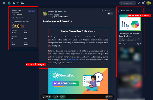
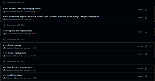
there are also other design and bug fixes, You can read all the changes here
https://github.com/faisalamin9696/steempro-next/commits/master
We are very thankful to @steemchiller for providing a deep insight into the design.
GitHub Repository (Public)
https://github.com/faisalamin9696/steempro-next
Visit here.
https://www.steempro.comSteemPro Official Discord Server
https://discord.gg/Bsf98vMg6U
Experience the future of blogging with SteemPro Blogs today!
Cc:
@steemchiller
@pennsif
@steemcurator01
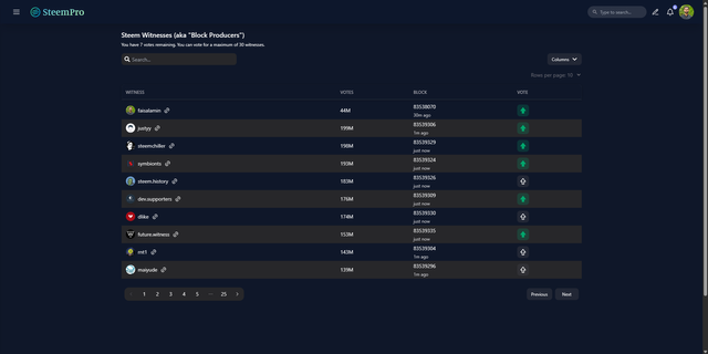
https://www.steempro.com/witnesses
VOTE @faisalamin as witness
Upvoted! Thank you for supporting witness @jswit.