👨💻 #Proposal-89: Reskin
It's been a long time since I've shared anything dev. related with my last update hidden amongst a load of other ramblings. Since funding's restarted with a renewed expectation of regular updates, here's an update.
As expected, the deliverables for this proposal will be more heavily weighted towards the back end (i.e. now until the end of February). I was able to cram a lot in to the initial deliverable which included the new expense of paying a professional designer - whose contribution made a significant difference to the quality of the output.
My designer's now focussing his efforts on a complete reskin - completely modernising the UI (User Interface) whilst we're both working on improving the UX (User Experience) in the process where possible. Given the proposal's name is "Modernise steemit.com Interface" rather than "add new features and fix bugs", this makes a lot of sense.
Keeping things simple, we're working from top to bottom on the most impactful pages. So far, we have reviewed the existing MastHead and come up with the below for a variety of resolutions. Please share any feedback that you have for the below:


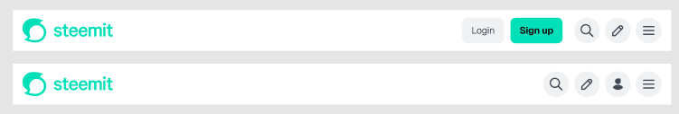


All screenshots are taken from Figma which is our preferred design tool for sharing and communicating with each other.

Before funding was paused, we'd also been looking at the use of fonts and the layout of the main feeds. This is still very much a work in progress so is subject to more significant change.


As you can imagine, there's a lot to do between now and the end of February which once complete, should mean that steemit.com is in a good position design-wise for a long time (hopefully not another 10 years but just in case!)
It's surprising to see so few comments here, especially considering that people have been complaining for years about the outdated interface, the stagnation, and the fact that nothing is being developed or updated.
I agree with @chriddi about price charts. They could be placed in a less visible place, giving the space they currently occupy to some more useful information for the reader and blogger. But these are minor things. In general, when your proposal was first approved, I think people expected more visual changes than functional ones. You took on much more necessary things - improving user interaction with the site. Probably not everyone understood how much was done and how much time and effort it required. Perhaps if you just changed a few colors, it would be more noticeable to a wide range of Steemit users 😁
It was a good idea to get the designer involved. Unfortunately, I don't think you'll have time to implement the changes before the offer expires. Except for a few cosmetic changes. Despite this, I think you've done a lot to make Steemit more attractive and user-friendly.
So, what would I advise? In the little time that remains, try to update the appearance of the site template (if there is one, if I understand the structure of this site correctly). To do this, it is probably enough to round the corners, experiment with the color scheme and fonts. It would be good to display some useful information for readers in the right field. For example, the best authors or the latest most interesting articles. But currently there is no such functionality on the site. In addition, it is impossible to automatically determine the best authors. The easiest way to do this is by earned rewards, but the biggest rewards go far from the best authors.
Alternatively, you could give authors the opportunity to promote their posts by placing them in a visible place, for burning SBD or STEEM, but this is probably difficult to implement.
In any case, if you manage to change/improve anything, that would be great. I wish you inspiration! 😊
0.00 SBD,
4.65 STEEM,
4.65 SP
I think that Steemit's at a point where a lack of comments is to be expected so thanks to you and @chriddi for taking the time to reply.
Using the right column for promoted posts is an interesting idea and one that should be seriously considered. In the article view, I'd like to move the author details there (which is what I think Medium do) to give them more prominence. Similarly, the opportunity to browse that user's other content.
We'll have to wait and see what the next 5 months brings - the project isn't currently being funded and I have an opportunity in the real world coming up that I can commit more time to now than I'd initially expected.
0.00 SBD,
0.00 STEEM,
0.83 SP
I've been looking at all the images for quite a while now, but I'm not entirely sure what your question is. Hmm.
In the first image, I prefer the second part (with the person icon).
I'm not so keen on the eye-catching green ‘sign up’ sign. But I suppose it's necessary in case someone happens to stumble across this site.
I can't say anything about the typeface; the differences are just nuances to me. Just go with the one that fits best with the overall screen.
As far as I'm concerned, there doesn't need to be crypto charts on the right-hand side. Anyone who needs that kind of information can click elsewhere. The focus should be on the articles. Yep, I prefer the wide version.
Anything else? Please ask me specifically.
February. A sporty goal! You can do it... 😘
0.00 SBD,
4.53 STEEM,
4.53 SP
🙂 Thanks for taking the time to reply... There wasn't really a specific question, more a "show and tell" and opportunity for the community to share some thoughts.
The addition of the person icon was to differentiate between logged out and logged in state - so the person icon is there to provide the existing avatar menu.
I agree with the crypto charts - I don't really see the point either but I'm hesitant to remove something that was presumably included for a reason... even if I don't know what that reason is.
Ha ha! I suspect we won't as I don't expect the funding to return again. I need to clean the gutters now before the rain comes tomorrow 🧹
0.00 SBD,
0.73 STEEM,
0.73 SP
Hello @chriddi! 👋
Congratulations!! Your post has been upvoted through steemcurator07. We support quality posts and comments throughout the platform. We encourage you to publish creative and quality content.
Upvoted! Thank you for supporting witness @jswit.
Interesting update. So, the result of five months’ work is… a designer’s Figma? Well, at least we all got to enjoy some nice visuals. But as a full-time developer, what exactly have you been doing during that time? Watching over the designer as a new “job role”?
And now the plan is to implement those mockups into the frontend by February 2026? Impressive. Turning what looks like under ten pages into a half-year odyssey do you perhaps hand-craft your code with a calligraphy brush?
If you really want to show proper results, then please share the actual Figma link, not just screenshots. And while you’re at it, how about also sharing the development work you personally completed during this period? Surely it wasn’t “nothing,” right?
At this point, it honestly looks like you’re just dressing up the same story to pocket 40–50K SBD every year. Unless, of course, your true ambition is to pioneer a brand-new genre the Infinite Reskin Project. If so, congratulations that is original.
It's always nice for Steemit's biggest hypocrite to share his opinion.
It's Web4. You wouldn't understand.
I should've used your designer, then it could look like this and you'd be happy