SLC | S21W 3 | Logo Design - Part 2
 |
|---|
Greetings friends and welcome to another week on logo studies as in this week's topic we look at the different types of logos. I trust you will stay true to the end as there is something for everyone. Without further ado, let's get into steam, shall we?
Discuss about each of the logo types we have and then talk about conditions when such logo should be used and when not to be used for a brand. You can do a little research to aid you. |
|---|
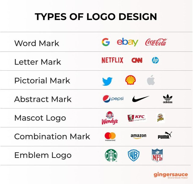
From the lesson this week, I was able to take a deeper look into the different type of logos we have, not forgetting when to use and when not to use the various types of logos. Like the lesson clearly stated, understanding this aspect of logos is crucial for anyone looking to create a brand identity that resonates with their audience. In that case, here are the logo types I've come to learn about;
 |
|---|
WORDMARK LOGOS
These are types of logos that make use of only the company or brand name, while paying more attention to the typeface, font and topography used. They are great to use when your brand name is unique, short and catchy. A good example is Google, where the name itself is memorable. However, if your brand name is long or difficult to spell, I am made to understand that wordmark logo might not be the best choice, as it could confuse potential customers who might not remember how to write it correctly.
LETTERMARK (MONOGRAM) LOGOS
Lettermark or monogram logos are logos that are made by using the initials of brand or company name. for example IBM (International Business Machine Cooperation) or HP (Hawlett-Packard).
These types of logos are considered to be very useful when your brand name is long and hard to remember. Although even brands with shorter names like Netflix seem to use it.
Therefore by using their initials IBM and HP, they simplify things and makes it easier for people to recall the brand. However, if your initials don’t convey much about your business, it might also leave your potential customers confused. Hence, in such cases, a more descriptive logo could be better.
PICTORIAL (BRANDMARK) LOGOS
These types of logos tend to use simple images or symbols to represent a brand without any text, but are well designed to be memorable and recognized easily. Examples of such logos include the Apple and Nike logos.
These types of logos are usually used by brands that want to create a strong visual identity without relying on words. They are usually very effective if the image is simple and easily recognizable. However, if the image does not relate with the brand or is too complicated, it leads to potential customers confusion instead of helping them remember your business. Hence, do not use such a logo if the image is not relatable to your brand.
ABSTRACT LOGOS.
These types of logos make use of shapes or symbols that do not look like anything specific but are meant to represent the brand's idea or feeling. They use colors and unique designs to create something memorable. Examples are the Adidas and Olympic Games logos that use abstract shapes and designs to help people remember their brand without showing a clear picture of what they do.
These types of logos are used when you want to convey a feeling or concept rather than a specific product, because they help you differentiate your brand in a crowded market. However, you need to avoid using abstract designs that are not connecting with your audience, so that it doesn't fail to communicate your brand effectively.
EMBLEM LOGOS
Emblem logos are types of logos that are designed by combining text and images inside a shape, like a badge or a seal, making them look classic and formal. These types of logos are mostly used for schools, sports teams, or government organizations, but then it does not mean individual brands cannot use them. For example, the Starbucks logo is an emblem because it has the name of the brand and an image of a mermaid all in one circular shape.
Therefore, these types of logos are used by brands that want to convey tradition and trust, like universities or established organizations, as they have a classic look that can make a brand feel more authoritative. However, if your brand is modern and innovative, an emblem might not fit well, as it could give the wrong impression and make your brand seem outdated.
COMBINATION LOGOS
Combination logos are made by combining the name of the brand and a symbol or image, i.e., they are made by combining texts and visuals. A good example of such logos is the Burger King logo that combines the company's name with an image of a burger, making it easy to remember.
However, these kinds of logos are mostly used to help customers clearly see and recognise your brand.
MASCOT LOGOS
In these kinds of logos, characters or cartoons that reflect the brand are typically used. The Pringles guy and the Kool-Aid Man are two good examples of logos that aim to establish a light-hearted and amiable relationship with consumer.
Therefore, companies and brands that want to appeal to children or project a humorous image are the ones who have these kinds of logos. you might not want to use a mascot logo for a serious or professional company, such as a law office.
DYNAMIC LOGOS
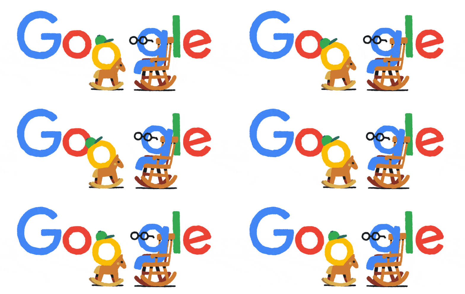
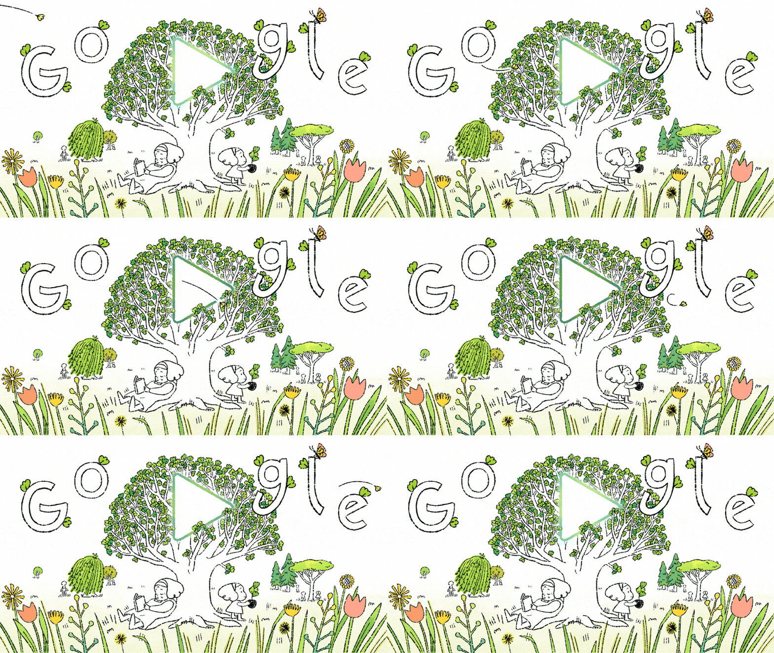
These are logos that change or adjust to various contexts. In other words, their colours, shapes, or even designs may vary based on their intended usage or meaning. A good example of such logos is the Google logo, which changes for holidays and special occasions.
 |
|---|
 |
|---|
Dynamic logos are therefore used when you want to portray your brand as a playful or innovative one to keep things interesting. Therefore such logos will not be good for companies that need to appear stable and serious, such as banks or law firms, because frequent changes to the logo may cause confusion among customers about your brand.
Therefore, this week's lesson on all these types of logos has helped me see the importance of when and how to choose the right logo based on the brand's identity, idea and goals because each type has its strengths and weaknesses.
Pick any two (2) of the Logo types discussed and then practically demonstrate how to make them, showing your detailed process. |
|---|
For this section, I will be picking what I feel is my best types of logos, which are Wordmark and Combination logos. Without further ado let's getting behind the scenes for the making.
Since this type logo make use of only the brand name, people believe it is the easiest to make, however this is not so true as you need to source for the right font and colours to bring your idea to life. So here I present my logo marking for a travel agency.
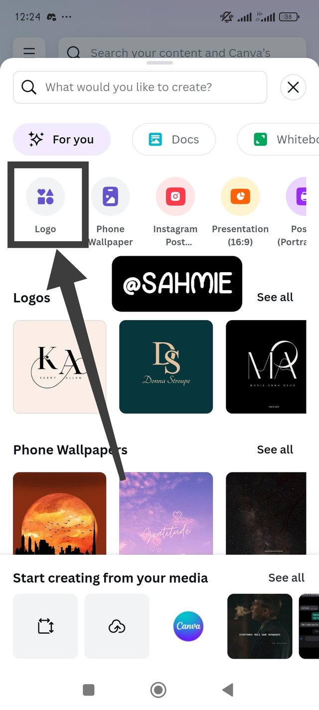
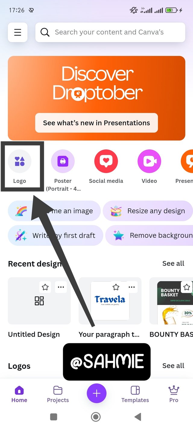
To start with, I open my Canva app, after the initial loading, it popped up a "For You" page, asking what would I like to create? So I just went on to click on Logo and it opened up a blink canvas, where I clicked on "Tex", then add text to add the brand name.
 | 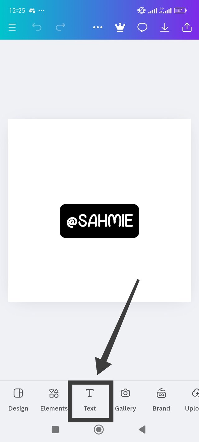 | 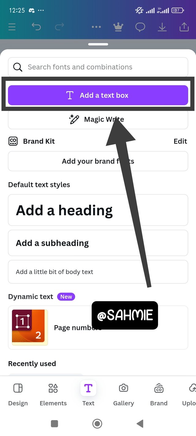 |
|---|
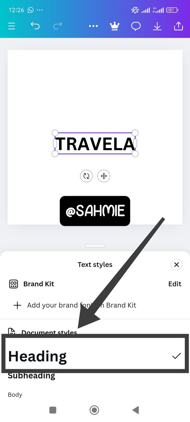
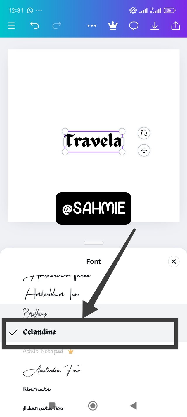
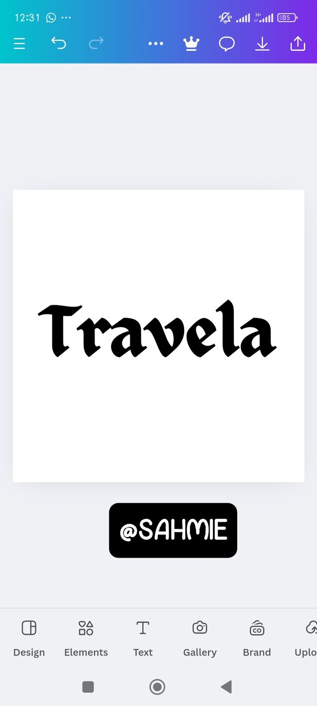
On the space provided, I entered the brand name, also made sure it was heading by clicking on "Head". Next task was looking for the right font to match the idea, which I kept searching until I arrived at a font named "Celandine" which I felt was good for the brand, so I put it to use and adjust the size of the logo.
 |  |  |
|---|
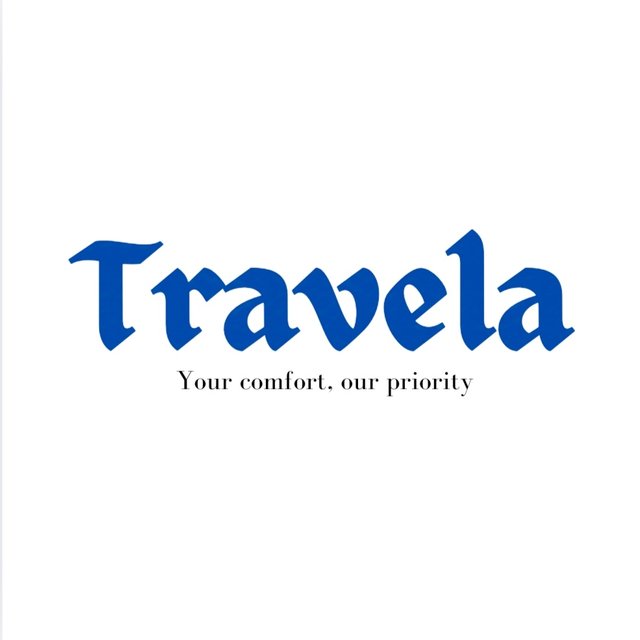
Last on the list was selecting the right colour and putting in the finish touch (a suitable tagline I mean), so after doing just my logo came out as shown below;
 |
|---|
Brand name: Travela
Slogan: Your safety, Our priority
Font Used: Celandine
Colour: Blue
Idea behind the design:
As the name implies, Travela is a travelling agency that looks to offer comfort, security and safety to it's customers, as the tagline says. However, using the colour blue which is usually taken to represent trust, is simply telling the customers and potentially customers to fully trust the agency with their safety. But then, the font choice is based on the idea that the agency is also fun and free for any one to use.
We are aware by now that a combination logo is made from combining a symbol and the brand name, so I will be doing just that for this section as shown below;
I opened the Canva app again, then went on to click on Logo and when it opened up a blink canvas, I clicked on elements to pick the perfect elements for my idea.
 | 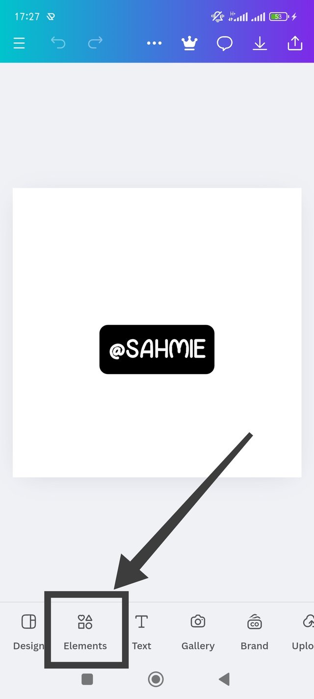 | 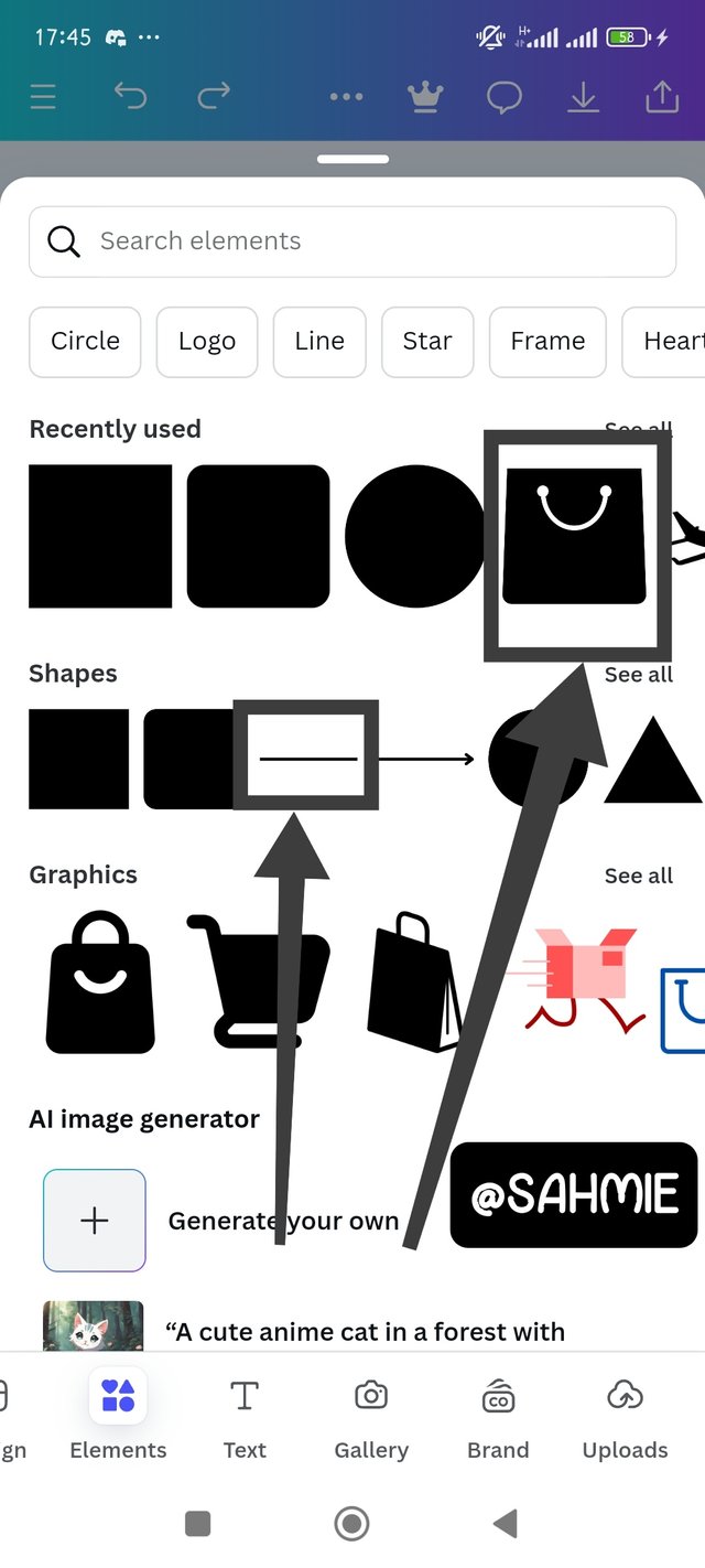 |
|---|
With my desired elements now on the canvas, next was to arrange them to my ideal outcome. After which was to add the brand name, and to do that, I clicked on the text and then add text to input the brand name.
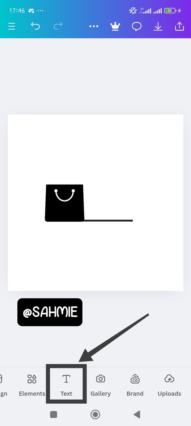 |  | 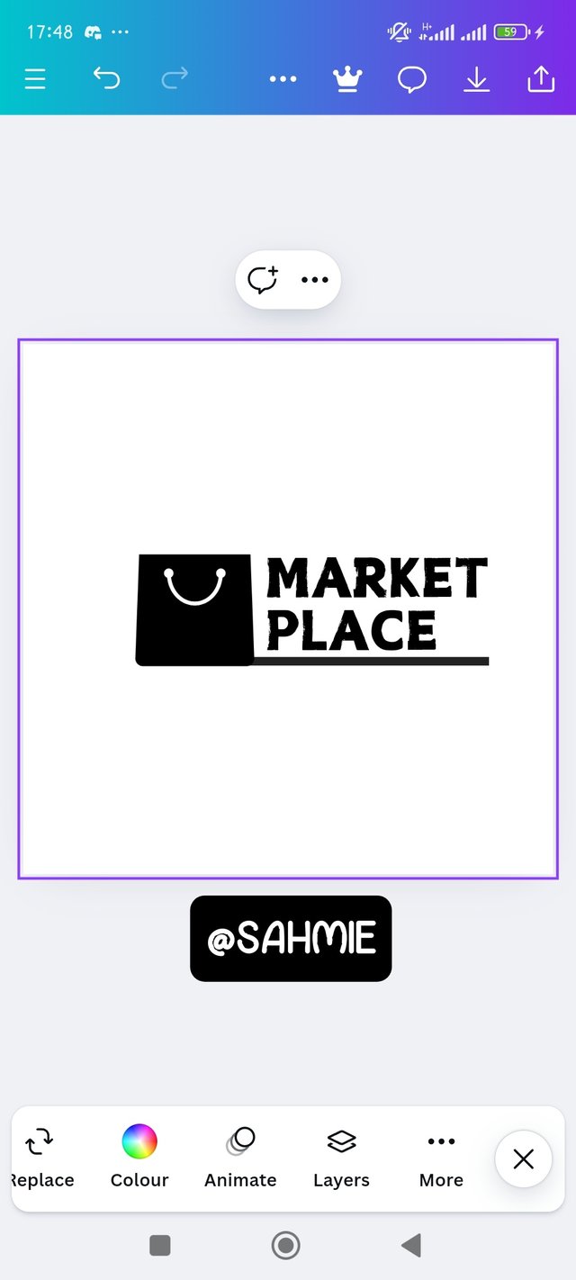 |
|---|
The logo was now looking acceptable to me and it was looking okay to me with just the colour choice remaining which I added as shown below for the final logo.
 |
|---|
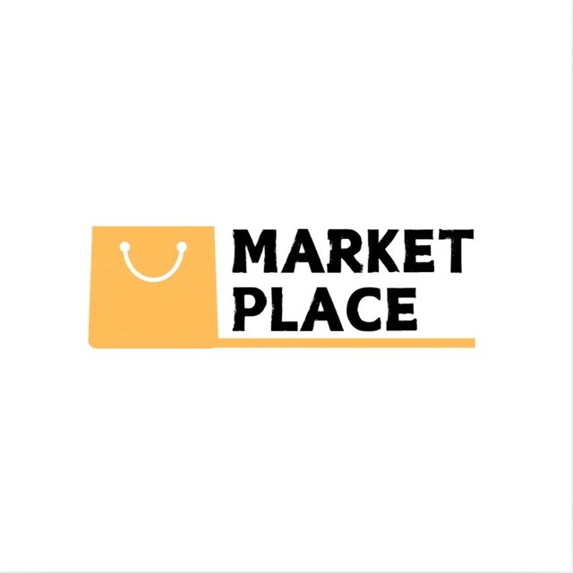
Brand name: Market Place
Colours: Deep Yellow, Blank and White
Idea: A market place for refined products.
Design a simple flier for your brand and then strategically place one of the logo you made in the flier. |
|---|
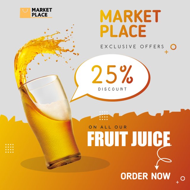
Above is an ad flier of my brand advertising a discount offer on fruit juice for all customers while carrying the brand name and logo.
I want to take this opportunity to invite @starrchris, @bossj23, and @bonaventure24.
Cc:-
@lhorgic
Thank You for your Time
NOTE: Always have a smile on your face, as you are never fully dressed without one.

Upvoted! Thank you for supporting witness @jswit.
Kai, ka sani (you sabi, abeg)
Thank you sir, I really do appreciate your kind words, it means a lot to me considering all my efforts.