Steemit Learning Challenge Season 21/WK1: Introduction to Gradients and Application.
 |
|---|
Welcome backs guys! Saying am super excited to be back in your faces will definitely be an understatement because am more than super excited about this rare privilege given to me to continue this course. I want to appreciate the steemit team for this opportunity and you all for the support. It means a whole lot to me...and I promise to make this 6 weeks journey another impactful one. Let's journey together friends!
• What is Gradient
• Types of Gradient
• How to Apply Gradients.
• Practical Demonstration.
• HomeWork Task.
Gradients can be defined as gradual transition between colours which gives a very appealing visual effect even as you see one colour fade into another on your canvas. Personally I would love to say that gradients is a progressive journey into the world of colours , how that you can blend one, two or more colours perfectly to make it appear harmoniously.
If you take a careful look at the designs we made in last season, you would notice that our background colour couple with that of our text elements was with a single colour.i.e white, blue, Green etc but with gradients we can make our background with a colour mix yet appealing and beautiful, this is also applicable to our text.
Mind you, gradient is applicable on all design tools, the goal of this lesson is to understand how it works and how we can use it to amplify and beautify our design so we are not just boxed in a one-styled kind of design. So for this lesson, we would continue with our design tool called CANVA, be it the mobile app version or the Software. Kindly note that Canva is the unanimous tool for this course.
Gradients have types and in this section, we are going to be exploring the types of Gradients we have and I would also be showing us a visual representation of these Gradients for better understanding. Let's get right into it guys.
• Linear gradients: This is the transition of colours on a straight line, however the graphic design can control the flow by choosing if he or she wants it to be horizontal, vertical or diagonal based on what he wants to achieve with the design.
 |  |  |
|---|
• Radial gradients: This is the kind of gradient that springs forth from the middle or central point creating an oval or view. It can also be perceived as light falling unto an object thereby creating a spotlight effect adding focal point and depth and to our design
 |  |  |
|---|
• Angular gradients: This appears just like the name implies, the transition of colours is seen from a particular angle thereby giving a directional effect. It is also known as the conic gradient.
 |  |  |
|---|
There are essential tips you need to take into consideration while attempting to use gradients. You don't just use it blindly lest you make your design a total mess, it would have just been cool if you stick to your one way flat design than mess things up. Below are tips to consider.
• Select the right Colours: Gradient is all about colours and you must be careful with your choice, the same principle of colour applies here, the use of gradients doesn't downplay the need for perfect colour combination and blend.
You do this by choosing from your colour wheel and maximizing the various scheme taught in our previous lesson. You have complementary colours, analogous colours, Triadic etc. For better output, you should select colour that align with the feeling you're trying to evoke in your audience because colour also play psychological roles.
• Use gradient Wisely/Skillfully: Gradients can be used to do several things in design and this includes, adding depth to design, creating visual interest to one's background and the list goes on. Now you need to understand that you do not have to use too many colours. You could use the following...
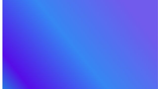
a. One colour: Choose just a colours and then play around it shades. For example pick a blue then transit or blend any shades of blue such as light blue, a dark blue or even a sky blue...these are all shades but altogether blue. With this we have just achieved a one colour gradient.
 |
|---|
b. Two or more colours: You can achieve this by blending two or more colours using your colour scheme. It could be colours opposite each other on the colour wheel or three colours sitting next to themselves on the wheel just as you've been taught. However we are not limited to this, you can check out what colour blends and transitions pro designers use in their design, you can be is sure it won't violate the rules of colours.
 |
|---|
• Have fun with it: What I mean is be flexible with it, don't get so rigid in applying, that means you can keep trying and trying several transitions and see what comes out best for your design, however try to maintain certain fundamentals rules which would definitely keep your design beautiful and aesthetic. Also ensure you have your audience at heart when applying gradients, use colours that they can relate with and produce the kind of response you want from them.
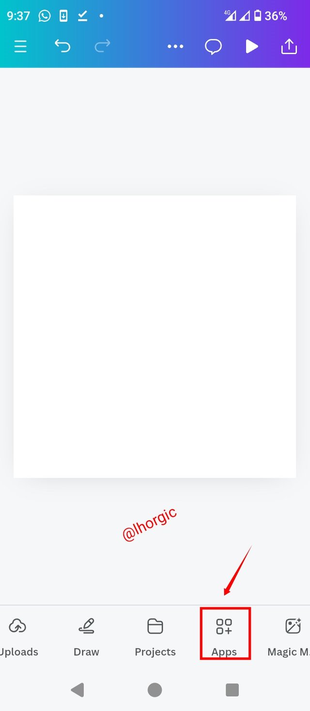
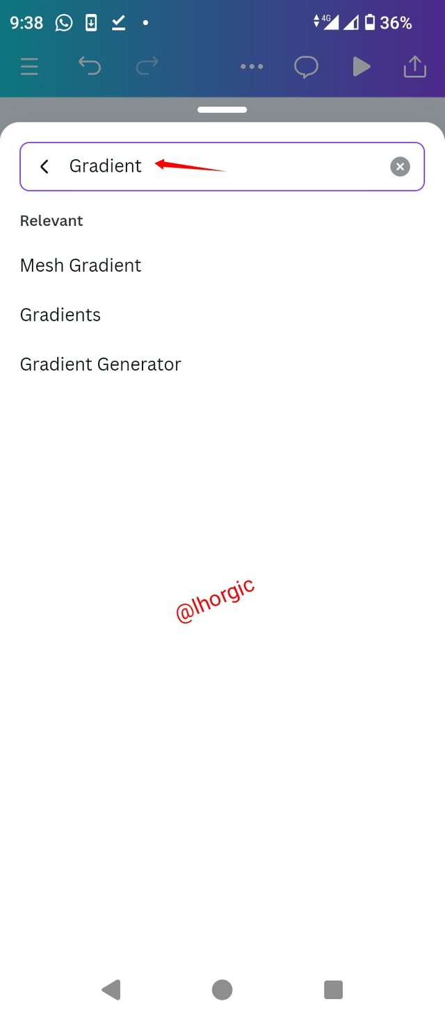
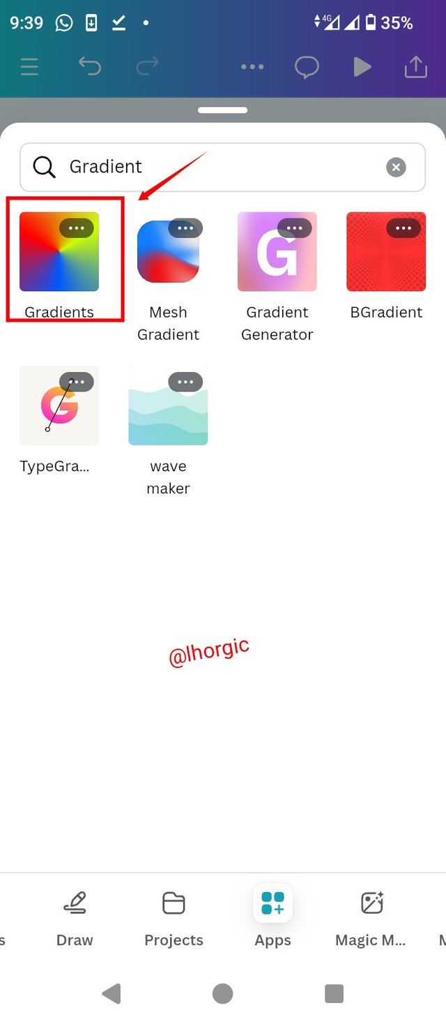
• Step 1: Get your canvas ready just like mine, I used the size 1080x1080, I then located the App option on the menu bar and then input "gradient" in the search session. I then clicked on the gradient option you see in the screenshot
 |  |  |
|---|
• Step 2:
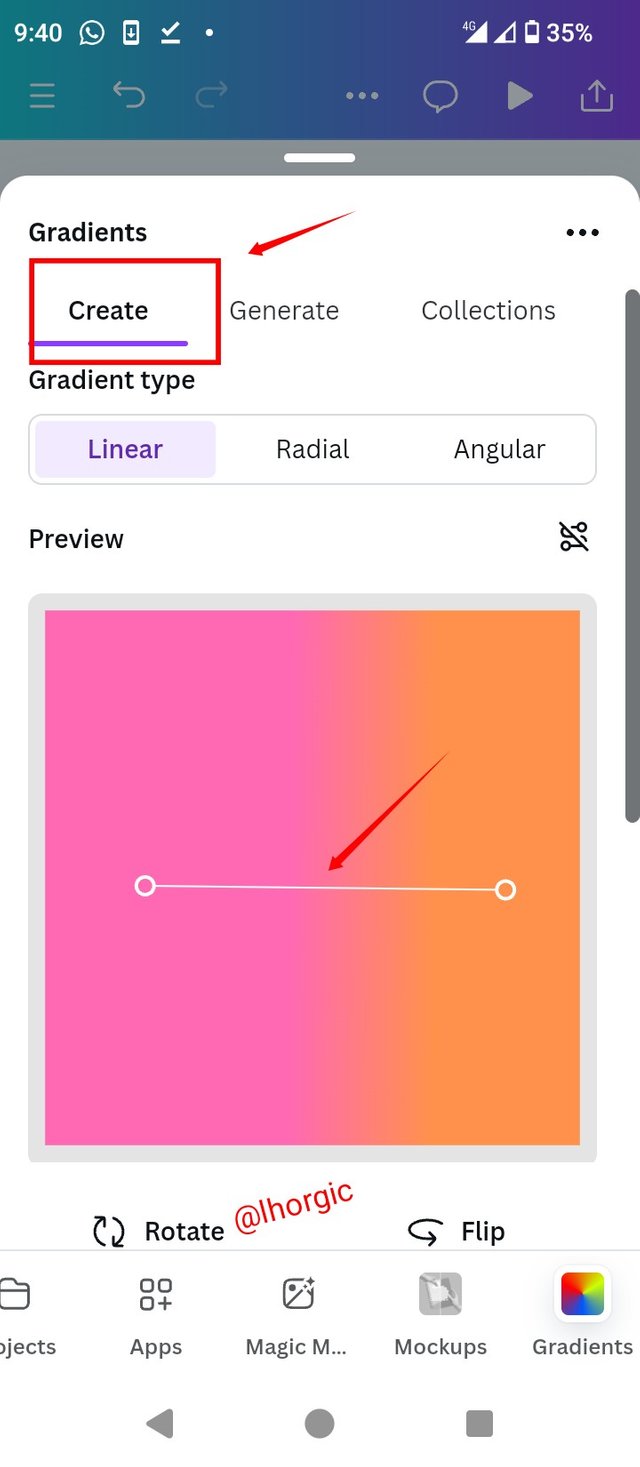
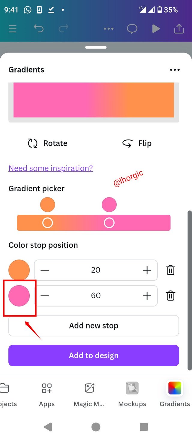
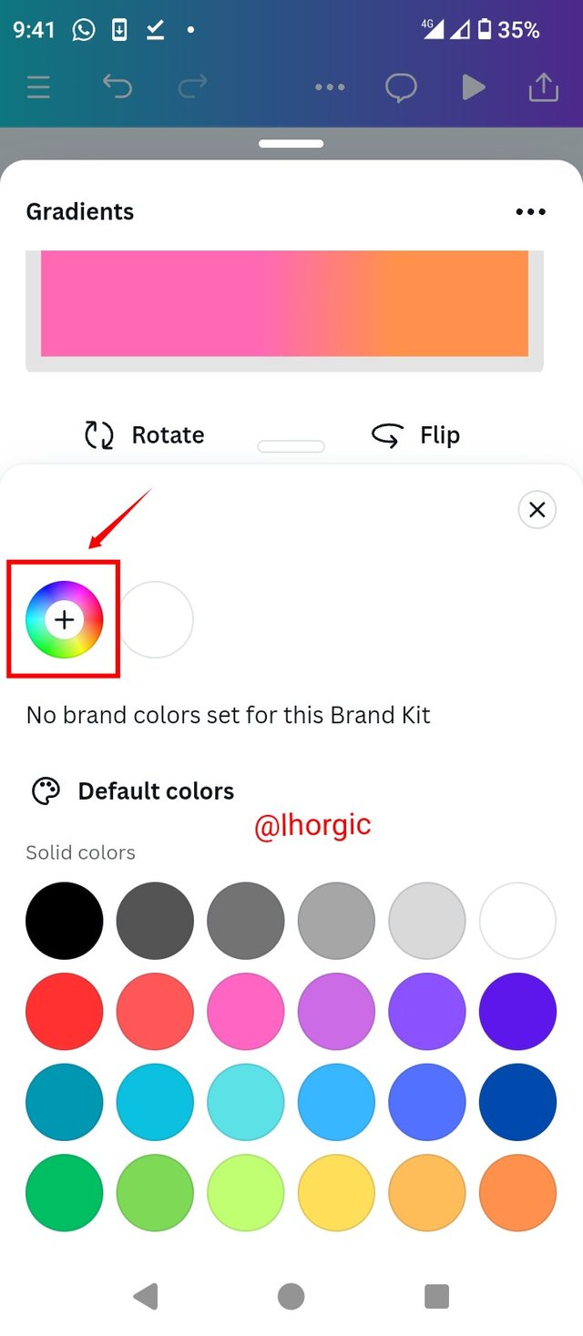
In the gradient Interface after launch, ensure you are on the create option, then proceed to create by changing the default colours if you have your colour choice/hex ready. I click on one of the colour I intend changing since I was okay with the other. It then brought out the colour wheel which I clicked on.
 |  |  |
|---|
• Step 3:
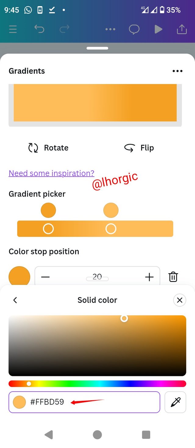
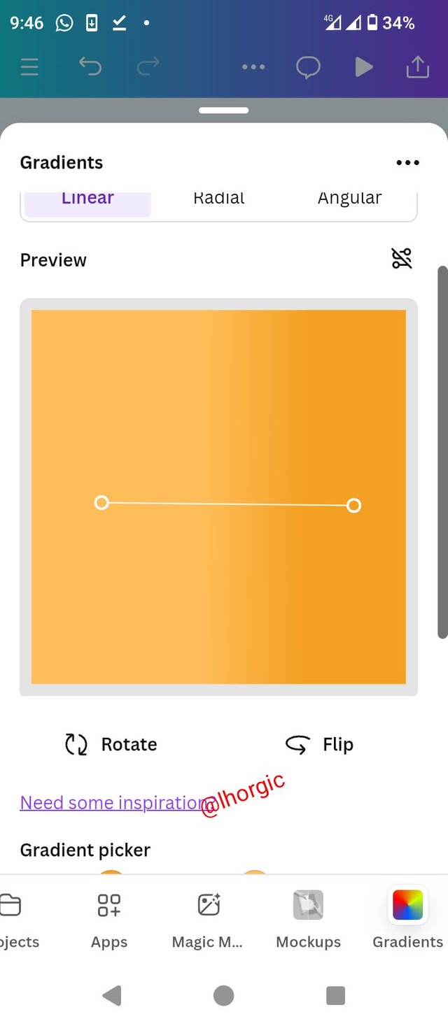
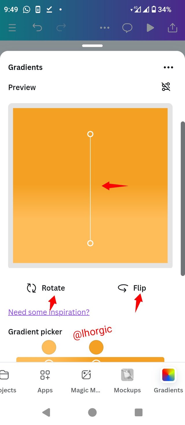
I then input the colour hex code of my desired colour and played around with the **flip, rotate and that line with two pointed edges to get different forms of the gradient.
 |  |  |
|---|
• Step 4:
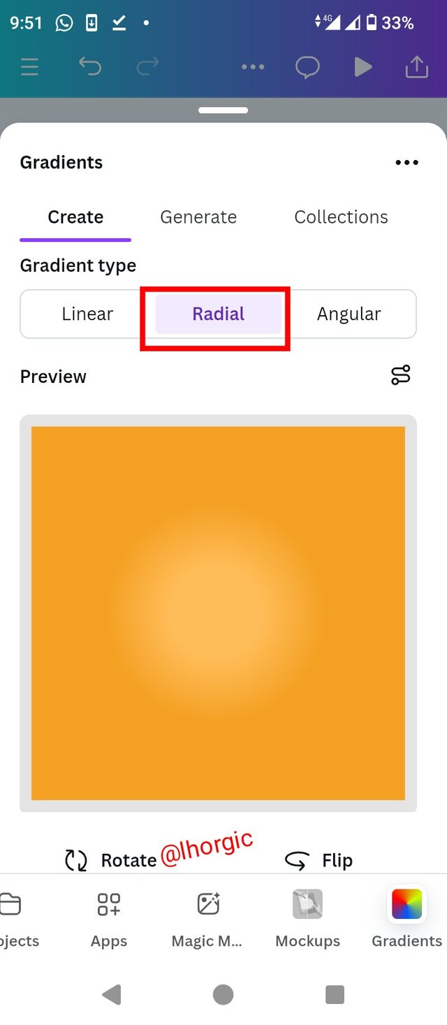
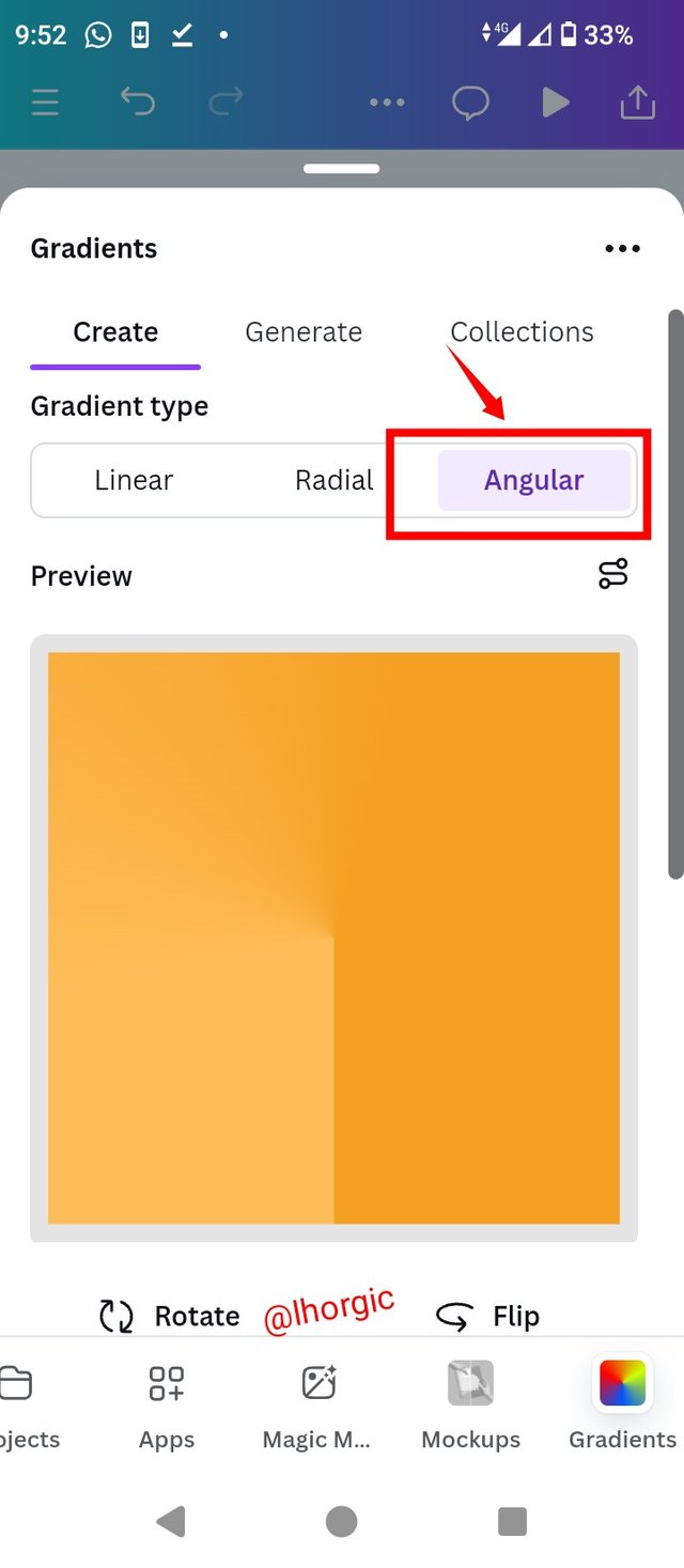
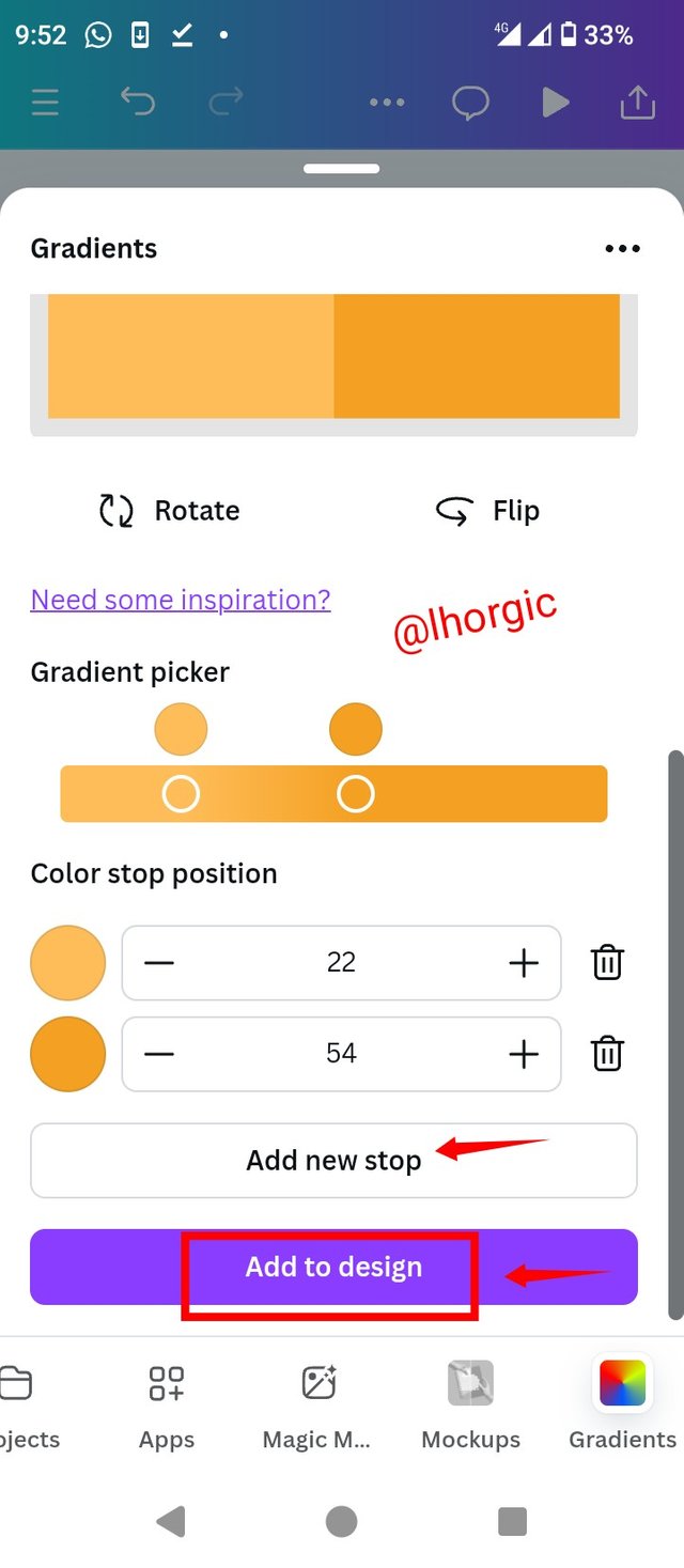
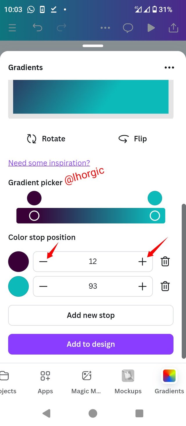
You can decide to also change it from linear to radial or even to angular just as seen in the shots below. You can also use the +/- in the colour session to adjust the transition determining how close and how far the colours should be from each other. Our Add to page option brings it to our workspace/Canva where we can then proceed to download it. Likewise, your Add New stop is used to add more colours to your gradient.
 |  |  |
|---|
 |
|---|
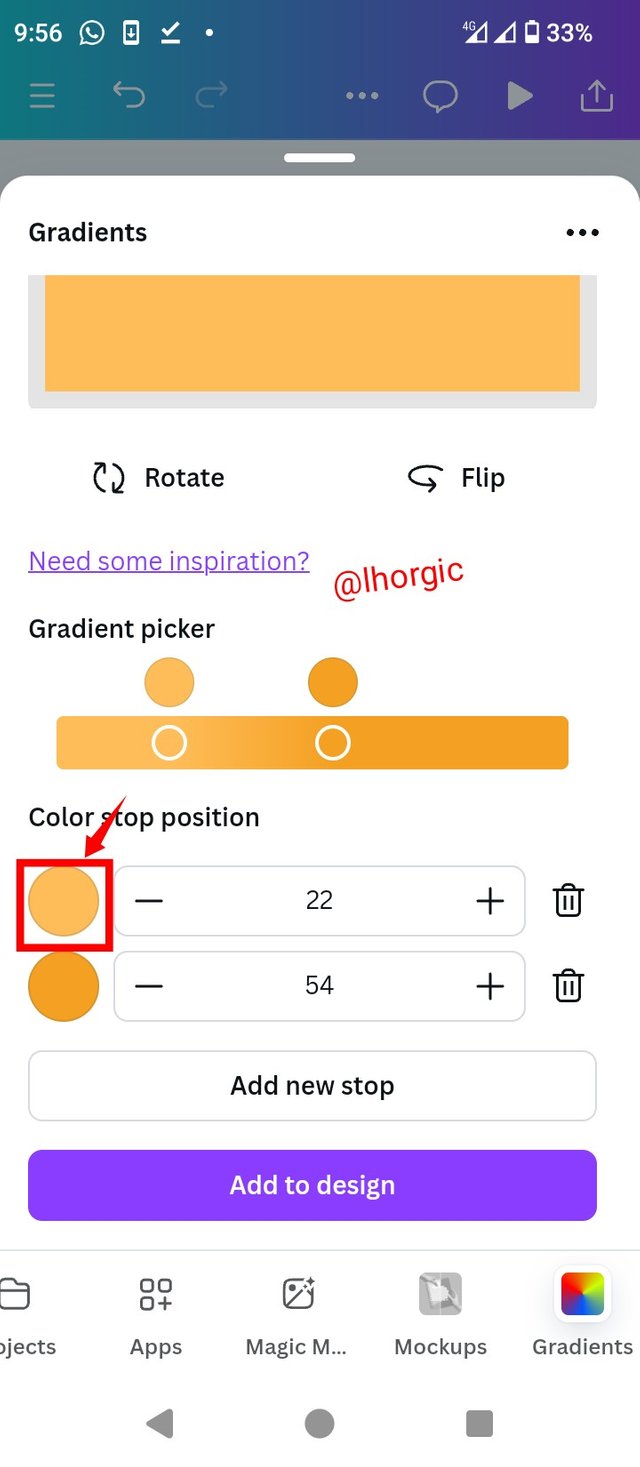
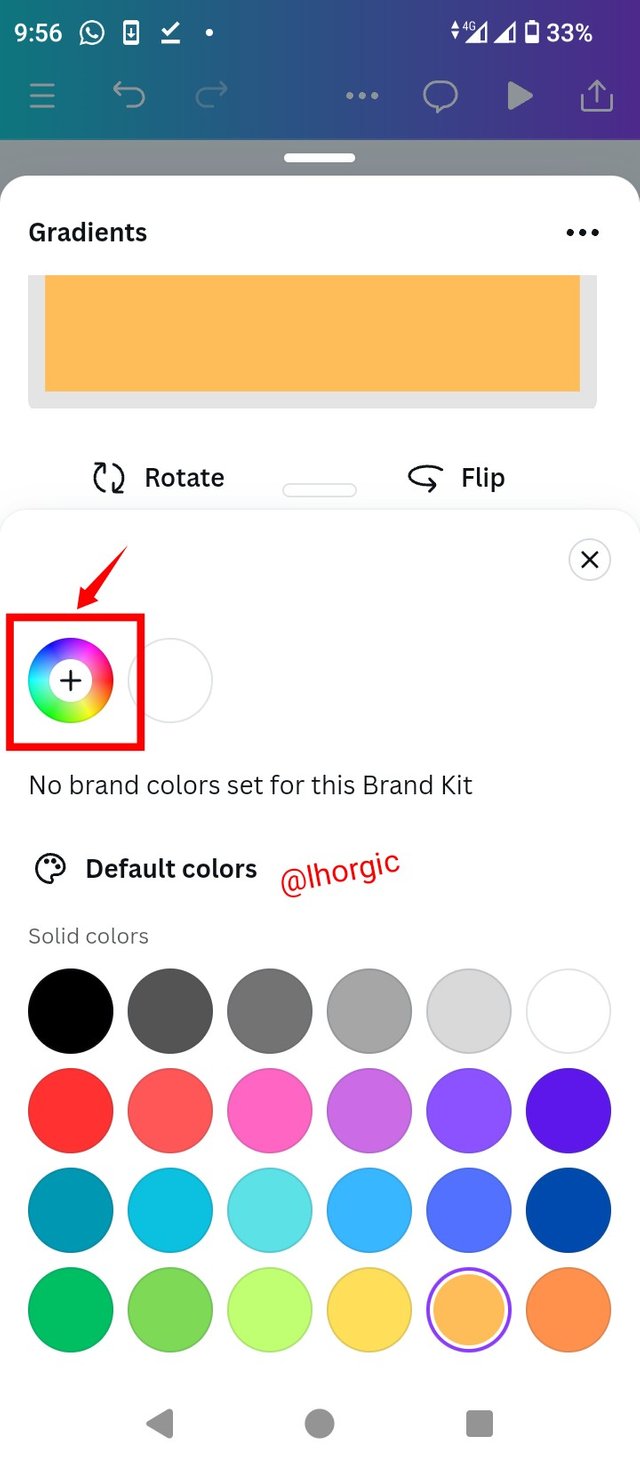
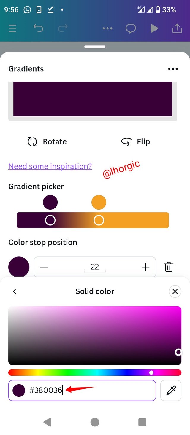
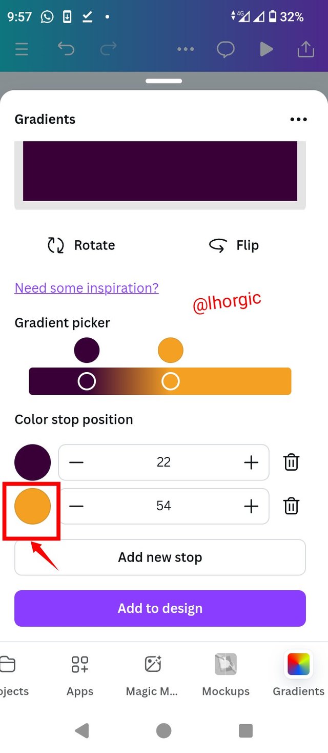
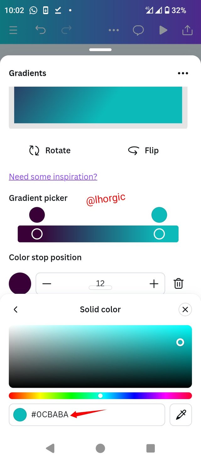
• Step 1: Click on one of the colours just as highlighted, proceed to click on the colour wheel, choose your desired colour or input your desired hex code just as seen...the colour automatically surface.
 |  |  |
|---|
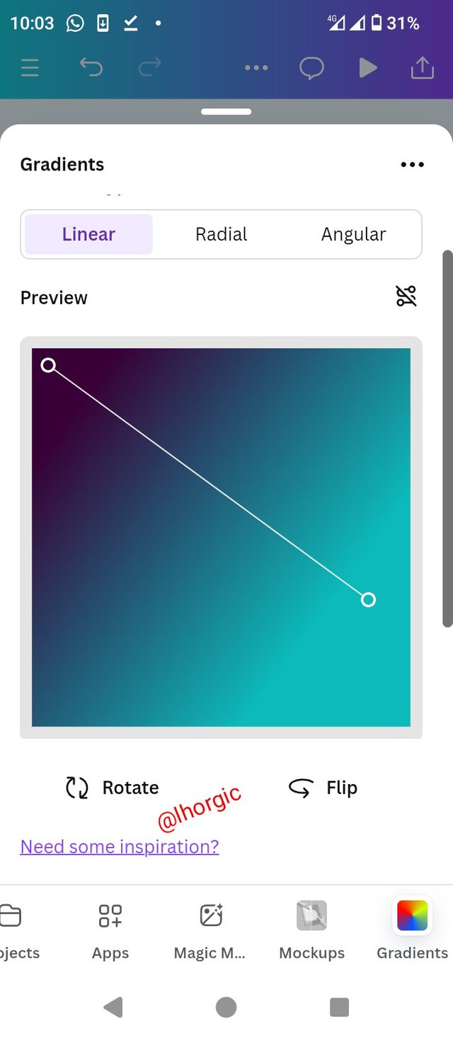
• Step 2: Click on the other colour to replace it with your desired colour since we are making a two colour gradient...proceed to click on the colour wheel just like we did for the first, choose your desired colour or input your colour hex code just like I did...proceed to adjust to your taste using the parameter shown to you earlier.
 |  |  |
|---|
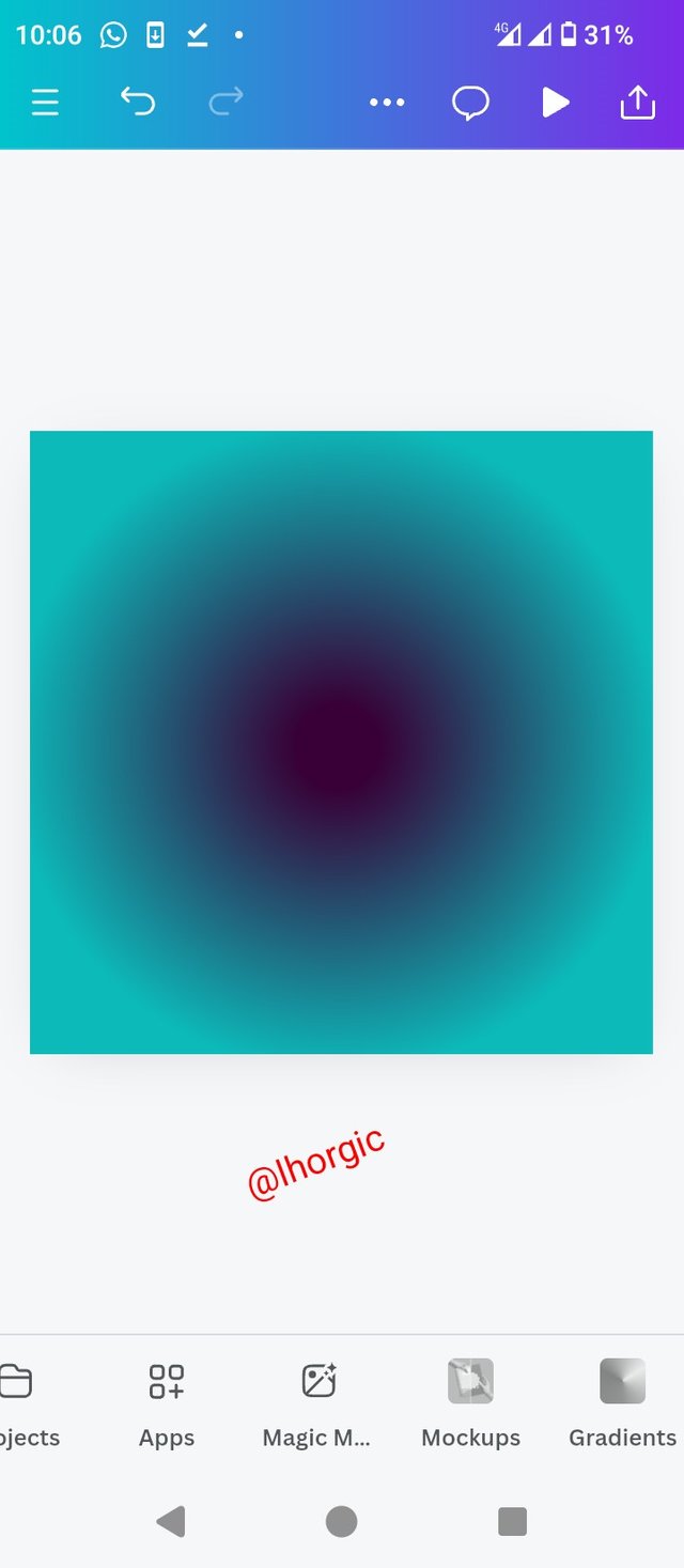
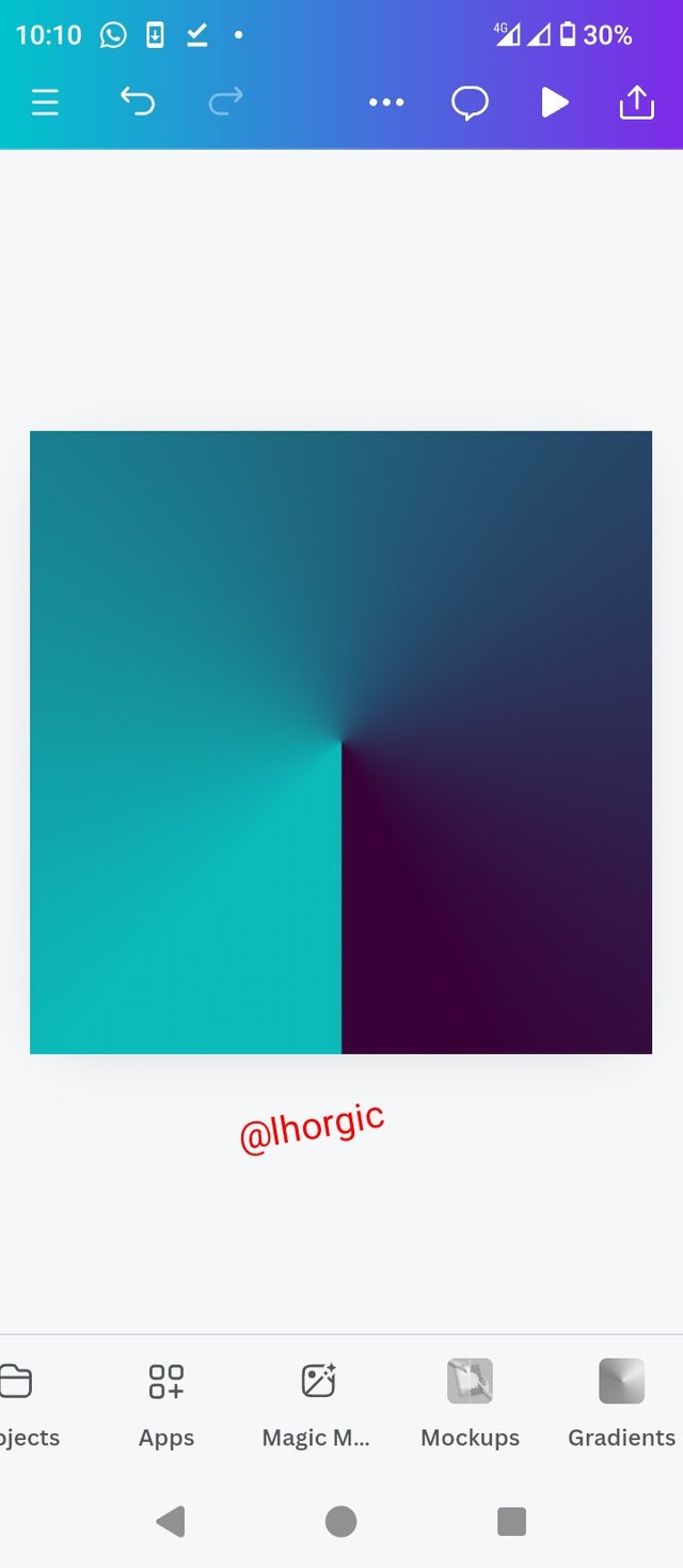
• Step 3: You can decide to have it in the default linear form or choose to have it angular or radial just as seen below. Don't forget to "add to page" and ultimately download the final result.
 |  |  |
|---|
 |
|---|
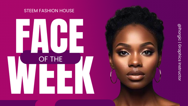
In this section, I decided to make a simple flyer using one of the gradients spotlighted this lesson with the colour hex code #aa0766 and #61045F. This is just to show you how beautiful designs made with gradients can appear if properly used and maximized. By the way this Gradients us a two-colour gradient just as mentioned earlier.
 |
|---|
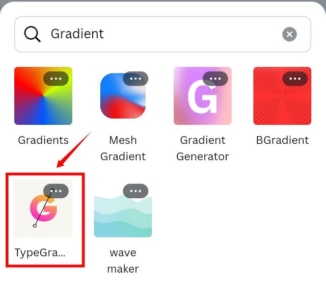
I deemed it fit to include in this lesson Text gradient as additional knowledge, so that nothing about gradient is left out. This means it is possible for your text element to have more than one colour and the approach/procedure is the same with that of the background gradients but with a different tool in the gradient category which I have highlighted in the image below.
Kindly note that I won't be demonstrating this for you, it's going to be part of your homework since I've been able to show you comprehensively and extensively how to create gradients.
 |
|---|
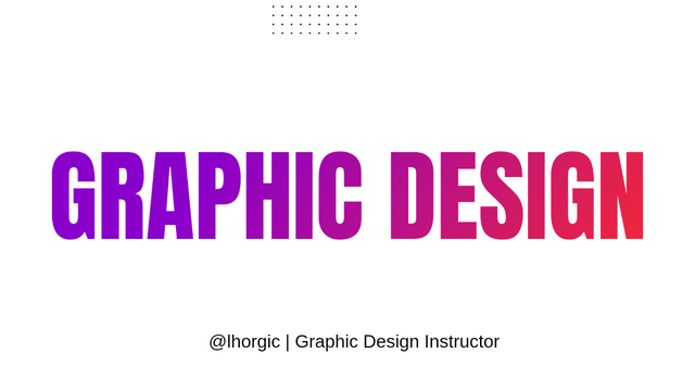 | 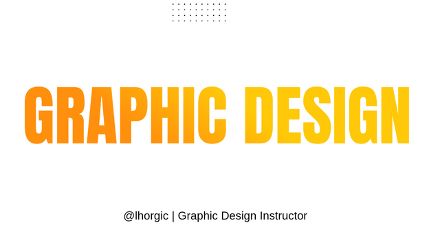 |
|---|
• Discuss about Gradients the way you understand it. Also mention other types of gradients not captured in this lesson.
• Create 3 gradients using the following guidelines.
a. The first gradient should be made with just one colour having different complementary shades. Ensure you reveal their hex codes.
b. The second gradient should be made with two different colours (hex codes) that blends so well. See your colour theory lesson on how to combine colours.
c. The third gradient should be made using three colours (hex codes) that blends perfectly.
• Create a Text gradient using the tool shown you in this post. Ensure not to use the default colour on the app, rather use your own combinable colours.
• Pick one of the background gradient you made and create a beautiful flyer design with it. Ensure you do not reproduce my design, rather do something entirely different from mine.
Note: Be sure to show every step involved in all your practical, in other words be very detailed.Most importantly, you need to highlight relevant areas with your markup tool and label your screenshots with your username to prevent intellectual theft
• You title should be "SLC21/WK1: Introduction to Gradients and Application."
• You can publish your homework task anywhere you deem fit and in any language.
• You're are to use the special tag #graphics-s21wk1 among other relevant tag like #country and your #steemexclusive.
• Plagiarism/AI generated content will not be tolerated. The penalty would be absolute disqualification.
• You're encouraged to continue with your club status, however it will not be taken into account for your grading & assessment.
• Invite 3 of your friends and don't forget to leave valuable comments on their posts.
• Use the burnsteem25 tag only if you have set the 25% payee to @null.
• Feel free to upvote and resteem this post if you want to.
• Participation schedule is between Monday, October 28th , 2024 at 00:00 UTC to Sunday - November 3rd, 2024 at 23:59 UTC.
Outstanding Students will be rewarded with a sumptuous upvote for participating. A total number of 4 entries would be selected to get this compensation weekly from SC01 & 02
However, kindly bear in mind that upvotes are not guaranteed just for making an entry.
Regards
@lhorgic❤️
My entry, thank you!
https://steemit.com/hive-147599/@shohana1/slc21-wk1-introduction-to-gradients-and-application-home-work
https://x.com/lhorgic1/status/1850591107593241074
My entry
https://steemit.com/graphics-s21wk1/@impersonal/slc21-wk1-introduction-to-gradients-and-application
https://steemit.com/hive-103393/@aneukpineung78/slc21-wk1-introduction-to-gradients-and-application
Thanks.
My entry
https://steemit.com/graphics-s21wk1/@rafk/slc21-wk1-introduction-to-gradients-and-application
https://steemit.com/burnsteem25/@khursheedanwar/slc21-wk1-introduction-to-gradients-and-application
https://steemit.com/hive-141434/@imohmitch/slc21-wk1-introduction-to-gradients-and-application
My entry
My entry
https://steemit.com/hive-147599/@daprado1999/introduction-to-gradient-and-application
My entry.
https://steemit.com/hive-147599/@josepha/slc21-wk1-introduction-to-gradients-and-application
My entry: https://steemit.com/graphics-s21wk1/@muhammad-ahmad/slc21-wk1-introduction-to-gradients-and-application