SLC | S21W2 | Introduction to Logo Design
 |
|---|
Hello Students, welcome back to this space, am super happy to have y'all back here again this week. I trust you got value from the last lesson. Well it has always been my utmost desire to have this knowledge shared and to empower as many that really want to have this skill set. So just give me your time and attention so that you can get the best out of this course.
Today we would be considering another interesting topic, one that is very essential in the world of design, it's a sought after service because everyone needs it in one way or the other. What exactly am I talking about?
Am talking about Logo Design. We would looking into this topic this week and the next so that we can be sure of having and absolute and thorough knowledge about this lesson. Let's delve into it guys!
• What is a Logo
• Principles of Logo Design
• Do's and Dont's of Logo Design
• Homework Task.
Let me start by giving an illustration that will help you comprehend easily. When you pick up a gadget i.e phone and then find something like an apple symbol on it what comes to mind?
An apple phone right, the one fondly referred to as iPhone right? Well let me announce to you that you have just seen a Logo that represent a well known brand.
A Logo can be defined as a visual identity or symbol made with the mixture of text, symbols, colour and image, describing your brand and what you do, coupled with the idea behind your brand.
 |
|---|
Logo is not actually your brand, it's an aspect of your brand that puts you out there, and travel even into places you have not personally being to and it also create a very strong impression about your brand.
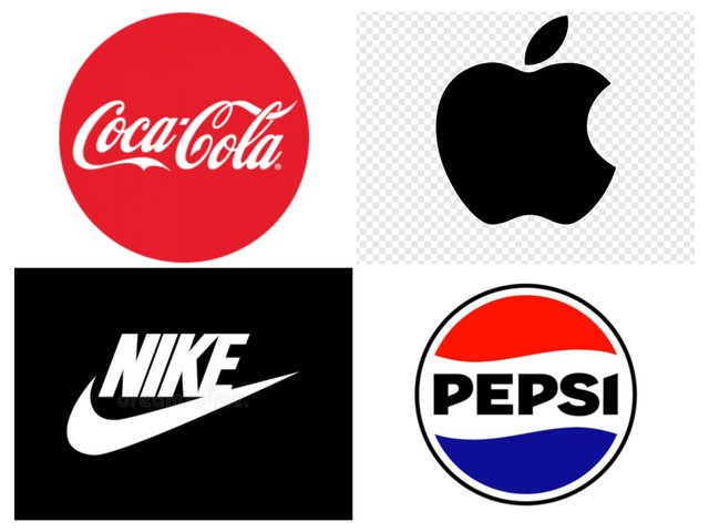
We have brands making wave all over the world today and we can easily identify them with their logos, i.e coca-cola, Pepsi, KFC, Nike etc. The funniest part of it is that they have very simple logo yet their brand is well represented all over the world. We have a lot to talk about in the next session.
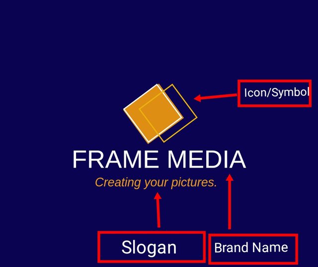
I carefully crafted the brand icon/symbol and slogan which complement the name of the brand, "Frame Media". The slogan gives more details into what we do as a brand, you can tell that our business is about keeping memories via pictures and coverage. Moreso, the colour is also superb and complementary.
In this section, we would be looking at the principles that work when it comes to making logos. The fact is that creation of Logo is something that requires a lot of attention, Intelligence and foresight because your logo is your brand and your brand is your person.
Now the question is, how do you want to be perceived by your viewers, knowing fully well that this identity called logo is not a one-off design but a visual symbol that will represent your brand for as long as it exist. Let's explore the principles to be engaged.
• Simplicity: This should be one of your major guidelines when it comes to creating your logos as graphic designers. The type of logo that defines you in a clear, concise and impactful manner. It should have fewer elements or details yet communicate what you represent easily even with less element or information about you. The golden rule Less is more is the idea am are trying to communicate here.
 |  |
|---|
• Memorability: Your logo should be a kind that can be easily remembered after been looked upon. It shouldn't be the kind that people would easily forget or can't really described because of the many elements a quack designer have stuffed up in the so called logo design. Take for example Apple logo. You can close your eyes and described it as an apple eaten from the side.What's about Pepsi, KFC, Coca-cola Nike etc.
 |
|---|
• Originality: This is also key, with this principle, you want to ensure the following.
a. Avoiding making similar logos with existing brands out there. Add your own touch of uniqueness.
b. You might also want to avoid using common symbols and icons that are already all over.
c. You would also want to go completely outside the box just like Pepsi,Coca-Cola etc that have logos that doesn't even give the slighted hint about their products...so unique.
The bottom line is just do what you think would work best and push your brand, it might interest you to know that the untold fact about logos is that it doesn't really tell everything you do an represent that's why I said it's a part of your brand identity and not absolutely your brand identity.
• Modern Yet Timeless: With this principle at the back of your mind, we want to create something that doesn't look old fashioned so much so that it doesn't fit into today but that doesn't mean you should jump into trend that fades with time and this is just where timelessness comes in, do something that will both be relevant now and in the future even as your brand grows over the years.
In a nutshell, your logo should be contemporary but not made with trendy elements that can fade out within a short period of time, the ripple effect of doing otherwise would be that your brand will be perceived to be outdated as well, don't forget I stated earlier that your logo is an integral part of your brand which communicates what you represent.
• Balance & Complement: The principle of balance in design is also applicable in logo design as well. Every elements used in your design should be proper positioning and aesthetically done to produce an eye catching and appealing result.
Every of your logo element should play a complementary role such that your symbols and typeface or what you fondly call font would synergize to give you the best result.
 |  |
|---|
• Versatility: The principle of versatility states that you should design your logo in such a way that it can be used on different platforms and on materials such as cresting on t.shirt, stamps on pen, key holders, water bottles and on your products. To achieve this seamlessly, you have to create and save the logo as a vector file.
In this section, I would be showing you these tips practically, so you can get the whole picture. Kindly take note that the sample I would be using here is just for educational purpose and not as sophisticated as many would love it, but it's foundational and can guide you in making your very kind of logo.
 |
|---|
So basically, local has three major elements which are Icon, Brand Name, Tagline. However, not everyone include the three in their logo design. Some use just the name and icon i.e Nike, while some others use their icon and a good example is Apple. But for the same of this lecture I would like to include all three major elements. Let's get right into the tips.
• Play around your Caps (Upper and lower case) and Typefaces
Don't be scared to check out with caps works and with which typeface. Your could decide to use the uppercase or even go from a lowercase letterings. The interesting thing is that it enhance design and makes all the difference in most cases.
 |  |
|---|
 |
|---|
Uppercase logo gives a strong and authoritative vibe while logos with lowercase give the comely and casual vibe. Never the less there are way to manipulate both loges to give whatever vibe you want it to irrespective of the caps. Colour can do this magic.
• Balance your Tagline. Personally I recommend that every logo use a tagline as it gives a short description of your brand even if you do not use a notable symbol or icon of what you do in your logo, it does the cover up for you.
 |  |
|---|
However it should be well positioned and smaller in size compared to your brand name.Also note that you should use a thinner font for your Tagline while your name takes the bolder one. Moreso, it should be short, 20 to 30 character would just be fine.Also take not below how I aligned and balance my Brand name and tagline
• Allow your Logo breath: Just like to taught you in the principles of design, it has not changed here. Always allow your Logo breath, avoid and edge to edge design, too many elements. If you feel everything looks chocked up, you can either increase the size of your canvas(size/dimension) or reduce your logo elements.
 |  |
|---|
• Ensure readability: One thing you should ensure is that no matter where the logo is features, it should be readable and clear. For you to achieve this, you should carefully consider your text size and fonts, ensure you test it on serval platform to see the outcome. One funny fact is that logo tend to appear differently on different platform, hence the reason you have to be sure it uniform and readable everywhere.
• Colour Choice: Am putting this as the last but it doesn't really mean it's the least, it's as important as others. Every well organized brand have a colour they project on all their product. The same colour can be considered for their logo. This is not a one fit size for all though but trust me, it's a good idea too. Morse you can tweak your colours to your taste just like we have below.
 |  |
|---|
• Discuss Logo design based on your understanding about the topic.
• Discuss extensively the role and impact of logo to a brand.
• Explain and demonstrate visually the do's and don't when it comes to Logo design. You can do more research to be outstanding and kindly ensure not to use my specimen logo.
• Design a simple logo with the knowledge you have gotten from this lesson by assuming that a client gave you a job to design for his brand (business).
The outcome of your design should clearly tell what kind of brand/business organization you designed for. Also do well to be well detailed in your design.
• You title should be "SLC21/WK2: Introduction to Logo Design
• You can publish your homework task anywhere you deem fit and in any language.
• You're are to use the special tag #graphics-s21wk2 among other relevant tag like #country and your #steemexclusive.
• Plagiarism/AI generated content will not be tolerated. The penalty would be absolute disqualification.
• You're encouraged to continue with your club status, however it will not be taken into account for your grading & assessment.
• Invite 3 of your friends and don't forget to leave valuable comments on their posts.
• Use the burnsteem25 tag only if you have set the 25% payee to @null.
• Feel free to upvote and resteem this post if you want to.
• Participation schedule is between Monday, November 4th , 2024 at 00:00 UTC to Sunday - November 10th, 2024 at 23:59 UTC.
Outstanding Students will be rewarded with a sumptuous upvote for participating. A total number of 4 entries would be selected to get this compensation weekly from SC01 & 02
However, kindly bear in mind that upvotes are not guaranteed just for making an entry.
Regards
@lhorgic❤️
Hello, below you can find my entry:
https://steemit.com/graphics-s21wk2/@ady-was-here/slc21-wk2-introduction-to-logo-design
Thank you :)
I missed last week bit won't miss the his werk for sure. I'm gamed. This is one of the lessons I've been craving for because Logo design is hot selling demands now. Thanks for this tutorial.
What an Interesting class, And I grab a lot, indeed I have being missing your teaches due to unstable device, but this time around am back to my dream skill graphics and design.
Dropping my entry so soon
My entry
https://steemit.com/hive-195150/@rafk/slc21-wk2-introduction-to-logo-design
My participation for this learning challenge,
https://steemit.com/graphics-s21wk2/@sitaraindaryas/slc21-wk2-introduction-to-logo-design
Regards to me
My warm entry https://steemit.com/hive-139765/@ahmneska/slc21-wk2-introduction-to-logo-design
My entry; https://steemit.com/graphics-s21wk2/@eliany/slc21-wk2-introduction-to-logo-design
My entry
https://steemit.com/hive-168205/@nalainzahra/slc-s21-w2-or-introduction-to-logo-design
My entry.
https://steemit.com/hive-147599/@josepha/slc21-wk2-introduction-to-logo-design
My entry
https://steemit.com/hive-111300/@emishael60/slc21-wk2-introduction-to-logo-design