SEC20/WK5: Graphic Design Hands-On Practical 2
Hi Wonderful Designers!
It's a pleasure to welcome you all to my second graphic design hands-on practical 2 homework. This week's course and task immerses me in real-world design projects, it enhances my skills as a beginner and refined my talents! I feel confident and experienced in bringing a unique design to life, I'm indeed a champion!!! Join me as I show you how I replicated the design assigned for this course:
To carry out my tasks for this week, I opened my Canva app and created a workspace by clicking on the + sign on the Canva home page, progressed with my work, and in the end, I created a catchy design to celebrate all the champions on Steemit.😉
HOMEWORK TASK: |
|---|
I logged in to my Canva and created a new workspace of 1080 x1080px, a template for Instagram posts and I chose a white background. I want to create champion a template!
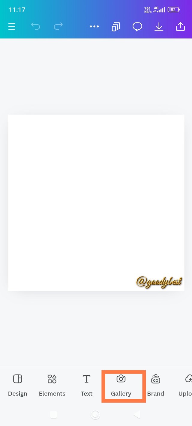
| Step 1: Creating A Workspace And Adding An Image |
|---|
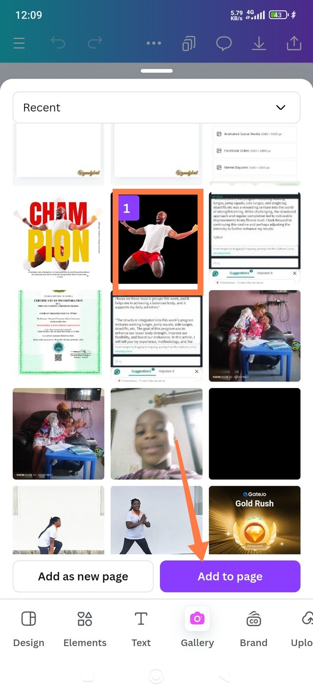
 1 1 | 2 | 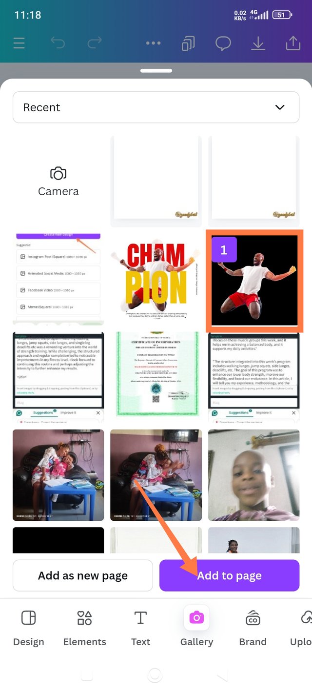 3 3 |
|---|
1. I created a workspace of 1080x1080px and added my username to serve as my watermark.
2. I needed to add an image that depicts the champion, so I clicked on the gallery.
3. I selected the image and clicked on add to the page.

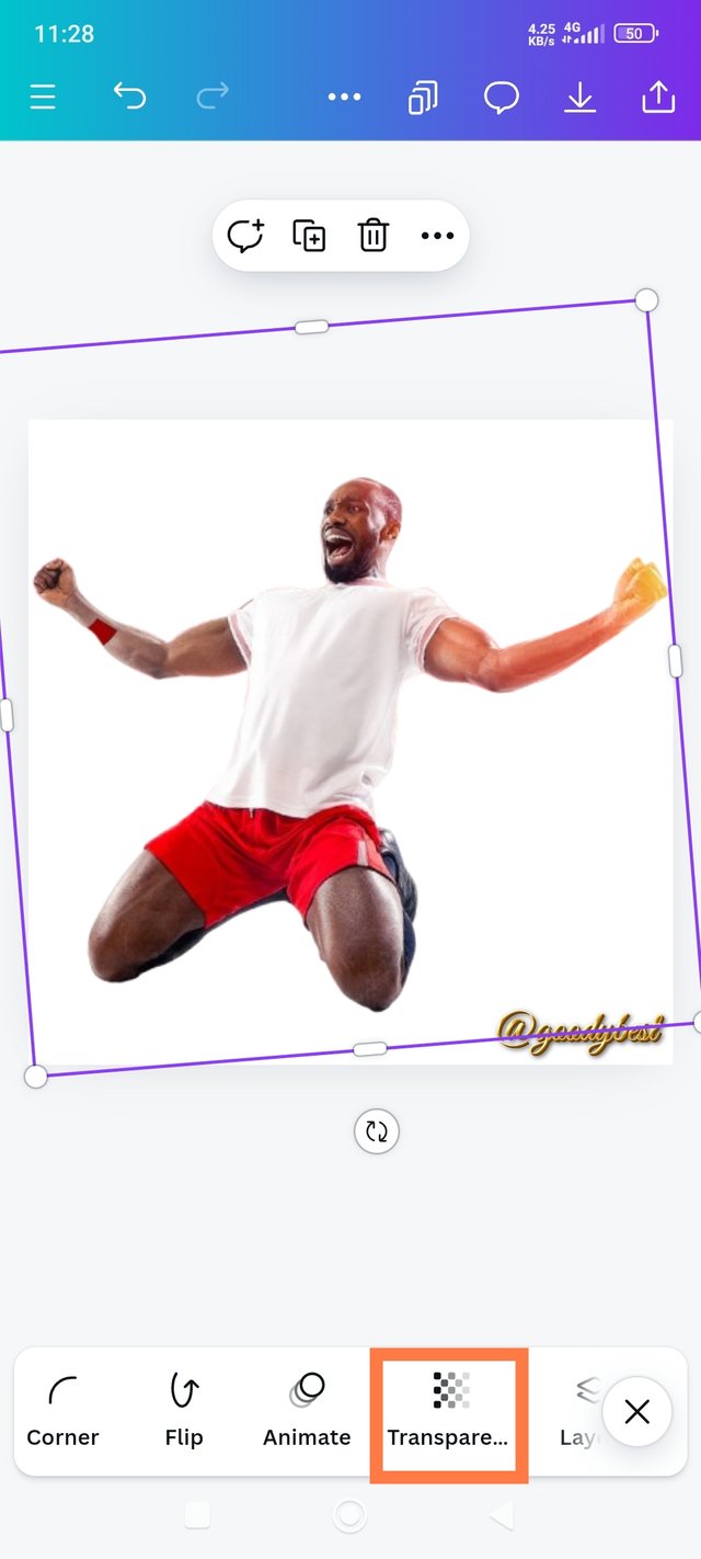
| Step 2: Adjusted The Image And Make It Transparent |
|---|
 1 1 | 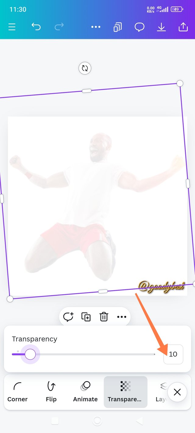 2 2 |  3 3 |
|---|
1. I adjusted the added image to my desired size.
*2. I made it transparent by adjusting to 10 using a slider.
3. It was okay.
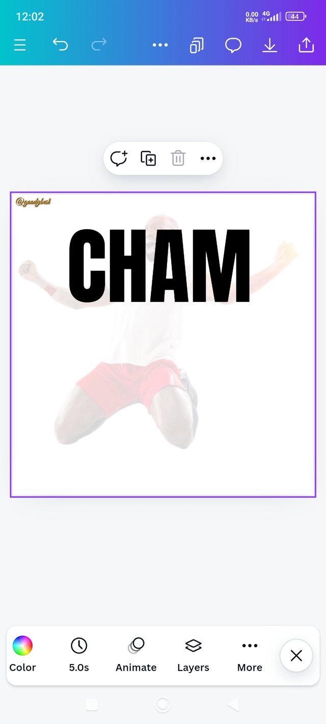
| Step 3: Writing The First Text, and Coloring |
|---|
 1 1 | 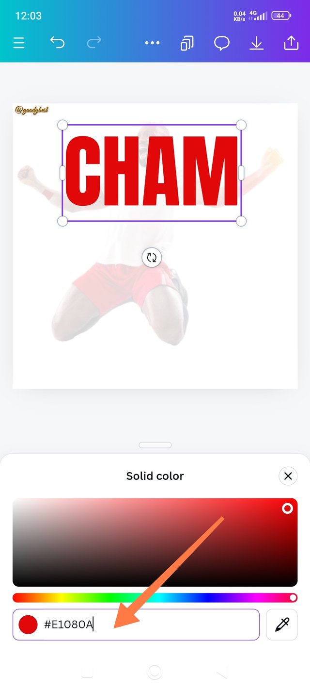 2 2 | 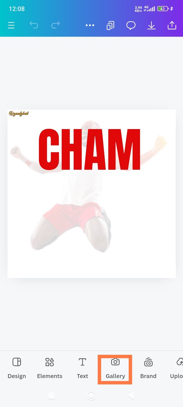 3 3 |
|---|
1. I clicked on Text and selected my preferred font, which was "Anton," and then wrote "Cham." Then, I increased my text font to 166 and applied appropriate word and line spacing, For line spacing, I chose 0.8
2. Next, I clicked on the text and chose my preferred color using the color wheel. Note: before now, I used the wheel to check our Prof. Own, and it was #e1080a, so I just added the hex code to get that vibrant red.
3. I adjusted the text to my desired taste and positioned it the way I wanted. Then I clicked on a gallery to add the second image.
| Step 4: Adding The Vibrant Image And Positioning It Properly |
|---|
 1 1 | 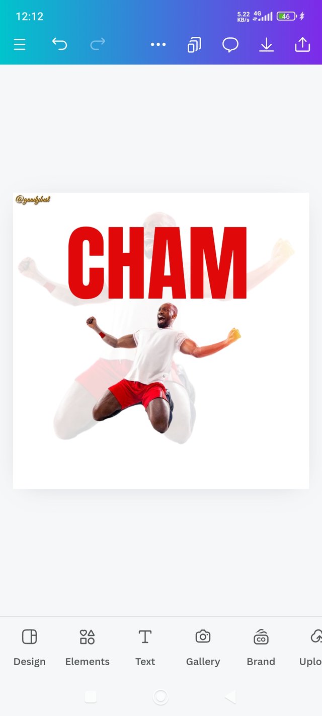 2 2 | 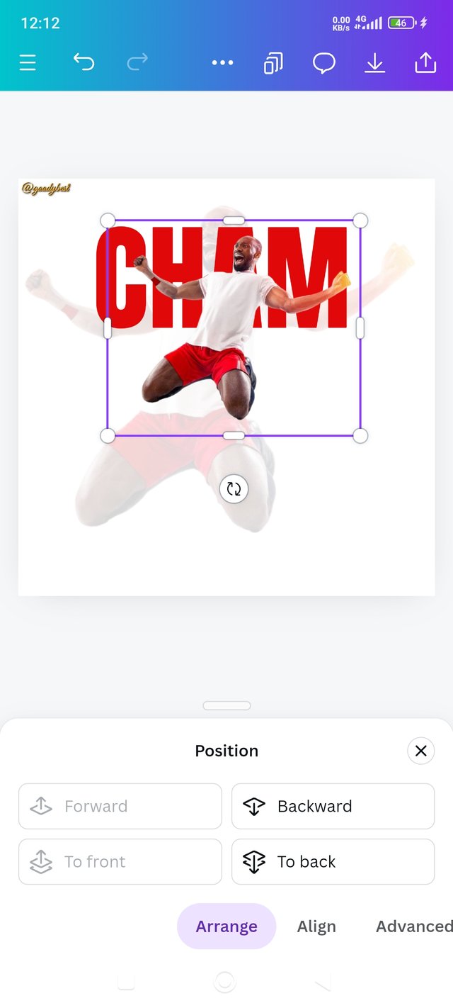 3 3 |
|---|
1. I chose the vibrant image and add to the page.
2. I positioned the image well because it went backward instead of being on the front of the text. I did this by highlighting the image, clicking on position, and then forward.
3. The image was in front now.
| Step 5: Adjusted The Image, Positioning It Well & Adding the 2 Text |
|---|
 1 1 | 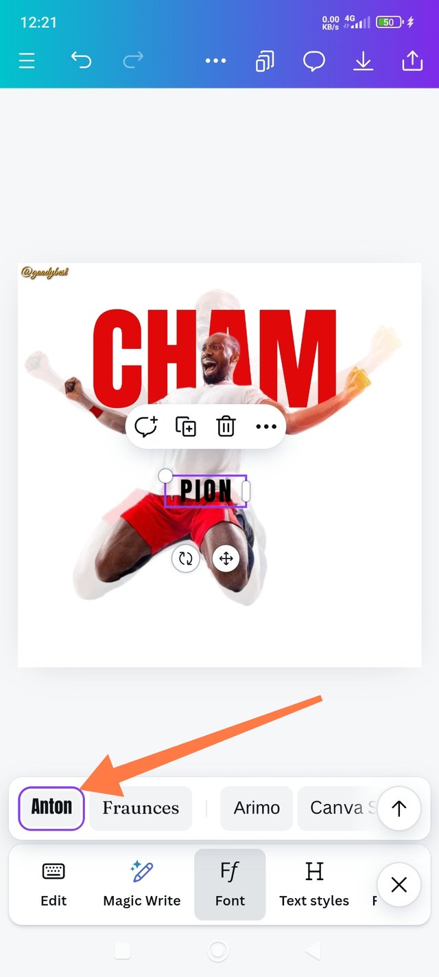 2 2 | 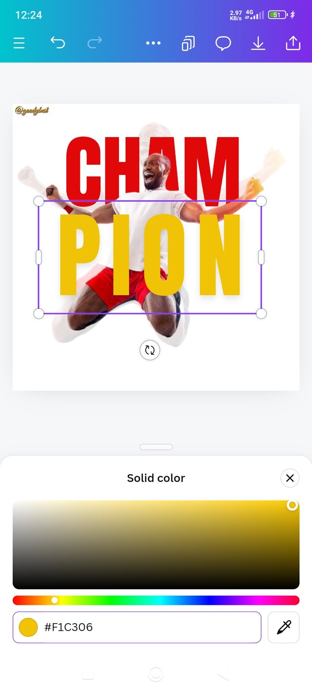 3 3 |
|---|
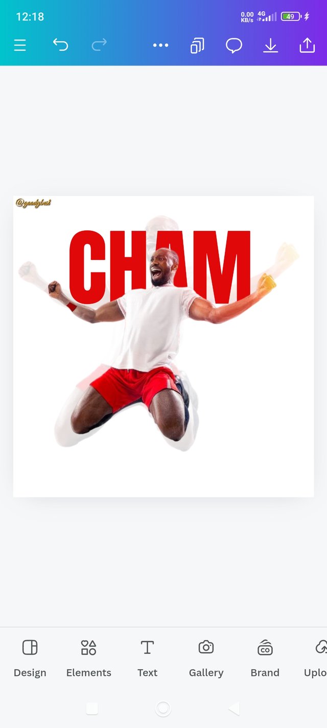
1. I adjusted and positioned the vibrant image well.
2. I wrote my second test, "pion," using Anton font and increasing the text font to 166, just like "cham," and I also applied the same word and line spacing. And Place it well on the second image.
3. Next was Coloring the text; I got the Hex from Prof own, so I simply clicked on the color wheel and searched for #f1c306, and boom I got that vibrant yellow!
| Final Step: Writing My Own Champion Quote and My Username And Position as a Graphics Design Student |
|---|
 1 1 | 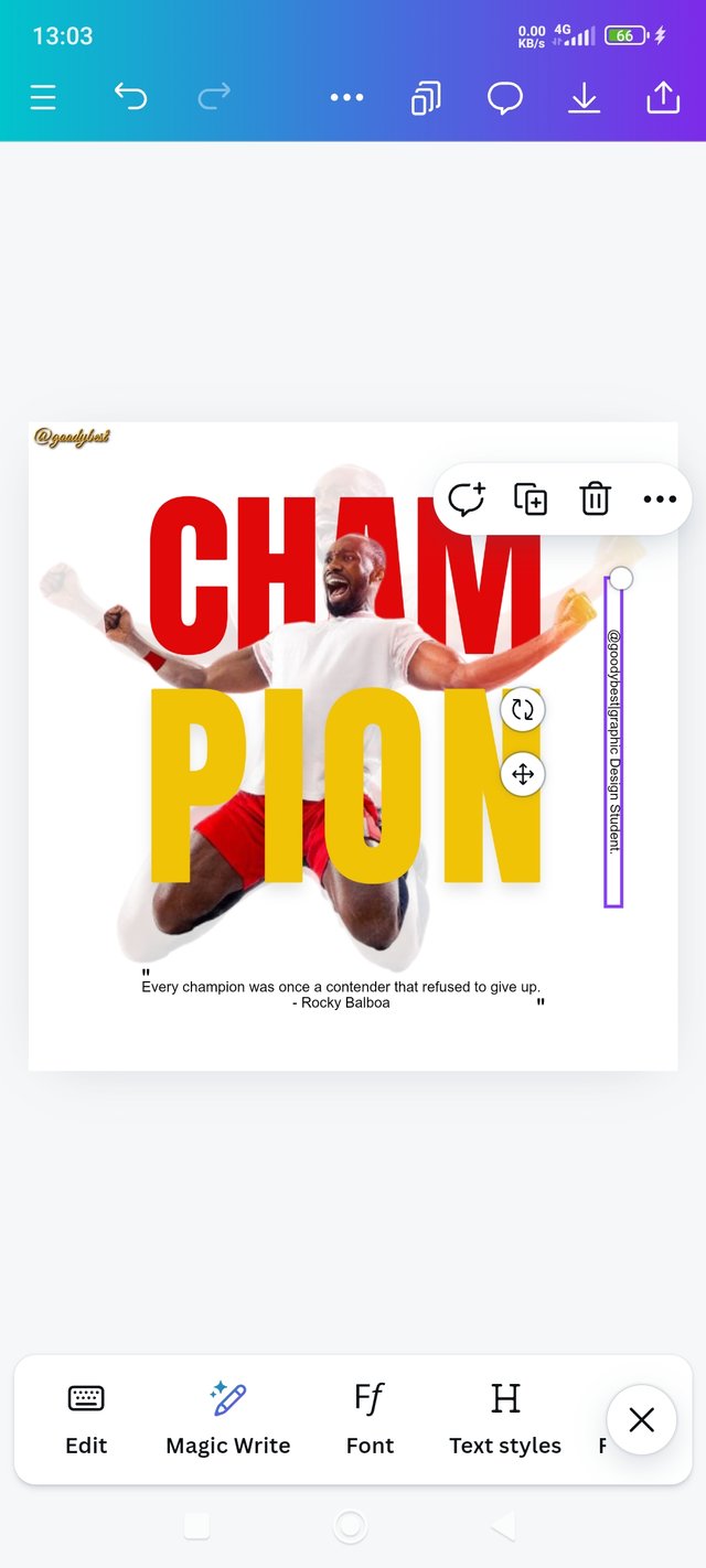 2 2 | 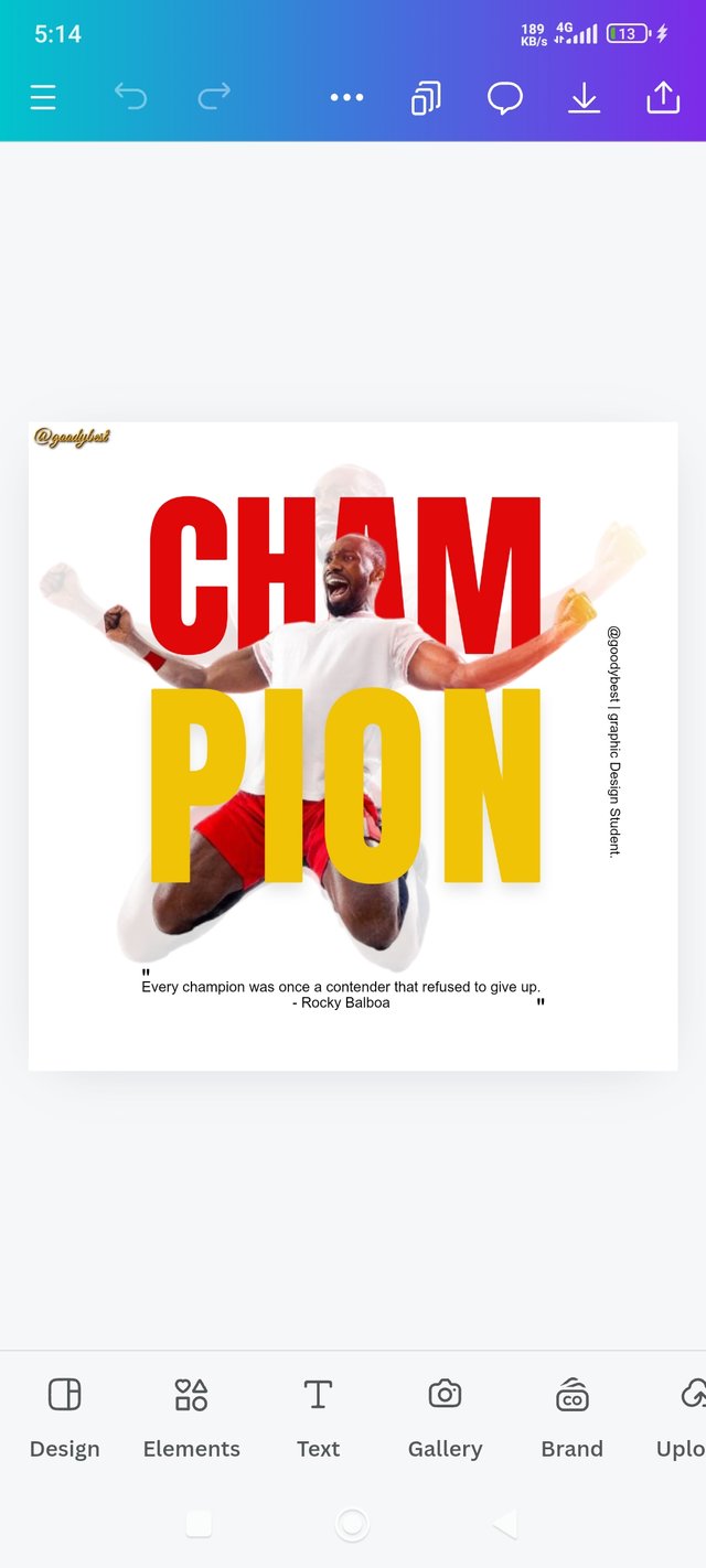 3 3 |
|---|
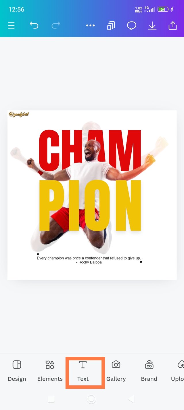
1. I wrote my own Champion's quote, which I quoted from Rocky Balboa: "Every champion was once a contender that refused to give up." I used Arial font and black color for this particular text. And I placed it under my elements.
2. Next, I wrote my username and my position as a graphic designer. Then I turned the text to be vertical and I placed it beside my design.
3. And finally, I was done!
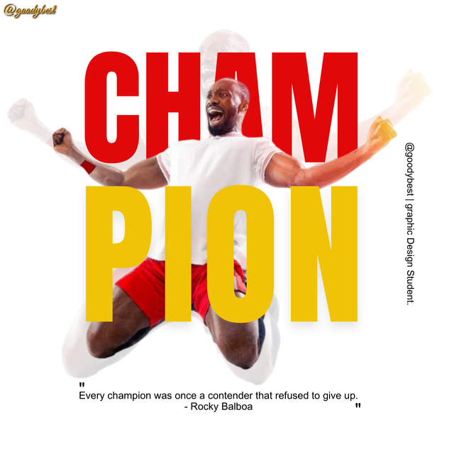
My Final Design |
|---|
THE PRINCIPLE I HAVE ENGAGED IN MY DESIGN: |
|---|
In Designing The Above Piece, I Focused On Several Key Principles Which Makes It Comes Out Fine And These Includes:
Emphasis: I applied this principle to my design; I did this by emphasizing the word "Cham" in red to draw attention and highlight its importance.
Balance: I ensured the composition of both images and text fonts felt balanced by distributing colors evenly, using yellow for "pion" to complement the red in "cham." Everything is balanced, nothing is underweighted or overweighted.
Hierarchy: The size difference between "the first transparent image" and "the second normal image" establishes a visual hierarchy, and I strategically positioned the word "Cham" immediately after the transparent image making it clear that "Cham" is the focal point.
Avoid Edge to Edge: I maintained a margin around the text and images. This makes it feel more spacious, and I avoided a cramped look and cut-off while printing.
Element Spacing: I carefully spaced the words and lines apart to enhance readability and visual flow. My words and elements are connected and united; as you can see in the case you Cham & pion, I used the same font, line spacing of 0.8, and same word spacing. Also, the images are connected too, which makes my design appealing!
Colour Combination: The red and yellow combination is vibrant and lively, creating a positive energy that resonates with the word "champions." I made use of the color wheel and hex code. The color wheel helped me to find the hex code Prof. was using, and I made use of the same.
Design Size & Dimension: The design size of 1080x1080px allows for clear visibility and ensures that all elements fit well within that space. I made use of it because of the images and this template is for social media posts.
Overall, these principles helped me to create an engaging and effective design. You know what? I'm so proud of myself! You know that happiness of creating something amazing 🤩😍 that's how I feel. Thanks, @lhorgic and the sponsors; I appreciate you 💕.
Tell me how My design is. Hi @eliany, @shiftitamanna, and @ngoenyi would you mind joining this contest?
Hello @goodybest thank you for participating in this week's lesson. We have assessed your entry and we present the result of our assessment below.
Feedback:
Let me start by commending you for the effort put into this practical work. Weldone. Your result is superb, even though am still wondering how you had to catch up this fast. You did a great job
Thanks for taking out time to discuss the principles you engaged in making this design and how you engaged them.
In all, you did beautifully well and I must commend your effort. I hope you keep up with the energy level dear student.
Regards
@lhorgic❤️
0.00 SBD,
0.20 STEEM,
0.20 SP
💃💃💃💃💃💃 The truth is that I'm a fast learner, If I set my mind to do something, I will do it. I spent time to read your previous courses and I got the idea of what is required of me. Moreover last week's lesson finalised everything. Yeah I really enjoyed your courses and the simple way you imparted knowledge, remember I told you that I'm in! Haha 😂 thank you for teaching us, and I'm encouraged by your wonderful commendations 💕
Upvoted. Thank You for sending some of your rewards to @null. It will make Steem stronger.
Congratulations, your post has been upvoted by @scilwa, which is a curating account for @R2cornell's Discord Community. We can also be found on our hive community & peakd as well as on my Discord Server
Felicitaciones, su publication ha sido votado por @scilwa. También puedo ser encontrado en nuestra comunidad de colmena y Peakd así como en mi servidor de discordia
Congratulations on bringing a quality content. You have earned a positive vote from team 2, and it is delivered by @ashkhan.
Many Blessings...🙏🏻
Thank you @ashkhan