SLC | S21W 3 | Logo Design - Part 2
Hello people of steemit today is another day to participate on @lhorgic steemit learning challenge and this is the second week of the logo designing class.
| Discuss about each of the logo types we have and then talk about conditions when such logo should be used and when not to be used for a brand. You can do a little research to aid you. |
|---|
Wordmark Logos
A wordmark logo primary function is to point out or show the main elements of the design that it carriess.
This type of logo sometimes feature or show the brand name which would be short and simple and also memorable for their customers to always remember. Because of this focus careful choice is been made to choose the font , the colour and also the design to use on the logo. Making use of the right font and right colors with fulfilling design can give the audience a good and well shaped personality of the brand. Examples of these type logo are coca cola,google and eBay as mentioned.
Monogram Logo
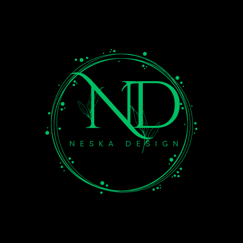 [image designed by me on canva
Monogram logos are often seen or called letter logo or lettermark logo. This type of logo uses the initial of a particular brand , or the first letter of a particular brand to build up their logo and create a stunning design. Unlike the wordmark logo that has the full name of a brand on it in a clear way but the monogram logos simplifies the identity of the brand by using recognizable initials and colour of a brand which will help customers to locate the brand easily. This type of logo gives many people a memorable, visual and a vivid description of the particular brand. Examples are Netflix and boomplay there are others also.
Brandmark Logo
A brandmark logo is a kind of logo that consist of a particular picture or icon that pass the information about the brand's identity without too many explanation and designs which are highly recognizable by their customers. This type of logo is commonly used by popular brands which are well known to people and have been an established brand
I you just established your brand, the brandmark logo may not be the proper or should I say it is not the perfect choice for you as a young brand and upcoming brand . Also this type of logos do not have slogans or writing on them instead they use eye catchy colour photos or design .
Abstract Logos
Abstract logo are seen as captivating or cool image which set them aside from others like the pictorial logo but there are use of some shapes which pass or tell the meaning of the brand and they have recognized and identifiable photos. The goal of an abstract logo is to have have an image that tells us about a particular brand,the name and their colors. Also this type of logo are not regularly seen .this means that they are not rampared. Many big brand have tried this types of logos and you can tell that it gives them a lasting impression on their brand. By looking at them you can describe or easily find them in a particular place.
Combination logo
This type of logo combines both the picture and the design of a logo this helps most of their customers differentiate them from fake or other brands which may look like them . Combination logos are one of the best and they are used my many popular brands in the world and most times it combines both the lettermark and the pictorial logo in it to give their audience the meaning of their brand.
Mascot logo
This type of logo include illustrated character or drawings which are seen in this type of logo and it include the brand name with some artistic images and writings about the brand . This serve as a spokesperson to their customers or people who are looking to try their products. This type of logos are sometimes used by restaurant such as McDonalds.
Pictorial logo
This logos by the name you can tell that this deals with picture and graphics sometimes they have little or no writing on them an example is nestle. This brand we all know that the logo is three birds on a nest and written downwards is nestle . The things you need to consider when designing are the graphic design or image to use, the color selection and how to place your image, the writing and how to design them.
Emblem logo
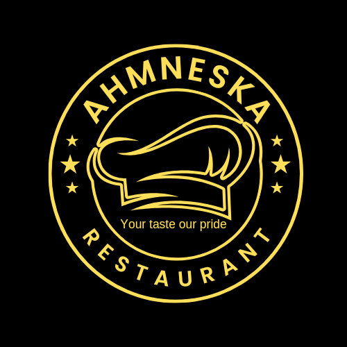
This kind of logo is the most commonly seen and the most that is created because church member use them, schools also use them small scale enterprises also make use of them. This type of logo include a logo and a bit of writing beneath the logo.
An example is a school badge.
| Pick any two (2) of the Logo types discussed and then practically demonstrate how to make them, showing your detailed process. |
|---|
First off I opened my Canva app after it has finished loading I taped on the plus button below
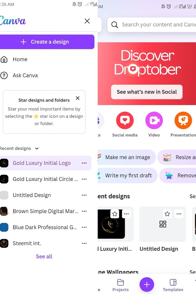
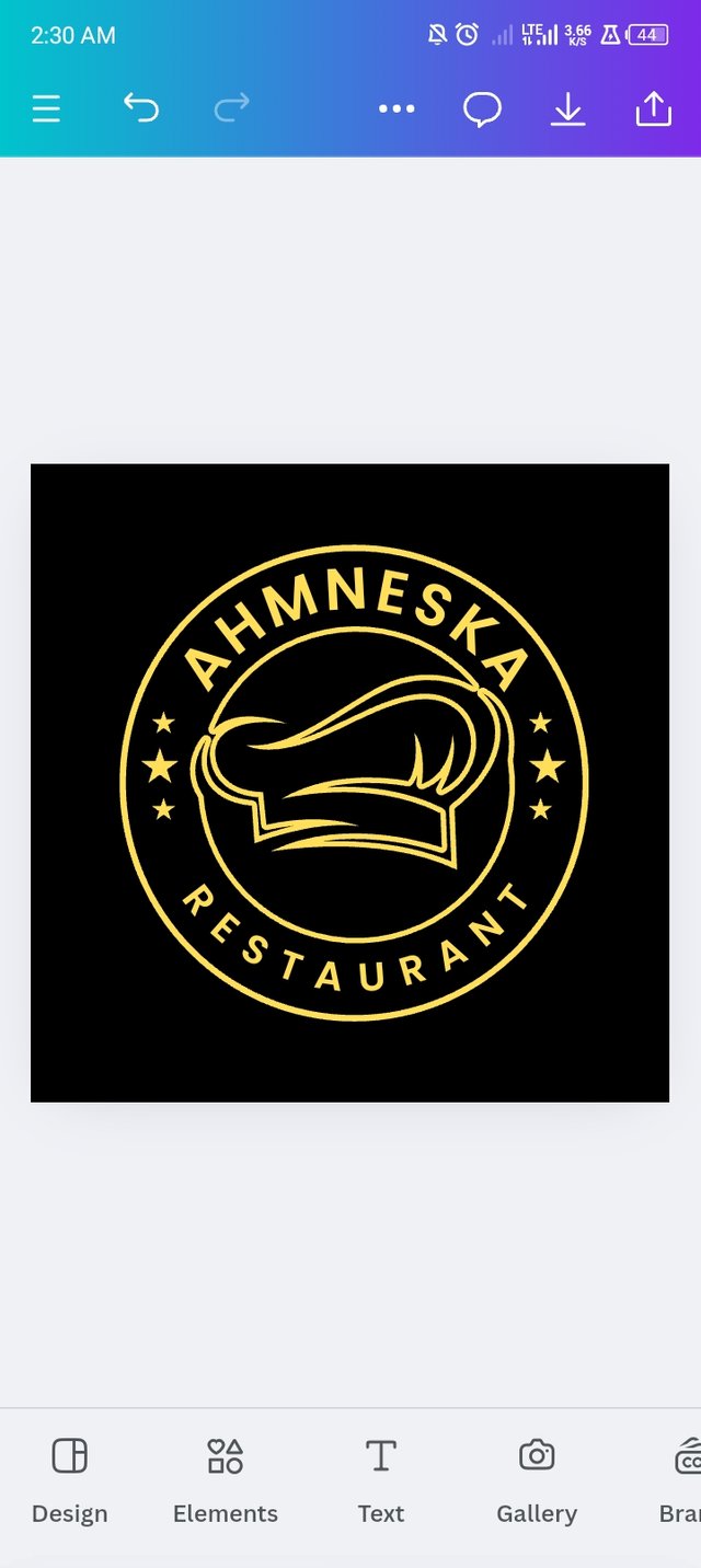
Then I saw create a design . I taped on create a design I took me to a dashboard where I was to chose what I want to create and choose logo , after the different logo template where rolled out , I now searched for emblem logo. Then may different logo load out for me to pic my choice. Then I saw the one that indicates borcelle restaurant and I wanted to create an emblem logo for a restaurant which is ahmneska restaurant
Then I changed the name from borcelle restaurant to ahmneska restaurant.
Then I finally added the last thing which I needed on the logo that is a little slogan which is your taste our pride
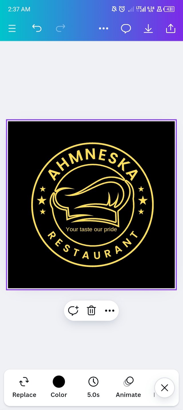
Then I hit the download and after I was done here is my result
Then I figured out how to create a monogram logo. This is how I went about it I opened Canva app after opening I saw monogram logo then I taped on it and I scroll down and I now saw this nd design initially I wanted to create a monogram logo for that particular two letter ND and this was because the name of the brand I am creating for is neska design so I now went on to design further the way I want it I changed the colors and made it look outstanding.

| Design a simple flier for your brand and then strategically place one of the logo you made in the flier. |
|---|
This is the flier which I design the task was to put one of the logo but please don't be angry I decided to put two
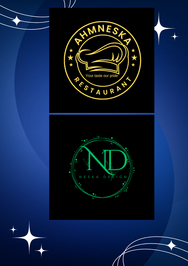
Thanks for reading i will now like to call on @suboohi @mikitaly and @alexanderpeace to also take part in this challenge.

x link
Thank you for publishing an article in the Steem4nigeria community today. We have assessed your entry and we present the result of our assessment below.
MODs Comment/Recommendation:
Your design is cool I must admit. You really put in work doing this. Thanks for sharing. Best of luck.
Remember to always share your post on Twitter using these 3 main tags #steem #steemit $steem
Hi, Endeavor to join the #Nigeria-trail for more robust support in the community. Click the link Nigeria-trail
Guide to join