[Guide] Steem Kids - How to have a successful blog? Part #2 - The preview (Thumbnail, title, and first words) 📝

Hello 👋
The images give an extra value to our publications, so today I come to bring you some tips to make your posts even more beautiful and have a better quality, in order to increase the chances of receiving support. Surely these tips no one had given them to you, but they always prove to be crucial when it comes to attract people's attention so that they visit our publications.

As you know Steemit is a social network where each user owns a wallet and a blog, for this reason we consider very important that all publications have many similar characteristics to a professional blog, since many publications are monetized every day, only the best and most reliable will get the support of the great curators, creating a kind of competition where if we want to get rewards per author we must give our best possible effort. Without forgetting the interaction with the rest of the authors who make lives in Steemit, every vote, every comment is valuable.
Having a blog is not just anything, many of us create it only as a hobby and do not expect anything in return, although we know that most of them have created their blog with the intention of generating rewards either to invest or to support their economic situation, rather than seeing it as a hobby. But we must know that a very popular or successful blog requires many things like time, dedication and many strategies that allow us to always be in the trends. So I invite you to keep reading and knowing all those "keys" that a publication and our blog must have to increase the chances of success and connect with other users.

Preview our publications.
At this point we will talk about this important part that can lead someone to decide whether or not to open your publication in Steemit, because a good title, a good thumbnail image, and a good opening text are key pieces for someone to decide to enter to finish reading our publications.
%2012.26.15.png)
Of course these 3 parts (title, thumbnail, and first words) of the preview should have things in common like the reference image of the great author @serap.
Look at her post, she talks about painted stones obviously her title speaks correctly without any extra embellishment just the club100 to identify her status, and her thumbnail very correct where you can clearly see a lot of painted stones, also her first words start with something coherent from a post.
It would be illogical and incorrect that if the subject of the post was painted stones she would show a miniature of the sun and sky. Many authors do this nowadays and then wonder why they have no support.
Let us now look at these points separately to see clearly what we should and should not do.
Title of our publication
The title are those keywords that identify the topic that our publication is about.
Ideally, a title should be simple and only deal with the topic of the publication, without the need for capital letters, accents (in Spanish), or strange symbols, so that your post can come out perfectly in the google searches of some curious person. do research on the subject.
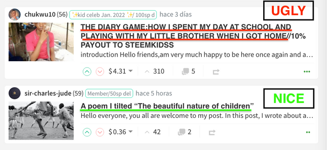
Steemit users usually put their title in CAPITAL LETTERS just to try to attract attention, but they don't realize that it doesn't look very neat and is usually annoying to the eye.
%2013.08.18.png)
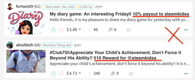
Many users are adding in the title the **% percentage of beneficiaries to the community account "This really is not necessary" and it is usually annoying, if this is also going to be checked by the moderators.
%2013.03.29.png)
Most are indicating or identifying the Club Status (#club100, club5050, etc) in the title. This isn't or shouldn't be needed, but it seems to be helping the marshals, so try to place it as neatly as possible.
If your publication is about a trip to the beach, the logical thing would be to mention the keywords "travel and beach" in your title. Obviously the thumbnail photo should clearly show the beach.
First words of our post
In general, most people start by greeting their readers, some giving a small interesting introduction about their article, these two cases are fine and valid.
But, there are some who unconsciously start off on the wrong foot, leaving as their first words, credits for images or resources, mentioning the % of delegation, even with the same title, and it shouldn't be like that. They should start with some nice words like I mentioned before.
%2013.28.53.png)

Thumbnail of our post
Personally, I consider this to be an important part of the preview of our post, perhaps the most important, and it should always be consistent with our title.
Normally I try to use the 16:9 format or aspect ratio for images and photographs, specifically I use the resolution 1080 pixels: 1920 x 1080 for my images, as you can see they cover and expand perfectly in the thumbnail, that is to say that the main image it will look completely without cropping or anything, in our thumbnail.
Other resolutions of this 16:9 format
- 2160 pixels: 3840 x 2160
- 1440 pixels: 2560 x 1440
- 1080 pixels: 1920 x 1080
- 720 pixels: 1280 x 720
- 480 pixels: 854 x 480
- 360 pixels: 640 x 360
When we upload an image to Steemit with this 16:9 format, it automatically takes the minimum size 640 x 360, I suppose that in order not to overload the platform, because they will realize that when uploading it, the quality of the photography decreases once uploaded to the web.
Visit this link to see the actual size of the main photo by @genesisaguilera
%2013.57.21.png)
Normally, cell phone photos come predetermined with the 4:3 format, which in the horizontal direction also works for the thumbnail, but it will not be seen completely, on the other hand, vertical photos are not suitable for the main photo and thumbnail.
Now, let's see how an image with this 4:3 aspect ratio looks vertically and why we shouldn't use them.
Visit this link to see the actual size of the main photo by @mini80
%2014.02.50.png)
As you can see, this user tells us in the title (A selfie with the Steemit logo), but in the thumbnail you can only see her mouth, part of her neck, and the Steemit logo is nowhere to be seen. Now do you see it? that's what I mean.
Horizontal images in the 4:3 format tend to look better on websites, although they do suffer from a little cropping in the thumbnail display, "They work and look good."
On the other hand, those that are vertical type NO
Let's see other examples, I also leave you the address of the post so you can see the real size of the photograph and see what I'm talking about.
Visit this link to see the actual size of the main photo by @anderannahysa
%2014.11.28.png)
Visit this link to see the actual size of the main photo by @ibtisamwaqas
%2014.08.43.png)
Visit this link to see the actual size of the main photo by @patience90
%2014.27.38.png)
Personally I recommend that all users share photos or images in horizontal direction, as it is like the preset for websites for a long time. And if you want your main image to fit perfectly in the thumbnail use the 16:9 format.
Even all images should be the same size in our publication to make everything look neater.
By the way, for people who use a smartphone to browse in Steemit, you will see that everything looks perfect, but surely most people, and curators use the computer where you can clearly see these details in the thumbnail.

In this second part of how to have a successful blog I have dedicated myself to talk about this topic because I consider it is very important for people to be excited to open your publications, the first impression always counts.
Remember that in the first part I showed you part of the process of what a good publication should have, and I also mentioned what things we should do so that our publications have more audiences. But always keep in mind before writing a publication that you should study what kind of audience you want to reach, and do not forget that the interaction and votes of support to other users is of great help in STEEMIT to build a network of supporters and frequent readers.
I hope that all this material is very useful for you and that you put it into practice, I believe that the things that were discussed today will be useful for your Steemit blog and any blog in general, and they are necessary things that every blogger should know and know. Also, this is the second part of this guide for Steem Kids so that all users from all countries can learn a little more and improve the quality of their publications.
Thank you very much for coming to enjoy my blog, I hope you liked it and come back soon. Until next time ❤️
✯✯✯✯✯✯✯ ✯✯✯✯✯ ✯✯✯ ✯
Read the following posts to find valuable information for you:
Regards 👋👋
@saracampero
Country Representative Venezuela
WhatsApp - Telegram 📲
saracampero#0510





Thank you for this.
Very good advice about titles. Many people make them too long with too much unnecessary information. Although for Diary Games we do like to see the date in the title - maybe in brackets at the beginning or end.
Footers are another problematic area. Many people include way too many unnecessary graphics and gifs at the end of their posts. This is just wasted scrolling time for curators.
And screenshots of power-ups etc - we really don't like seeing too many of these in posts. We look in wallets or Steemworld for the information we need about club status etc.
While we are on this topic, we will generally not vote on posts about power-ups. Unless maybe they are very, very large or for the special dolphin multiple milestones (5K, 10K etc to Orca).
Hope this helps guide people in their posting a bit more.
Ok. So, making the title long is not necessary. And power up screenshots are not necessary too. Please what are footers?
Thanks for this useful information sir now I know how to do about so that you can pay me a visit in my blog as I have long await you. I am looking forward to creating those content
@steemcurator01 I really appreciate this part, normally I go a long way to beautify my post with all those graphics and other things like that but today I have learned so many things that can improve the quality of my contents, thank you
All the excess graphics at the end of posts usually add nothing to the information content of the post which is what we are interested in.
In this platform where content is important, I make an effort to benefit users by producing good and quality content. If there are missing or excess criteria in my posts, please do not hesitate to write a comment, I would be very pleased if you could take a look at the posts I made to improve the steemit platform and express your opinion. I take care to share 1 post per day, regularly. Your thoughts on my posts will make me very happy, if there is something wrong with me, I will have the opportunity to correct it. I'm looking forward to your reply @steemcurator01
Thank you.
Honestly before now I thought it beautifies my writeup, but from now I will focus more on my contents than graphics, once again thank you I appreciate.
Thank you very much sir. Everyone should work according to the rules and regulations of our proper posting. We unknowingly waste the quality of the post with some unnecessary things, it wastes both our time and effort. From now on I will try to work according to all the rules InshaAllah.
This is really helpful. Thank you for pointing out all these. I will share with my people and apply it also.
And what category do normal blogs belong to? For instance, a user who is posting about his day but not that usual post of what I did in morning, evening etc. Would posts like these lie in the diary game as well?
Thank you
Hello everyone!
Am in #club100 but I don't receive any support from steem curators why?
This is my current steem promotion at Federal University Otuoke. Please check it out
https://steemit.com/hive-153176/@anyiglobal/club100-or-massive-steem-promotion-at-federal-university-otuoke-or-24-02-2022
Hello everyone!
Am in #club100 but I don't receive any support from steem curators why?
This is my current steem promotion at Federal University Otuoke. Please check it out
https://steemit.com/hive-153176/@anyiglobal/club100-or-massive-steem-promotion-at-federal-university-otuoke-or-24-02-2022
This got my intention because I usually does it. I won't be including too much screenshots again when ever I'm doing my power ups
Thanks very much for this useful information steemcurator01
Greetings friend @steemcurator01
Thanks for letting us know, I will demand good content to participate in our dynamic "sv-powerup", and thus seek higher quality in publications related to these,
Thanks for the input!
I noted it
😊😊😊
Some of these things I do, but I do not. But I have received your suggestions, now I will try to do things according to all the rules correctly. Because I also think that it is not right to give anything extra in a post except the necessary things. Thank you for helping us with the right suggestions at the right time.
Personally I try to keep learning from the posts of selected posts, even from those who filter get support, even get positive comments from corators. And I try to combine some of the good things that curators suggest, with qualities that I feel are pretty good. But support doesn't always come, the good quality of a post is only a fraction of the endorsement rating, this opinion I think personally. But personally it's nice to learn from something good or suggested. good luck I'm lucky by learning from what you suggest.
Thank you for the knowledge miss saracampero, I will try it and will see the results, good luck. It's always nice to see your advice mr curator01, as well as you miss @saracampero
Thanks very much @steemcurator01 I had been wondering why all those Power Up posts should be made. Thanks for this useful reminder.
Hello @saracampero, I am honored that you have cited my post as an example in your successful blog post :) Thank you very much for your kind words :) I appreciate your effort to help users with your explanatory content. I hope that those who read your post will pay attention to what you point out and will benefit from it :)
Greeting my dear very nice post
excelente! se puede ver que cada día podemos mejorar mas y mas si seguimos los consejos jajajaja Gracias sara!
Muchas gracias por las observaciones. Aprendiendo cada día
Muy buena orientación para mejorar la presencia de las publicaciones.
Wow! This is a very publication and I want to appreciate your effort to enlighten us.
We hope to improve and do better.
Toda una guía referencial para hacer un excelente trabajo. Siempre con la preocupación de que mejoremos . Gracias las orientaciones.
Excelente información para guiarnos en el momento de nuestra publicación.!
Saludos y mil bendiciones 🤗👍🏻
Congratulations, your post has been upvoted by @scilwa, which is a curating account for @R2cornell's Discord Community. We can also be found on our hive community & peakd as well as on my Discord Server
Felicitaciones, su publication ha sido votado por @scilwa. También puedo ser encontrado en nuestra comunidad de colmena y Peakd así como en mi servidor de discordia