SLC | S21W 3 | Logo Design - Part 2
Hello friends!
Welcome back to my blog. Let's get started with the business of the day.
 |
|---|
Discuss about each of the logotypes we have and then talk about conditions when such logo should be used and when not to be used for a brand. You can do a little research to aid you. |
|---|
1.Wordmark Logo
Also known as Logotypes, they are simply logos that represent brand names. This brand name is observed to appear in a stylish manner that makes it appealing. We have to be careful while choosing this typeface.
When to Use it
a. Our brand name is simple to remember. That is, memorable without difficulty.
b. Ideal for new startups that need brand-market recognition.
When Not to Use it
a. Too lengthy names may not be ideal.
b. When there is difficulty in name pronunciation or spelling, it is a no for wordmark logo typeface.
c. Where brand visuals are better off, the wordmark should be substituted.
2.Lettermark Logo
Also known as Monogram. This is a logo typeface that requires that a brand abbreviation be used for its logo. We find a situation where we use brand name initials for logo typeface. So, companies with lengthy, difficult pronouncing or spelling names can use this.
When to Use it
a. When a brand name is seemingly lengthy
b. When a brand name is difficult to pronounce, spell, or complex.
c. Ideal for existing brands who need a simple brand logo
When Not to Use it
a. This is a no for new startups or brand names. Initials do not represent the required brand identity.
3.Brandmark Logo
This is the use of symbols or icons in our logo typeface. They are exclusively used.to represent brand entity without having to use text. This use of icons or symbols is unique in a manner that once it's seen, the brand is remembered.
When to Use it
a. To navigate through language barriers and represent all.
b. Brands with good visual representation other than text types.
When Not to Use it
a. Not ideal for new startups or brands yet to create market impact. This type of logo does not disclose the true brand identity or allow for recognition.
 |
|---|
4.Combination Logo
As the name implies, is a logo typeface with both symbols and text. This helps express the brand holistically through dual representation. There is certainty to brand recognition without guesses.
When to Use it
a. If we want a strong memory that represents a brand through symbols and text.
b. Generally acceptable logotype, used by many to achieve their purposes.
When Not to Use it
a. Not ideal when symbols are complicated or complex for easy interpretation. This brings confusion in the minds of customers.
5.Emblem Logo
Logos that have a resemblance to that of a batch or seal. This is typical of it with a text inscription in it. With this logo, we can achieve both text and icon/symbol.
When to Use it
a. Mostly used in authority-based institutions like schools, government, or entertainment bodies.
b. Brands with premium quality tend to go for this kind of logo.
When Not to Use it
a. Beands with flexibility may not align with their use as they look outdated and rigid.
Pick any two (2) of the Logotypes discussed and then practically demonstrate how to make them, showing your detailed process. |
|---|
Wordmark logo Design
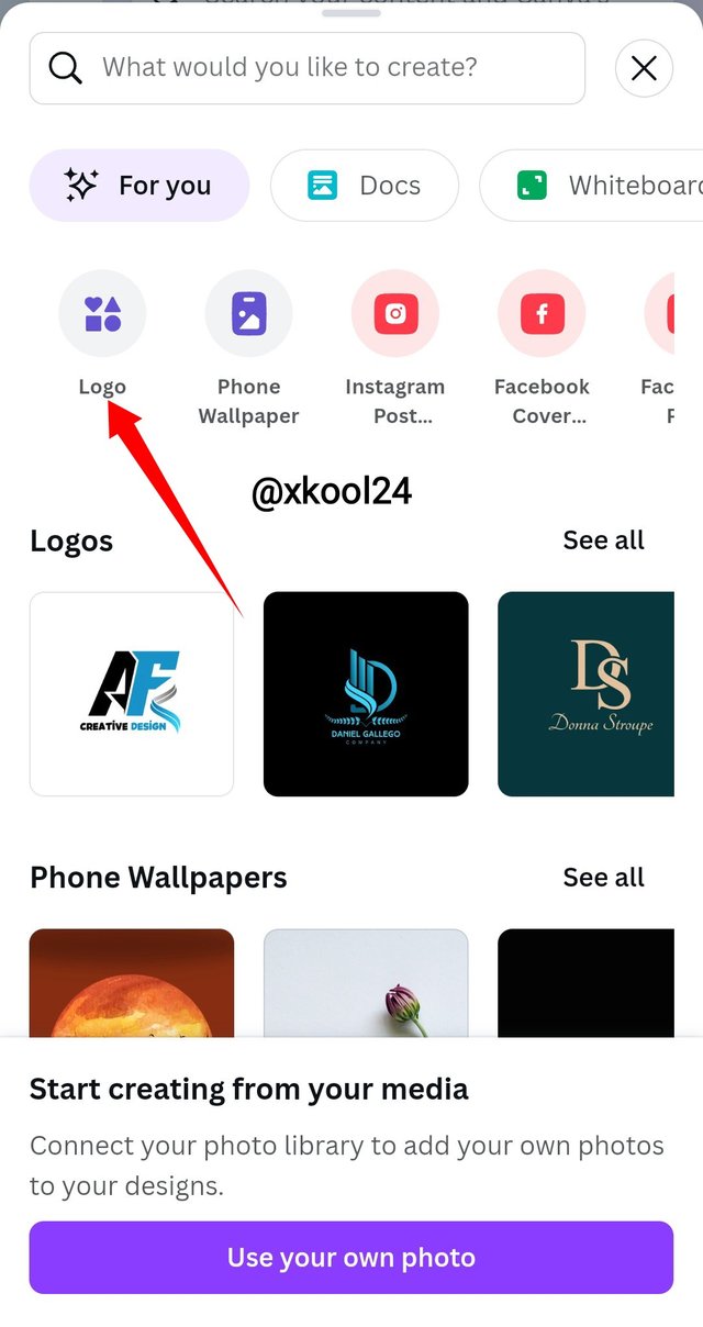
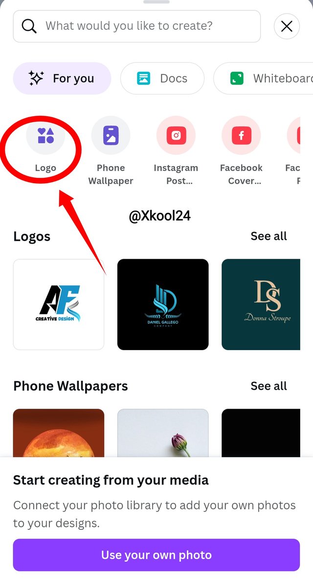
While using Canvas, designing the Wordmark logo is a lot easier for me. In doing that, I would click on the "LOGO" icon on the top left screen of the app.
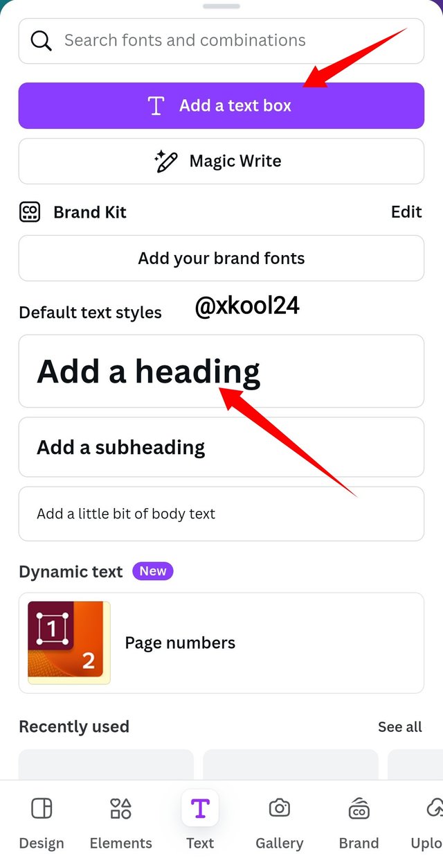
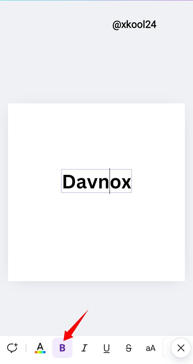
The next is to click on the "Text" button and choose from my preferred "Text Styles". Text styles enable me to add both my brand name and tagline. I selected the bold text styles for more visibility.
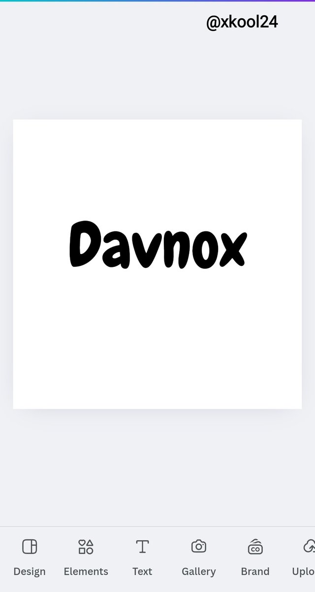
I had to replace the text with "Add a Heading" with my brand name which is DAVNOX. And also used a font styling that is befitting for my brand. Our font styling is vital during logo creation, as this is the first impression they get from public view.
Our color is another essential element that brings that attraction. A good color combination is always advised where mono coloring isn't in use.
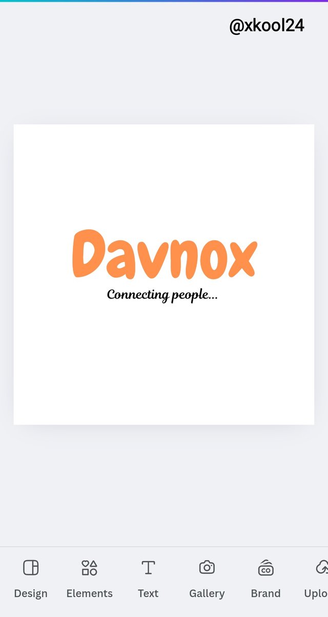
This is my final brand name for wordmark logo creation. Davnox is an agency responsible for delivering telecommunication retail services within its territory. This retail sales company is becoming a known name, and hence, the use of this brand name continues to drive usage and remembrance among its present and potential customers.
 |
|---|
Brand name - Danvox (Coined out from Davnox Ventures)
Colour used - Orange
Tagline - Connecting people
Combination logo Design
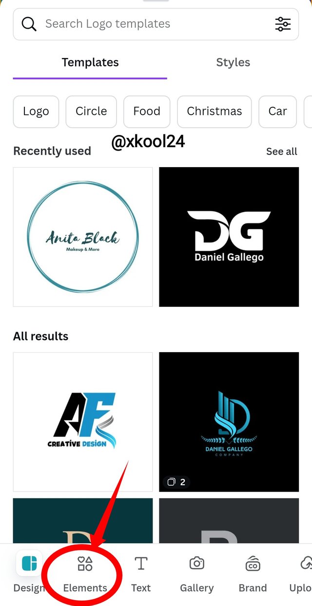
While using Canvas, designing the Wordmark logo is a lot easier for me. In doing that, I would click on the "LOGO" icon on the top left screen of the app.
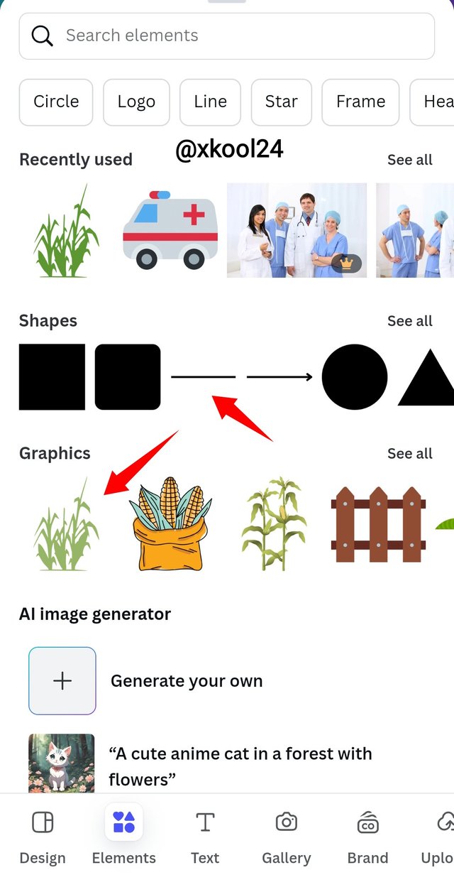
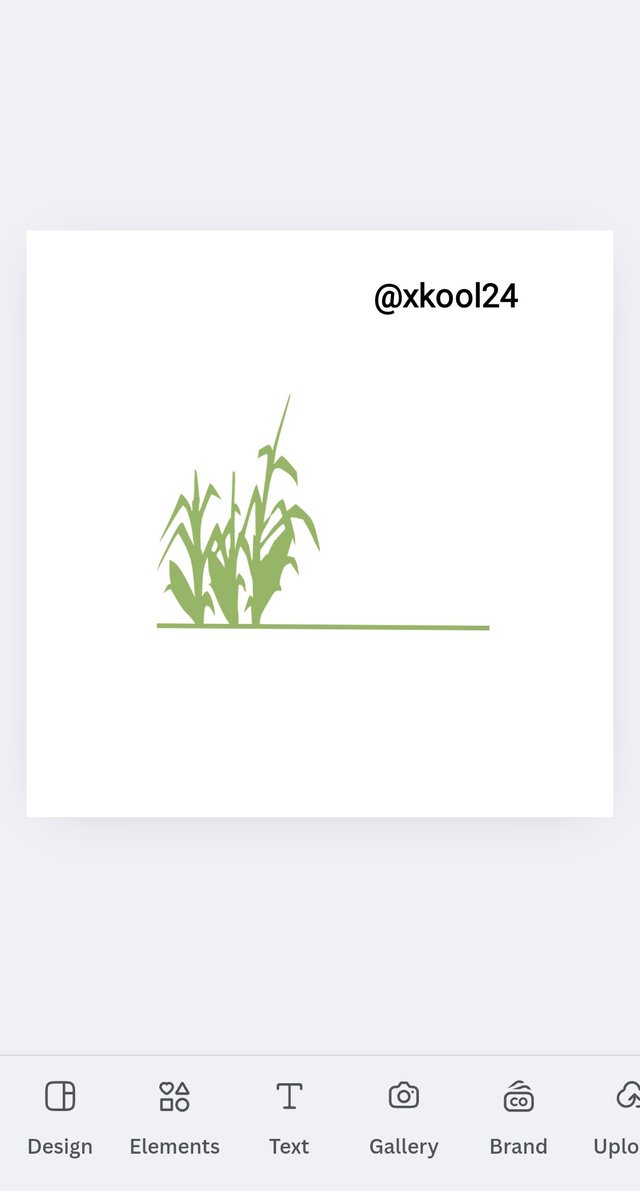
The next is to click on the "Element" button and choose from my preferred "shapes". Shapes enable us to have an appealing brand logo. I selected the farm-related shape to represent my intent.
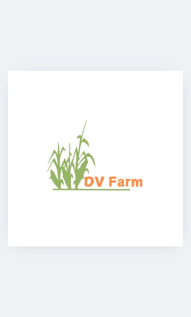
I had to also pay attention to the shape and text colouring. This is in line with the product vision of a greener pasture that drives productivity. The text tools were also used to add a befitting tagline as well. Not forgetting is my front style for an appealing display.
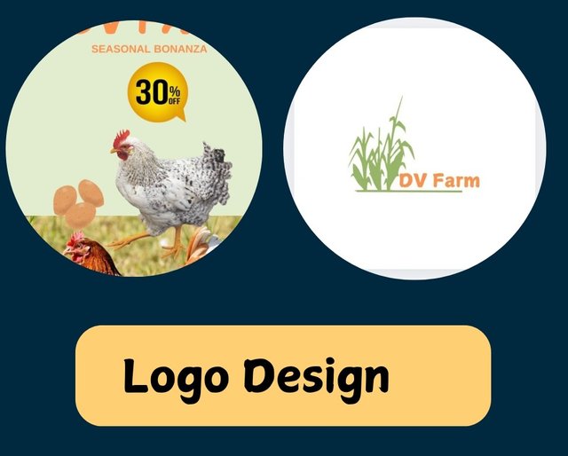
The final design is here. DV Farm is poised. to deliver agri-based services. Like supplies of poultry products, fishery, and snail production.
Brand name : DV Farm (coined from Davnox Ventures Farm)
Colour used: Green (represents green pastures and yield)
Design a simple flier for your brand and then strategically place one of the logos you made in the flier. |
|---|
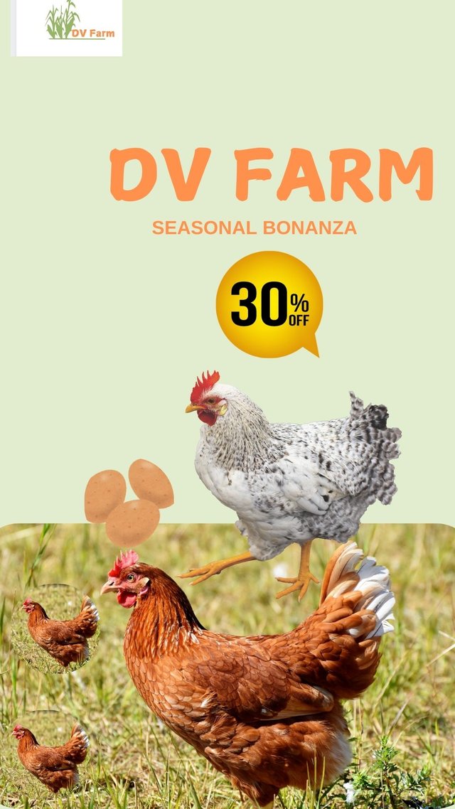
This is a promotional flier for the upcoming festive period. It is designed to drive sales and traffic on the farm. This is one way to drive profitability and awareness.
Thank you
I am inviting @chilaw, @woka-happiness, @chant.
https://x.com/xkool24/status/1857126790331805833?t=RQOdQ8nOzpILCAmAESHnWg&s=19
Greetings to you sir 🫡, your designs are amazing, thanks for inviting me, and good luck to you